Federal election results maps from 2008 and 2011
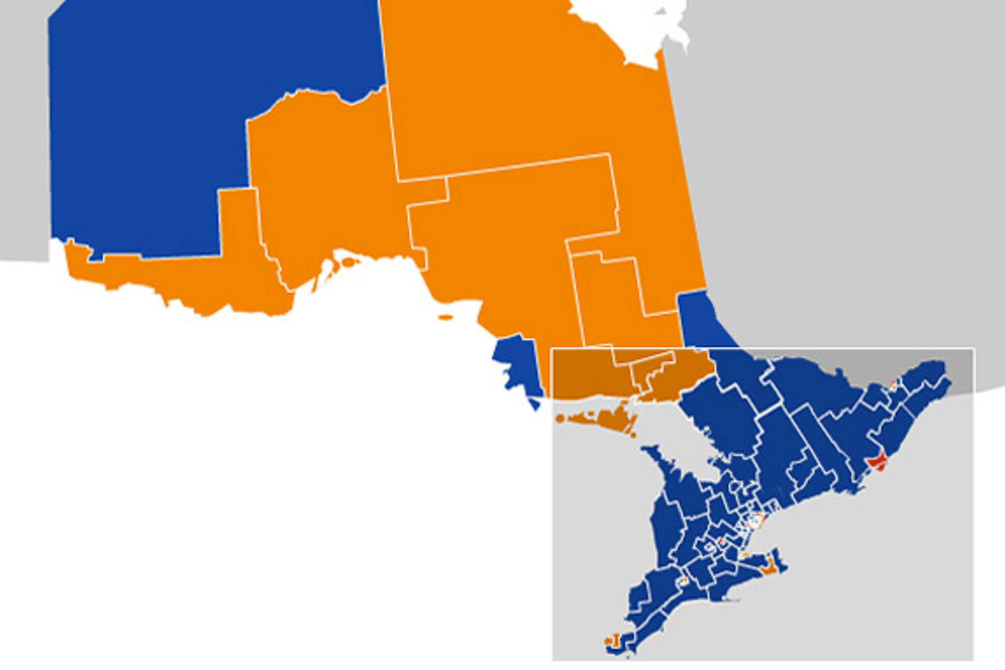
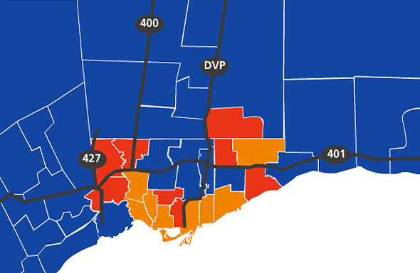
Federal election results are sometimes best presented visual terms. In fact, maybe it's always the graphics and maps that hit home exactly what changes have taken place. Case in point: a comparison of the CBC's results maps from 2008 and 2011 paints a pretty good picture of just what went down last night. Quebec turned orange and the GTA lost most of its red. It's obviously a bit more nuanced than that, but the collapse of the Liberals in Toronto and the rise of the New Democrats in Quebec are certainly the most obvious visual cues that the winds of change were a blowin'.
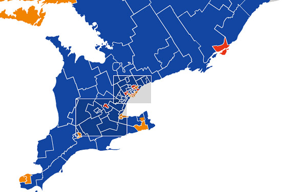
The blue crush in Southern Ontario is also dramatic looking, but less so when compared with 2008. Most of these ridings voted Conservative last time as well. So does the Toronto map look like Ford Country has lived up to its name (i.e. on a federal level)? Perhaps not in the core of the city, but the inroads are obvious. What this means for the next provincial election remains to be seen, but one would think Tim Hudak has been energized by the success of the Conservatives in the GTA.
To use the interactive maps, which allow you to zoom in and out, check out the CBC's Canada Votes page. Lead image of voting breakdown by party in Ontario from 2011.
For more how the election played out last night, check out our results post.
GTA RIDINGS
2011
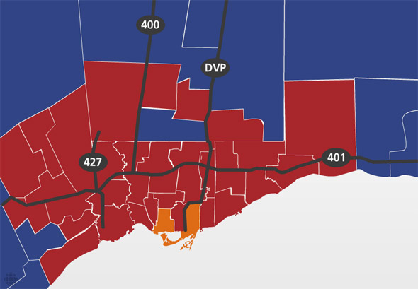
2008
SOUTHERN ONTARIO
2011
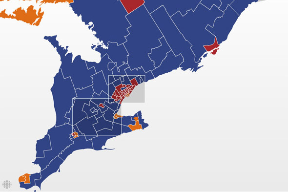
2008
CANADA
2011
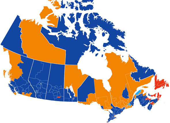
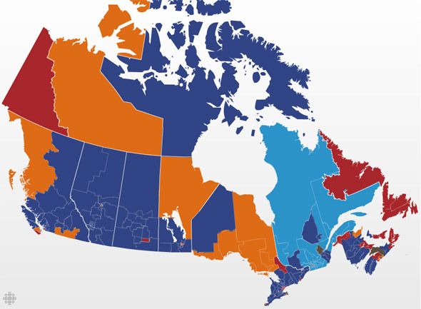
2008
All screengrabs from the CBC's Canada Votes hub
Latest Videos
Latest Videos
Join the conversation Load comments

