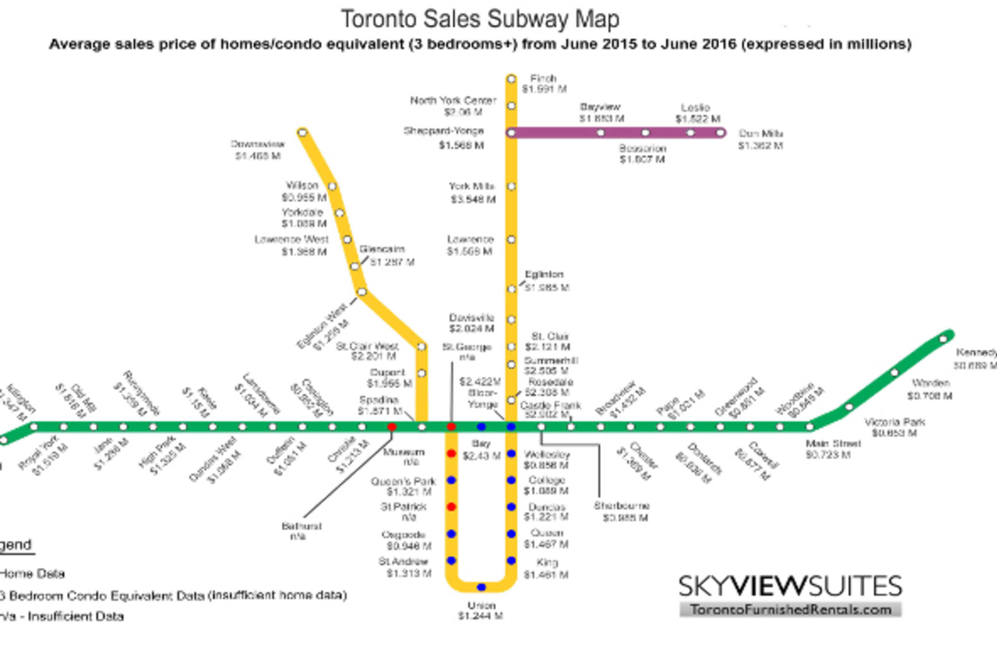
Map charts Toronto housing prices by TTC subway stop
Toronto is an expensive city, especially when it comes to real estate. For many of us, buying a home is a pipe dream considering the average price of detached house is sitting at just over $1 million. But not all neighbourhoods are that exorbitant.
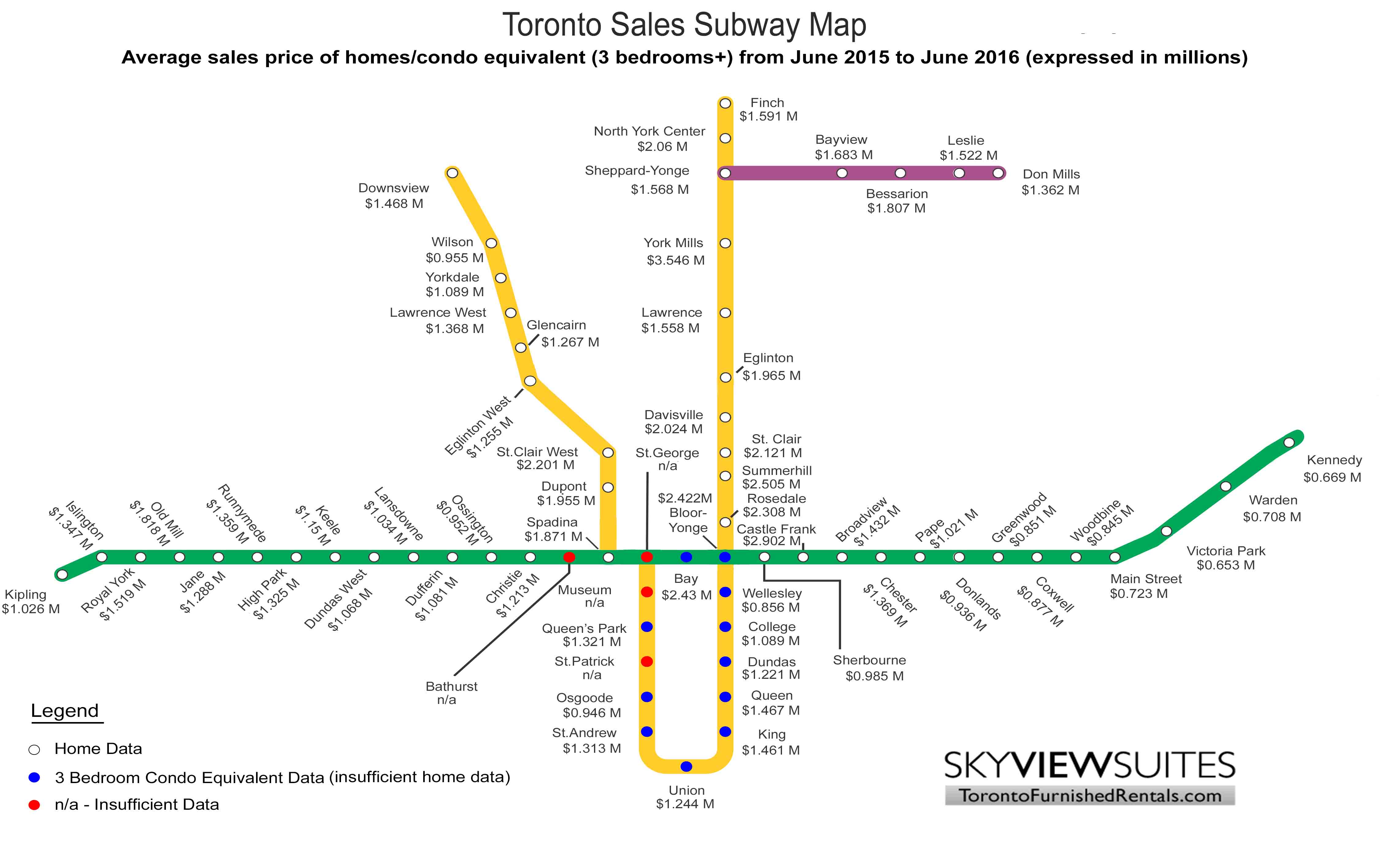
Sky View Suites charts the average sales prices of homes (and their equivalent condos, or units with three-plus bedrooms) from June 2015 to June 2016 (here's the high-res version). It places its results on a handy TTC subway map so you can compare and contrast each stop - well, except those with insufficient data, like St. Patrick and Museum.
But the results aren't all that surprising. Prices go up to more than $2 million near Summerhill, Rosedale and Castle Frank and they fall as you travel east along the Bloor-Danforth Line.
As we said with Sky View's rental map, take these numbers with a grain of salt and instead use the map as a guide to help illustrate real estate trends in Toronto - it's pricey to be in the core.
Map via Sky View Suites.
Latest Videos
Latest Videos
Join the conversation Load comments


