Transit: TTC-Inspired Design
The TTC has had it fair share of (mostly nasty) run-ins with design over the past few years. Between selling ugly apparel from an ugly store, and installing inconsistent and poorly designed signage throughout the transit system, they've definitely shown that they could use some help.
Unfortunately, they don't seem to have a really good reputation for fostering ideas from local designers or creative types, and have even gone so far as to threatened well-intentioned bloggers.
Some of the best designed TTC shwag has come from third parties inspired by TTC stations. (Spacing buttons, anyone?)
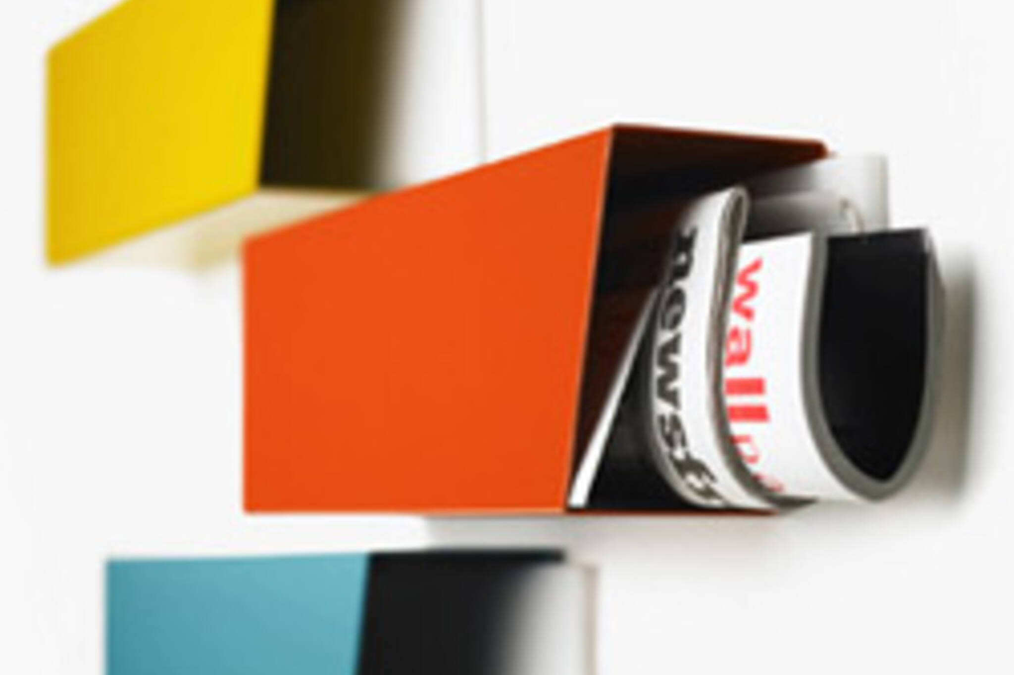
The same is true for Transit, these new TTC-inspired powder-coated aluminum mailboxes, designed by Stephen Hugo-Seinader and seen on MoCo Loco. The mailboxes are "inspired by the colour schemes and strong graphic appeal of stations on the Toronto subway system, the first phase of which was designed and constructed in the 1950's."
The colours of the boxes are taken from specific stations, and each is named accordingly. Bonus points to blogTO readers who can correctly identify the stations that inspired the designs shown here.
You can find them at Eye Spy (1100 Queen Street East) for $125.
Latest Videos
Latest Videos
Join the conversation Load comments


