Towards a map of Toronto desire lines
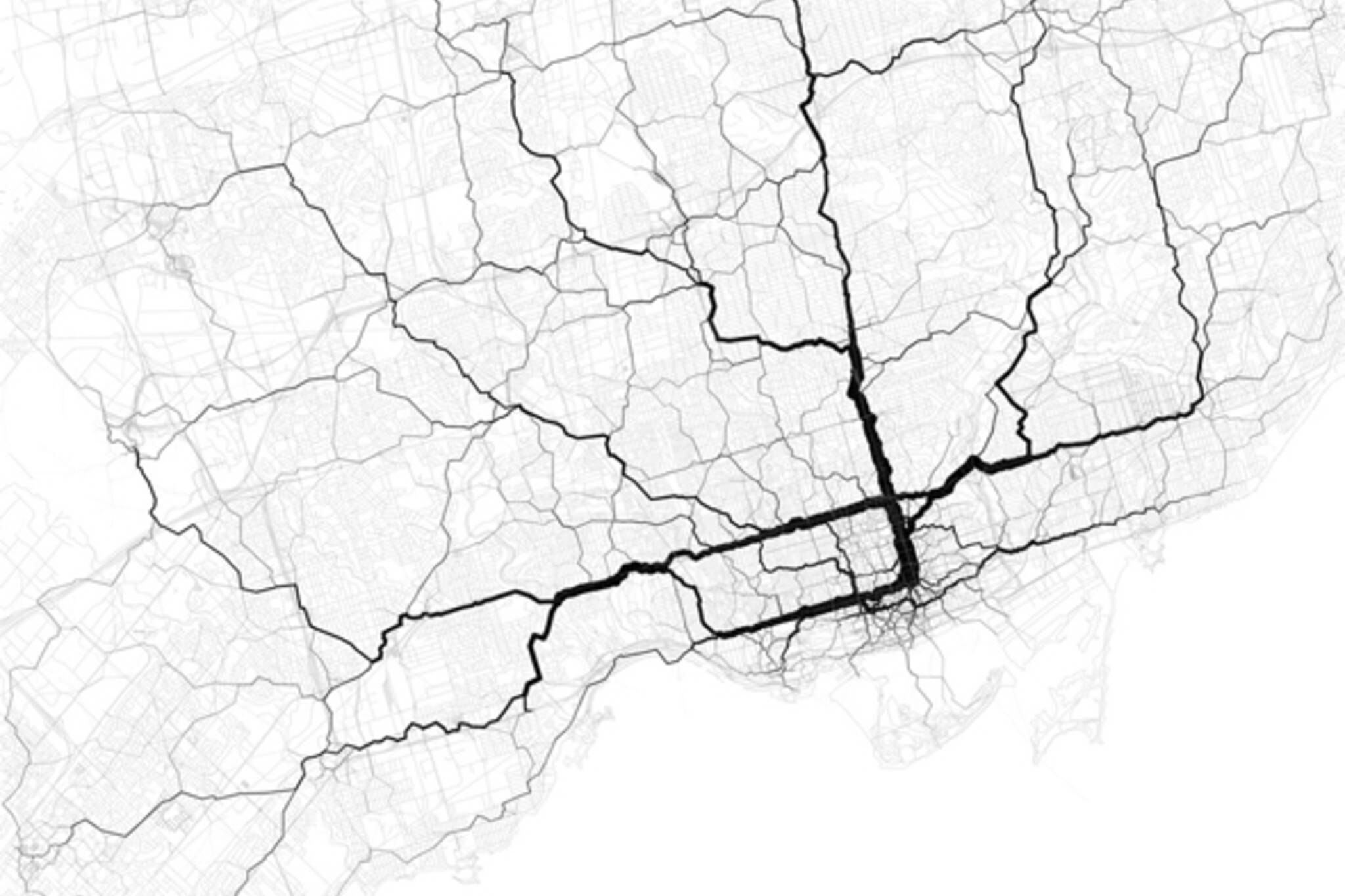
Eric Fischer, digital cartographer extraordinaire, is at it again with a new series of maps that track the paths that smartphone-toting people take to travel through cities. Using geotagged tweets, the Oakland-based data visualization specialist has plotted the arteries of Twitter traffic for a host of cities around the world including Toronto.
Mashable probably has the most lucid explanation of Fischer's methodology:
"The project lays out around 10,000 geotagged tweets and 30,000 point-to-point trips in cities like New York City to plot the flow of people in terms of favored paths... Using a base map from OpenStreetMap, he drew out transit paths using Tweets. Movements are indicated on the geolocation of a Tweet, with an individual's start point marked with one geotagged Tweet and ending with the next geotagged Tweet. This is what creates a mass of traffic routes."
The reason two sets of data are required, Fischer explains, is that "if you just draw lines from the beginning to the ending of each trip, you get a big mess." Hence the geotagged tweets in addition to the point-to-point trips. "The most plausible routes are ones that pass closely through places that other people have been known to go."
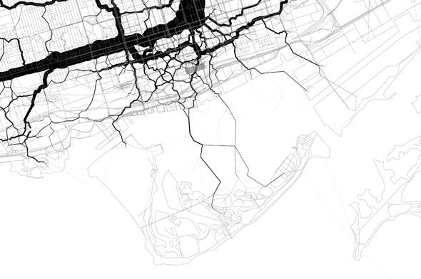
Although some have speculated that the resulting maps might show where transit planners should look to build infrastructure, that's probably a bit of stretch given the methodology and the nature of the base data. Not only is there a demographic bias based on smartphone usage, but it's unlikely that many drivers are incorporated into the trends (save for those who drive and tweet). The data also doesn't account for those trips that start or end out of the city limits (hence, as a Flickr commenter points out, the relative lack of activity along the Lakeshore GO line).
Nevertheless, Fischer's latest maps might hint at something akin to the desire lines of the featured cities. It's not surprising, of course, that the most popular corridors tracked in Toronto are Yonge, Queen, and Bloor streets. Not only are these hubs of activity in general, but they're also streets rich with pedestrian and taxicab traffic, two modes of transportation that are friendly to social media usage.
While admittedly narrow in focus, there are tantalizing hints at the way that we navigate cities to be found in these maps. For that reason alone, they deserve closer study. Leave a comment if you spot a noteworthy trend that Fischer has plotted on our behalf.
See also:
Towards a map of social media in Toronto
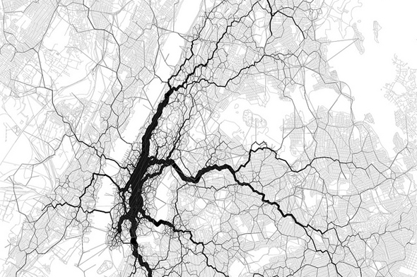
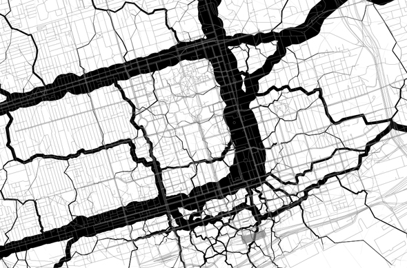
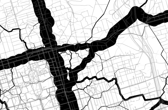
100% crops
Downtown Core
Triangle Below Bloor
Ferry routes
Latest Videos
Latest Videos
Join the conversation Load comments


