The TTC gets a new look
The lure to redesign the TTC logo and branding for Toronto designers is nearly irresistible, it would seem. I don't think anyone has actually improved upon the Keystone (which was itself quietly modernized in 2014), but it's always fun to see how this iconic Toronto symbol is reimagined.
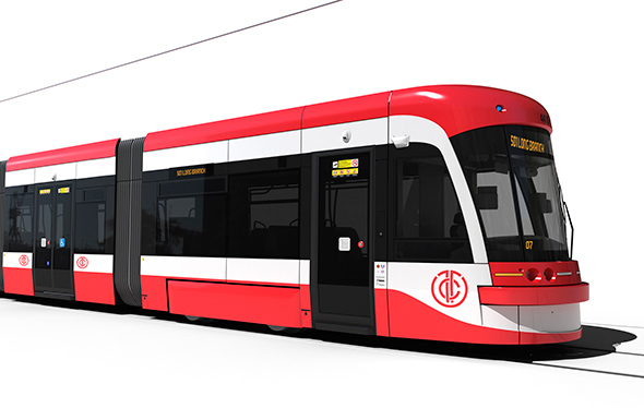
Anton Mwewa is the latest to take up the challenge for the sheer fun of it (note well: none of this is official or sanctioned by the TTC). I have to say his branding is some of the slickest that I've seen. My sense is that his logo will be a divisive subject, but perhaps only because we're so accustomed to the clean design of the Keystone.
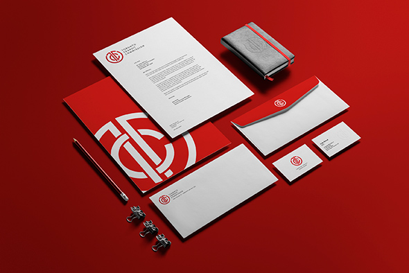
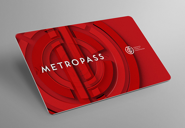
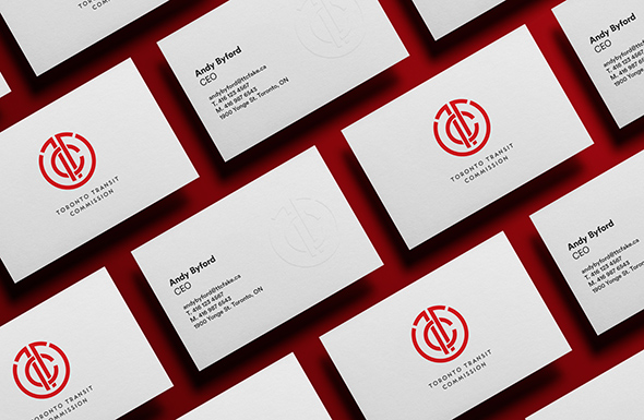
When featured on mock versions of a Metropass and TTC business cards, the results are impressive.
Perhaps one of the reasons for this is that Tankovich has maintained the original Toronto Subway font alongside the updated logo. "In this version, elements of the original branding live on through type choice, while the logo itself is reimagined with art deco influences," he explains.
What do you think of the redesign? Let us know in the comments.
Latest Videos
Latest Videos
Join the conversation Load comments