
The story of the "Toronto Subway" font
Dominion Modern is set to open a new exhibit that'll be of interest to TTC history buffs and Torontophiles. Based around David Vereschagin's reproduction of the font used for the original Yonge Subway stations, it's part of an ongoing oral history project in which the museum's director, John Martins-Mantiega, interviews important contributors to the legacy of modern Canadian design and architecture. The majority of these interviews have yet to be made publicly available, but new additions to the archive are now being uploaded to Vimeo, including last month's fascinating look at Honest Ed's sign painters.
Each interview is accompanied by an exhibition at Dominion Modern's display case at George Brown's School of Design. These aren't really gallery shows — though those do happen a few times a year as well — so much as a single works, but they're still absolutely worth checking out if you're in the area. To accompany the story of the "Toronto Subway" font, Martins-Mantiega and students from the school have fashioned a huge cardboard replica of Eglinton Station's interior tile facade (the only that's yet to be updated), complete with Vereschagin's font.
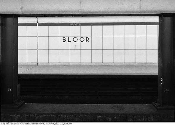
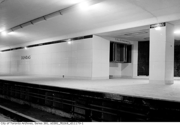
It's an impressive feat, but the story of how Vereschagin came to recreate the TTC's font is even more compelling. As Joe Clark has written about at length, the TTC has been anything but consistent in its font usage, so in the late 1990s (when Vereschagin started his work), preservation of a unique bit of Toronto typography was his chief motivation. "I was going to rescue the Toronto subway typeface, essentially in typographical terms...to ensure its continued existence," say Vereschagin in explanation of his work.
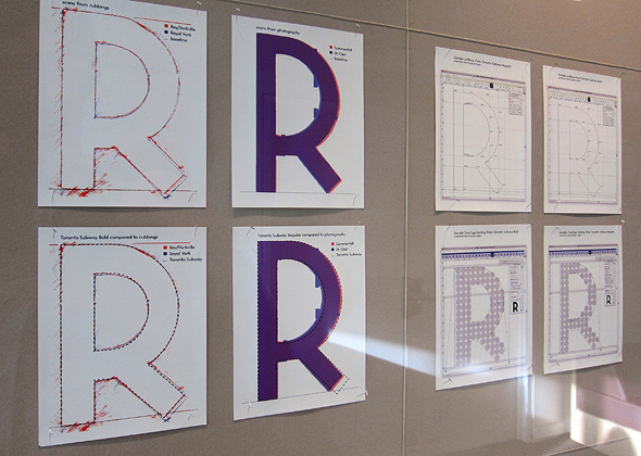
At the time, the TTC had commissioned Paul Arthur to implement a new signage system (some of which remains at St. George Station) and he favoured Gill Sans as a replacement font. And because no one knows who designed the original font or has access to the documents on which it's contained, Vereschagin set about to create a faithful alphabet by visiting stations and making rubbings of the sandblasted letters on the original Vitrolite glass tiles. When this proved impossible he took photographs.
After compiling and examining his research, he eventually crafted "Toronto Subway," a reproduction of the original typeface that's extremely close to the ur-font — so close, in fact, that even the TTC now uses it. Vereschagin, as many transit experts know, has also made the font (and a new lower case version) available through his design firm, Quadrat Communications.
During a phone conversation with Martins-Mantiega about the exhibition and Vereschagin's original project, I ask why he thinks more and more people have become fascinated by TTC typography. At first neither of us can come up with what we think is a compelling answer. But it quickly dawns on us that it might actually be quite simple. Like the "bathroom aesthetic" of so many of our stations (past and present), it's unique. Perhaps the explanation doesn't need to be any more complicated than that.
Toronto Subway: A Love Story runs at Dominion Modern from April 7, 2011 - June 16, 2011.
Images of original TTC stations from the Toronto Archives.


