
Unique maps of Toronto
I'm a junky for unique maps of Toronto, be these hand-drawn or computer generated. For the most part, I satisfy my interest via the Historical Atlas of Toronto, which is my favourite book about the city. But, when I'm looking for something more interactive -- or even just recent -- I obviously take to the internet to supplement this little hobby.
Over the years, blogTO has posted on a number of cool projects that map Toronto in various ways, but because it's tough to find all of them with one click or search request, I realized that the time has come to collect a number of them together in few map-themed posts.
Why a few posts? Well, because I'd like to keep the TTC out of this for now -- not because I'm not a fan of the various fantasy maps that have popped up over the years, but because they deserve their own treatment. Similarly, a number of the older maps that can be found in the Historical Atlas have also been digitized, and thus warrant a dedicated post. I may at some point also update our Google Mashups Compendium, but that's a little more use-oriented that what I'm collecting today.
So stay tuned for those at some point in the near future, but for now I'll share a few of the somewhat recent maps I've come across that really get my cartographic juices flowing.
Eric Fischer's The Geotagger's World Atlas
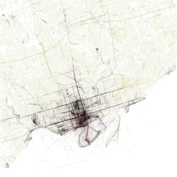
Both the lead image and the one above use Flickr and Picasa's publicly available API to reveal where photographic activity is concentrated in a given city. Fischer's colour coded map above shows the relative speed at which photographers are travelling (via geotags and timestamps) when shooting: black is less than11 km/h, red is less than 19 mph, blue is less than 69 km/h, and green is any speed above that. In the lead image, photos of Toronto are divided into those taken by locals (people shooting in Toronto for a period of at least a month) and tourists (people shooting the city for a period of less than a month).
Fischer's latest project is Race and Ethnicity distribution maps, which is yet to include Canadian cities because the raw data he employs derives from the more detailed U.S. census.
James Redekop's Cycling Map
Probably one of the coolest GPS animations I've seen, the above traces the travels of (recumbent) cyclist James Redekop over a span of roughly five years, during which time he creates a map of Toronto. How did he do it? With a Garmin GPS and his own programming ingenuity. To see individual years and more information in general, check out his blog, '77 Track 7.
Flavio Trevisan's Studies of a New Past
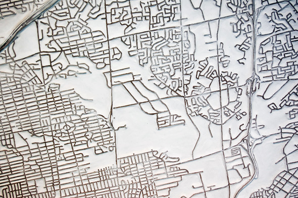
I first discovered Flavio Trevisan's Toronto map-sculptures earlier this year at Diaz Contemporary, and I just wish I had a few more dollars so that I could get my hands on one of his pieces. Lacking labels, these maps -- which range from the city-wide to neighbourhood cut-outs -- are both a study in the iconic nature of our local topography and the degree to which we're all mental cartographers in one way or another.
Kieran Huggin's Animated TTC Service Maps
So cool. Designed in 2008 using an OpenGL algorithm and data from myttc.ca, Kieran Huggins map of TTC service levels is a fascinating as it is visually compelling. It may not look like much when the video starts rolling, but just wait until the subways start running and you're in for a treat. Vimeo credit: TTC Weekday Service (HD) from Kieran Huggins on Vimeo.
Marlena's Maps
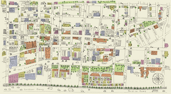
A map doesn't have to be a technological wonder for me to enjoy it. Case in point: Marlena Zuber's arts and craft-like maps are always an endearing way to explore Toronto on a virtual level. Somehow they just make the city seem so livable and friendly, which can be a nice antidote to the rigidity of most official maps. The complete collection can be purchased at Pixel Print.
Ork Poster Maps
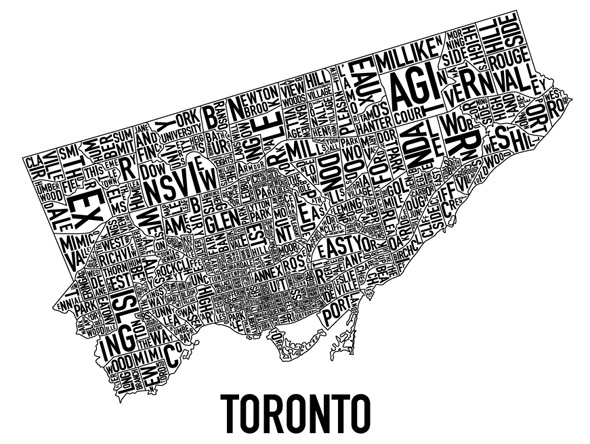
With more than a dozen other cities on their website, Ork posters aren't unique to Toronto, but that hardly diminishes how cool the TO version of their map is. Far more interesting to me than the Manhattan or Chicago versions (hey, I'm biased), the poster-map illustrates well just how much Toronto is, indeed, a city of neighbourhoods. The Toronto version can be purchased at Telegramme Prints.
blogTO's Toronto Neighbourhood Maps
Shameless plug.
Know of a cool Toronto map that I've missed? Let me know about it in the comments section.


