Announcements
A New Look for blogTO
Unless you're reading this through a feed reader you'll notice that blogTO looks a bit different today. (If it looks totally messed up to you, please clear your cache or do a hard refresh). Overnight we introduced a new design for the site, as well as a lot of new functionality. And while we're still working away at resolving many bugs and other fixes there's a lot of new stuff we're excited for you to check out.
Many of the changes we've made are geared toward improving the usability of the site. We've been creating content for more than 5 years now and we wanted a design that made this content more accessible.
We also wanted to give the site a cleaner look. We've always been a fan of lots of white space, easy to read fonts and a layout that makes the photos pop, but we think this latest design really helps us get closer to these ideals.
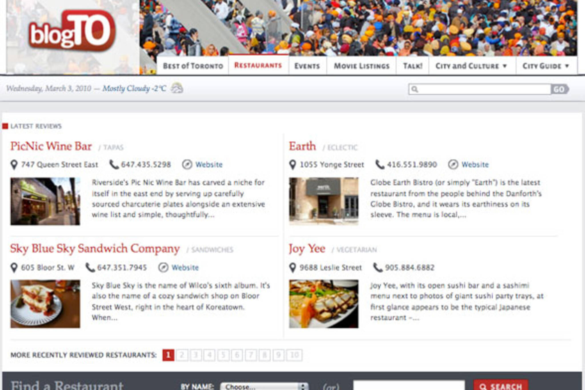
Homepage
Starting with the homepage, we've changed things up quite drastically and now feature more than just a sidebar and the six latest posts. Now, you'll find the latest 4 posts (with handy links to recent stories directly to the right) followed by quick access to other popular sections of the site. Now, directly from the homepage you can:
- Check out some of the latest restaurant and store reviews we've posted to the site
- See what movies are now playing in theatres and quickly look up showtimes
- Scan today's events or quickly view future dates to see what's happening in Toronto in the days and weeks to come
- View our most recent Best of Toronto post or select any of the ones we've published to the site
- Get up to speed on where the conversation is happening through our list of recent and active comments
- View our pick for our photo of the day (a new daily feature on the site) and see what else has recently been added to our Flickr Pool
Navigation
We've re-thought the site wide navigation and replaced the former primary/sub navigation hierarchy and pulldown access with what we think is a cleaner and more logical structure. You'll now find most of our categories like arts, music, film and city under the City and Culture tab. Under the City Guide tab you'll find links to all our reviews and directory-type content like restaurant reviews, bars, fashion stores and more.
Best of Toronto
For more than a year we've been getting requests to re-design our Best of Toronto section. Well, here it is. The big change is we now offer the ability to look up Best of Toronto posts alphabetically. You can also quickly sort between food-related and non-food-related Best of Toronto content. (note: this feature has a bug that should be fixed soon)
Restaurant Section
In our restaurant and other review/directory sections, we've re-designeded the entry pages to make it easier to scan the latest published reviews as well as look up places by type or neighbourhood. For example, we now have dedicated pages for things like Thai Restaurants in Toronto or restaurants in Leslieville (note: this page has a bug that also should be fixed soon).
When you're reading a review like, say, Sky Blue Sky Sandwich Company, you'll now see links to other restaurants in the area as well as other sandwich places in Toronto.
Events and Movie Listings Sections
The functionality hasn't changed much for these sections, but we hope you'll find them easier on the eyes and a much improved layout to lookup locations details, showtimes or watch movie trailers.
Development Still in Progress
There are dozen of bugs we are still working on and hope to have fixed soon. But if you care to share any thoughts about the new design or let us know about any problems please add your comment below.


Discussion
175 Comments
Sort By Oldest First / Newest First
Subscribe
I don't mind it, but I dislike that the photo of the day is at the very bottom. You're looking like more of a newspaper. Congrats!
Congrats!
cases they are loading empty boxes or leaving a huge gap between some of them.
http://www.blogto.com/fashion_style/2010/02/street_style_at_the_sandman_viper_command_residency_at_cest_what/
Also some text is hidden underneath a few spots on the headlines in Chrome, you may want to check your z-indexes or positioning.
http://www.blogto.com/fashion_style/2010/02/street_style_at_the_sandman_viper_command_residency_at_cest_what/
Also some text is hidden underneath a few spots on the headlines in Chrome, you may want to check your z-indexes or positioning.
also this is the 3rd time I've attempted to post this comment.
however, i believe someone else may have mentioned this - the menu font looks quite odd.
Good job.
I guess working up a new mobile site is a lot to ask after this...?
BlogTO's advance is the well written content, not the events or movie listings (huh?).
Why do I want to see movie listing on a city specific site when those movie listing are nearly identical to those of any other city in the world?
-overall I think it looks good, I'll keep reading
-really like the addition of the 'stories from today' and yesterday thing- keeps me from scrolling through pages to find what I missed
Dislike:
-there are no comment counters next to the stories on the home page- I like easily seeing which articles are creating discussion
-the 'most commented' and 'recent comments' are good, but they are buried at the bottom of the page, I'll never scroll that far down to find them- theres a big batch of empty space on the side bar under the 'today' and 'yesterday' stories- why not put the comments there?
-I liked the big pictures much better than the small ones with the text at the side
-with the photo of the day so far at the bottom, you might as well get rid of it
And my biggest pet peeve about BlogTO that I hoped to god would be fixed and isn't- when searching for restaurants or bars, why do I have to search by neighborhood or cuisine type? There are so many neighborhoods that are walking distance from each other. If I am say at College at Clinton, sure I will look at the Little Italy section, but I could also walk to Ossington, or up to the Annex, or down to Queen West, or up to Korea Town- I should be able to input my location and then see whats around me, not have click on 7 different neighborhoods. This is also unfriendly to tourists or people new to Toronto who might be less familiar with specific neighborhood names. And the neighborhood codings aren't always correct- for example right now if you look at restaurants in the Annex you get Coffee Culture at College&Bathurst- isn't that Little Italy? And you have reviewed Salad King- but it doesn't come up when you look for restos near Yonge&Dundas.
Sorry for the rant but there are just all kinds of inconsistencies that could be fixed if you went to a better filter system for displaying restaurants/cafes/bars.
- there are no comment counters for the posts on the first page
- the grey backing behind the blogto logo on the header is a bit too dark or something, might look better if it was more transparent
- the 'latest comments' thing is too far down the page
- for movie listings, the 'Select a Film' dropdown menu lists movie theatres after the list of films, but when you click on any of them it says "Oops, looks like the page you tried to access doesn't exist."
Also agree with the person/people above who said the big photos were a major reason for choosing this place over Torontoist. At some point TOist became a wall of text with a few photos, while BlogTO always had really large photos with most of the text viewable on click-through...that was better.
Put credit where credit is due! I shouldn't have to scroll throw an entire article to find out who took the photo two pages back. Also, the "Toronto Food" group on Flickr that was secretly run by BlogTO and streamed alongside restaurant reviews is no longer there? Is this a permanent thing?
Finally, yeah, I agree with everyone else... the big photos were a draw. Torontoist has the plain-jane layout cornered - I expect something a little more fun/artistic from BlogTO.
Maybe you can find somebody who understands markup. I’m sure Dave Topping has some friends.
The design is nice and clean to be sure, but it's lost that vibrant, happy feeling you had going here. This looks much more serious.
I hope it's someone who had gone to school and actually learned about 'Typography'. Overall the text is sooo small to read. There's not enough contrast for the article title and the detail fonts.
The article text size is the same size as the comment text size? come on!!
I find the new design very cluttered, I find myself loving the last design better.
Very first thing I noticed was the smaller pictures.
Sounds like I'm not the only one feeling that.
It's not terrible or anything but the original layout was just fine the way it was.
In the top-right corner of the site, in the menu, there's a little yellow box that has the word "summary" in it. If you mouse-over, you can change it to "full," and that'll give you the full viewing experience—it'll show you how Torontoist is supposed to be seen. Big pretty photos and illustrations, lots of article text, etc.
(This information, for what it's worth, has been on our FAQ page for several years now.)
I liked the bigger pictures as well..
On firefox- there is way too much empty space on the both sides that make it seems like im just reading a sliver of column-it should fit the screen.
An improvement might even be to move the blogTO logo up (and scale down), in line with Freshdaily, etc.
Also, LOL at the "Just use IE, it's better" comment above.
But my real question is, are movie listings really as central to the site as the new menu suggests? It took me a second to figure out that you hadn't just done away with the various city guide content, and I never would've come through here for movie listings. Are you actually getting many hits for them? Because all you have to do is Google "toronto movie nameofmovie" and Google itself will return showtimes without even directing you to another site. I guess your strength in that area would be working harder than most to include as many independent theatres (and strange men in their house on Bathurst) as possible. But when I see how many things are under those two drop-downs, I definitely wouldn't have selected movie listings to give such priority.
IMO it would look better with the menu stretching across the full width of the banner with the logo simply Z-indexed overtop the rotated image in the background.
As for the rest of the main page, it's a bit more complicated with having several more sections involved but I like it.
B+
Firstly, and I think most importantly, I can barely focus on the red, uncomfortably thin headline font - it is actually giving me a headache.
Secondly, there is nothing inviting me to read/click through a post - the photography (which has always been a strong point of the site) has been minimized and the deletion of the comments count is gone - I always found the comments/discussion more informative than the actual writing (which has always been a weak point of the site).
I'll come back... but only because the torontoist is even more of a disaster to read.
would be nice if the pictures were bigger and the date/time/temp font was a bit more this decade - same for story headings too.
lastly, how to i get to page 2?
Can you at least provide an option for the old layout? This is really really bad.
please bring back the old one!
- The comments have a good look, they are easier to read.
- Serif font, no, too hard to read.
- Header, reminds me too much of the Vancouver/Montreal one, it had a nice wrap before, bleeding off the edges. And it was different from the other two blogs, which made it original. Does it show the information about the photographer anywhere, I can't seem to find it?
- The bottom of the page seems a bit scattered, there is just a jumble of information, even though it is placed in a grid, it doesn't seem to work.
- I feel as if this was the before blogTO layout, as if it was the first one ever created, not the most updated one.
- Ah the photos, blow them up! :) We have a blogto flickr page, it seems to be an important part, blow those babies up. They added such a nice touch, made me want to read the articles.
- I do enjoy the category section in the restaurant page, it is all laid out and easy to find. Gold star for that.
- No italics (date).
This is a blog no? It doesn't feel like one.
It's hard to adapt to change, and it's hard for the designer to create something that everyone can relate to, something that can communicate. Perhaps I'm being too harsh with my comments, but I don't know, I feel it should have been tested more before being put out.
Change is good yes......but not today:(:(
I'm reserving judgment on the "look". My initial impressions are that I'm not too fond of it, but I'd like to give it a few days before I feel confident in that decision. No point in making line items of problems as they seem to be covered above.
Something seems wrong with the comments though. I submit them and they don't show up, had this problem everywhere yesterday. I even did a hard refresh, cleared cache, opened a browser that hasn't been on the site ever and still... my comments weren't showing up. The preview of comments seems severely broken too and isn't styled and often falls behind the comment above.
Sad to see the wrap around tab.
Overall it has moved in a direction of an online paper (like The Star), and that's not a good thing.
Unnecessary elements add a lot of noise (red dots, borders).
Buttons lack coherent spacing within them - kerning is too loose and font too heavy.
Too many horizontal lines in the header - makes it feel heavier that it can be.
Overall, seems all over the place.
Fails validation: http://validator.w3.org/check?uri=http%3A%2F%2Fwww.blogto.com%2F&charset=%28detect+automatically%29&doctype=Inline&group=0
Where are the metatags?
6/10
coming from a developer, did you guys decide to forgo any sort of organizational layout, instead giving priority to ads, and just tossing everything on the main page? I can scroll down forever! as obsessively as I have checked blogTO in the past, this site makes the experience so bad I have trimmed down my blogTO time considerably.
is this an early april fools joke?
The new design looks cool.
This is really boring. It has no personality. The blue is awful. Bring back the red, bring back the photos. Who wants so much text clawing at their eyes?
stop complaining and be objective people... subjective, biased and vague comments on design are no use if you want to this site to become a better to place to be informed
but yes, the recent comments and most commented stuff should be put near the top
I am also aware that change is shocking, when we're used to something, we grow accustomed to it and are comforted by its stability and neutrality in our lives, so maybe in a few weeks we'll all be over it? Although really really, nothing beats nice large photos that say so much more than text on text on text. ;o)
Parse error: syntax error, unexpected T_STRING in /nfs/c06/h01/mnt/88474/domains/blogto.com/html/arts/2010/02/snow_art_declares_honesty_is_the_best_poetry_/index.php on line 8
We are trying to do something very new here. There wasn't a site we were trying to copy and look like, bur rather we tried to come up with a homepage that best provided access to the daily blog posts as well as the site's wealth of resources like events, movie info and restaurant and store reviews.
We believe blogTO is unique in the city in that we provide both these types of content (in other words, not just a blog, and not just a place to look up movies/events/restaurants) and we've tried to come up with a homepage that prevents content from being buried or inaccessible.
We found through research, for example, that many didn't realize we actually had an events or movie showtimes section so hopefully this homepage provides more awareness and access to that type of content. That's one of our goals anyway.
We're still very much into featuring large photos and hoped this site redesign would further this goal. I still believe it does on 99.9% of the pages on the site. But, of course, they're reduced in size on the homepage which many of you have let it be known is not a change for the better.
I should note that the only reason they're reduced in size on the homepage is that we felt that keeping them as-is would make the homepage too long given we wanted to add the additional content.
The new design is still being worked on. Unfortunately there are a number of issues that surfaced when we moved it from the test to live environment. But we hope to continue to resolve these through the end of next week.
I just want to reiterate we really appreciate the above comments and suggestions. Yes, we spent a lot of time and money on the new design but we also want to create a site that all of you love so we'll definitely take all this feedback into consideration as we continue to refine it.
Missing the old site.
Your original design was much more sophisticated, yet easier to use.
What were you thinking? Why change something that was working?
Also I don't really like this idea of pre-categorizing each article. I can't explain why, but when I see these categories such as "announcements" "city" it makes me feel like you're saying "it's salty" just as I'm having a bite of potato chips. Bigger photos and unique titles were more intuitive than these make-sense boring categories. Random-themed chronological order made more sense to me. What is the difference between "restaurant" and "announcements" anyway?
In response to your comment:
"up with a homepage that best provided access to the daily blog posts"
When I read that I was like - really? When I check the site lets say at 10am or 1030 I have to look for Morning Brew on the right hand side. Why not have all the of the days post stay on the main site at least for the day?
Besides the graphics (which are ok...), it feels like any other blog.
HURM!
Also, why no more 'stars' when rating the restaurants? Afraid you might offend someone?
I feel like you guys have taken attention away from your readers and their comments and discussions in a big way, as if you don't want that reader engagement, which of course makes no business sense.....but you seem to have done it anyways. Puzzling!
http://www.blogto.com/ossington
http://www.blogto.com/restaurants/n/81/ossington
Now there doesn't seem to be a simple way to do that anymore. And, if things are in with restaurants (not sure if they are) there doesn't seem to be a 'cafe' option in the choose by type of restaurant.
I'm hoping this is just me not seeing stuff that is there, and someone can show me how to connect with this content easily once again.
http://www.blogto.com/cafes
Oddly, your content probably hasn't changed; but the way it's presented -- now seemingly "packaged" into too slick and mainstreamed a manner -- has, and in a way that I just don't find myself relating to as before.
Your site is now a weekly read at best. You've become bland and I don't have a relationship with bland.
I'd be curious to know if the traffic has had any change since the redesign?
For me, what bother me the most (aside from the poor design, fonts, comment notification, etc.) is that there are only 4 articles on the front page. Every time I need to click "next page" I feel like I'm getting ripped off in an effort by BlogTO to generate more pageviews and traffic stats to sell to advertisers. Heck, if even the MB is pushed to page two by 10am, how do you expect people to get the relevant quick look info they seek?
I browse many blogs daily, and for me, the small number of posts on the home page at one time is the biggest issue. If you could fix this, I might come back to my normal routine. As it stands, I'll be over at the other Toronto(ist) blog for the most part.
Sad to se BlogTO go so far down from what once was a great place.
R
That said, as I commented earlier, we do appreciate the feedback and will be making some changes to reflect this.
I should note that we're particularly hurt by accusations that we're somehow trying to rip you off (let's overlook the fact that our content/site is free to use and we don't charge you or make you sign up for a subscription) by making you click more often to view the content. In fact, the design changes were made so that you could click less. That's why we elevated content like recent reviews to the homepage as well as our new sidebar that provides direct links to content published in the last 48 hours. These would have never been direct links on the old homepage design and you would have had to click more than you do now. Also, we used to have 6 posts on the homepage and now we have 5. That's hardly a drastic reduction.
To reiterate - the whole point of this redesign was to improve usability. We even eliminated or reduced banner ads from certain sections of the site (such as our main restaurants page) in order to make the site and its pages as user friendly as possible.
In summary, while we will unveil changes to the site design soon (design and testing takes time FYI) we feel some of these comments are unwarranted and juvenile. And to suggest that another site is a substitute for us basically says to us that you don't value our original content and the hard work of our writers and photographers who are publishing stories you can't find anywhere else on the web and that we should basically just shut the site down.
The comments from others are not personal, neither should yours be in response. Step back a bit, don't be so close to your work. You've changed the packaging... many a company that altered a major aspect of their brand, only to see negative feedback, wishes they hadn't. Roll with the punches. The commitment to your writing and photography is not in question: the container through which you present this material is. Your readers had a relationship with your whole brand, not just the copy and imagery.
Sure, you made major usability changes, but too much perhaps? There is a point at which web sites can get overly "repaired", become overly focussed on usability at the expense of the unique visual design that helped to create the site's personality in the first place; if you re-read the comments, it's pretty clear the site personality is primarily what most of the negative feedback is referencing.
Finally, get over yourself. BlogTo is beloved, and you've probably received lots of positive feedback about the new design as well. But when you dismiss outright the feedback of your readers, or worse, insult them for bothering to care enough about your site to contribute comments in the first place, you move from accidentally turning off some readers (re: the new layout) to doing so intentionally.
Do you have so many readers you can afford to do either?
Also, I am not the designer of the site and don't take the feedback personally.
I appreciate you replying to my comment in sprit, but I have to say I am bit surprised at the tone.
My comment in no way devalued the contributors or content. In fact, I made mention of how much I do value the content as used to check the site so frequently. While, yes the content is no no different, the experience is. This is my point, and why I commented in the first place (I should also not that I've waited more than a month since the new look first rolled out to see if I would get used to it, or if it would be adjusted).
Information, entertainment, content and medium are all important and should not be looked as as separate. The experience is key. You could reformat tomorrow with all the same great news stories, but in flashing pink ascii text on a black background, and say that the content is the same, so commenting on the looks are irrelevant. Obviously this is not true. I appreciate you tried to make the site easier to use with the new UI. I don't think however that you achieved the goal, at least not in perception, which is ultimately the key. +/- number of posts, number of links, etc. don't really matter. It is what the experience and perception is like. If you study UX design, I think you will find this principle.
My comment that I now go elsewhere was not intended to be an insult, threat or value judgement of the content, but rather an observation. One that I would think you be interested in hearing to add some qualitative information to whatever quantitative traffic stats you might have. I don't see how it is juvenile if it a true observation.
I have been a long time follower (even tipped you guys a few times), but am noticing I now follow less. I appreciate the content may be the same, but the experience is not. Take this as you will. If the tone of my original comment did not come through as intended, I apologize. I didn't mean to be accusatory, but rather was expressing my feelings/perception.
R
....
Also - am I the only one who seems to lose comments into the ether here? It's happening more lately. I click post, it shows the comment, but when I refresh it's gone.
This site has long since been removed from my favourites and this is the first time I've visited in a month to see if any changes have been made. Guess I hoped too much.
Also, if you're looking for our contribute section you can find it here:
http://www.blogto.com/contribute
There are a whole bunch of links that point to it at the bottom of each page, plus select call-outs in various sections of the site. We've noticed the level of reader contributions has actually increased since the site redesign so this gives us reason to believe that our efforts to make this page more prominent were mostly successful.
I have to also add that I'm a bit surprised to learn the main reason you came to the site was the star rating system. I'm glad you liked the star ratings, but most of the feedback we received over the past few years was that they were almost useless and many readers complained they couldn't change their rating once they submitted it. Also, some mistook them as the writer's rating of the restaurant, not the average of the total reader ratings which it was. Overall, the star ratings seemed more problematic than useful.
Nevertheless, the star ratings were never removed permanently and will be reintroduced with a slightly new look later this month. I hope you reconsider us as one of your favourite sites once they're back.
Would be great to even see simple to implement changes that many have expressed concern over fixed (ie. more posts per page, comment count on the articles, etc.).
Just kinda missing my BlogTO daily fix as a long time reader and feel offput at new design. I do know I check very less frequently now (used to be 6x times a day at least), and feel some resentment whenever I do now check in.
Just some honest thoughts here, nothing intended to be on the offensive.
R
1. We updated the look of the hyperlinks so they're now more visible.
2. We updated the main restaurants and other main review pages with a similar map to what we had before the redesign.
3. We added the information icon to the photo at the top of the page.
windows oem version
windows 7 oem
nero oem
cheap mac software
<a href="http://austinist.com/profile/flycndoomacflo">autodesk discount</a>
A number of them are rife with spelling problems and I in finding it very bothersome to inform the
truth however I'll certainly come back again.
many new stuff right here! Good luck for the next!
at this site is really pleasant.