
The lost beauty of the TTC's original colour scheme
It's not as easy to discern today, but there was a time when the TTC subway system was a masterpiece of clean design. Stations were practical, orderly, and even elegant if you were partial to the minimalism of what was called bathroom architecture.
Perhaps it's because modernist architecture tends to be undervalued or because we're so often disgruntled by our commute, but it's rare to hear much gushing these days about the austere design of mid-century TTC stations.
Another reason might be that the formal constraint employed in the original design of the Yonge, University and Bloor-Danforth lines has been disrupted by so many station upgrades and makeovers that the initial uniformity has been mostly lost.
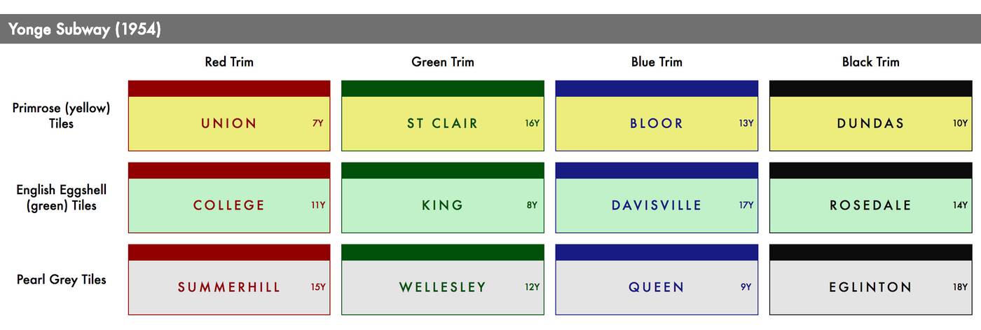
The original tile colour scheme on the Yonge Line. Image by John Chew and Justin Bur.
When the Yonge Line opened, on the other hand, this uniformity made the system a gestalt. There were only three colours of station titles (Primrose, English Egg Shell, and Pearl Grey) and four types of trim (red, green, blue, and black), but the very lack of variety lent an elegance to the system as a whole.
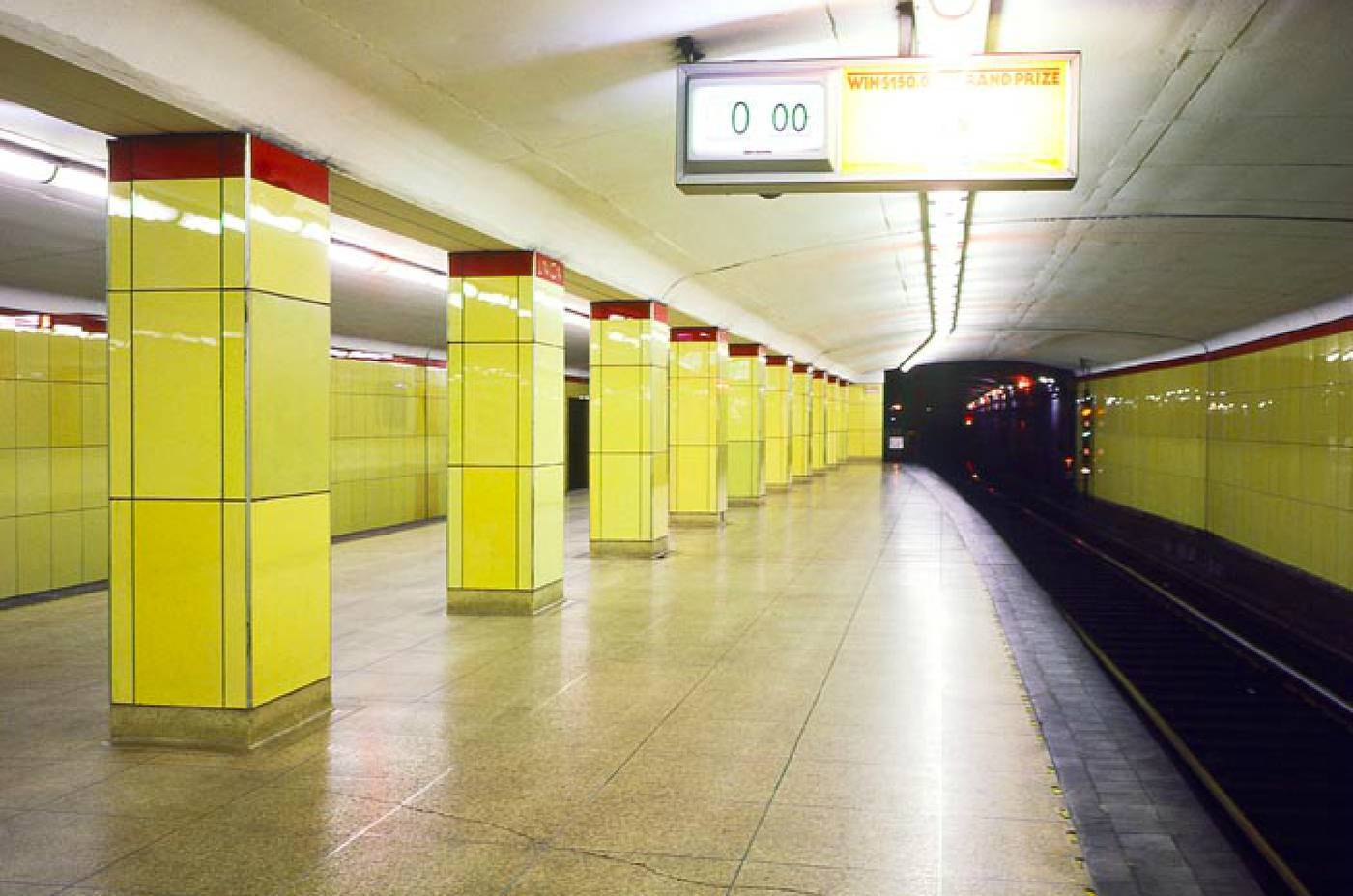
Union Station, 1970s. Photo by Ben Mark Holzberg, Library and Archives Canada.
Try to bear in mind that the shiny surface of the Vitrolite tiles also made a difference, as their glass surface reflected back just enough light to make the stations appear brighter than they do in the same colours today.
Alas, the Vitrolite proved too delicate to last over the long term. Today the original tiles remain only at Eglinton Station, though every once in a while they're exposed at other stations during various maintenance and upgrade work. The rest of the stations have been outfitted in a hodgepodge of colours and styles.
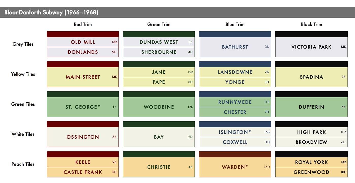
The original colour scheme for station tiles on the Bloor-Danforth Line. Image by John Chew and Justin Bur.
The University Line, the second in the subway system, was a hybrid. As we've seen recently, St. Andrew and Osgoode were fashioned out of the remaining stock of Vitrolite, St. Patrick and Queen's Park used curved panels that were painted green and grey, while Museum was the first station outfitted in ceramic.
When the Bloor-Danforth Line was built in the 1960s, the TTC opted to stick with these far more durable ceramic tiles and introduced a slightly more elaborate colour scheme. Five colours of tiles were now used with the same four options for trim.
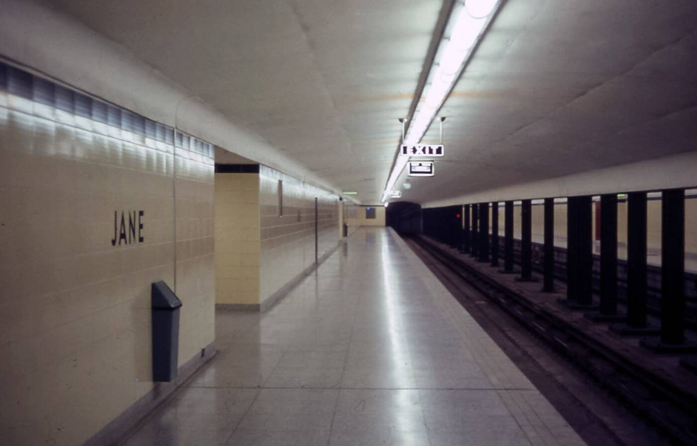
Jane Station in 1968. Photo by David Wilson.
Using Yonge Station as the dividing line, the east and west portions of the route are laid out in different orders. Heading east, the stations are grey, peach, white, and green. Going west, the order is white, green, yellow, grey, and peach.
Based on the way that the scheme works, there are sister stations along the line that share the same colour combination. Of these, the strangest pair might be Yonge and Lansdowne, which appear quite different in real life based on the differing light levels in each station (Yonge is much brighter).
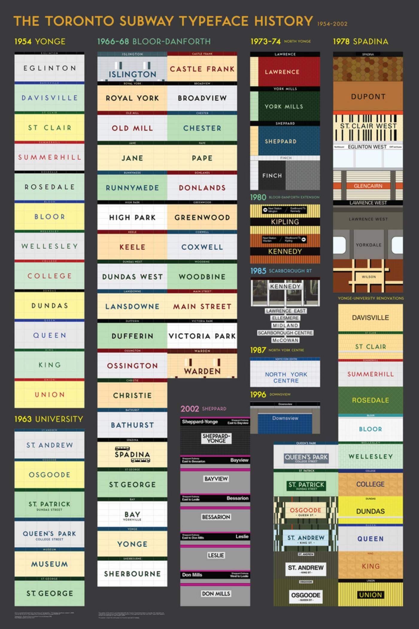
The TTC design scheme as of 2011. Image by Jose Ongpin.
Exceptions to the original Line 2 colour scheme arose early. Terminal stations Islington and Warden, for instance, use different tiles. But it wasn't until much needed makeovers to stations like Dufferin and Pape that the internal order was compromised.
Both of these stations look far better than they used to, but something was certainly lost when the original colour scheme was dispensed with. We tend to ignore the subtleties of TTC station design, but significant thought was put into crafting a system that was aesthetically pleasing and practical.
The ceramic tiles of Line 2 are occasionally described as dreary and uninspired these days, but have they ever stood the test of time. One day we'll likely lament dispensing with the original colour scheme.


