What do you think of the new TTC subway icons?
The TTC's long-held tradition of naming its subway lines after city streets could soon be finished. The Yonge-University-Spadina, Bloor-Danforth, Scarborough RT, and Sheppard lines could become simply 1, 2, 3, and 4, if the transit agency's board approves a raft of visual changes at its next meeting.
The changes are part of the TTC's new customer charter, which promised to simplify signage and wayfinding by the end of 2013. For example, platform signs indicate which direction trains are heading - eastbound, westbound, etc - while trains use terminal stations - Finch, Downsview, Kennedy, Kipling.
Internally, the subway lines have always been referenced by number in the order they were built, says spokesman Brad Ross. The practice of publicly referring to the lines by street started with the Yonge line and gave us the awful and clunky Yonge-University-Spadina line.
During the brief "interlining" period in the 1960s, two routes were named Bloor-University-Yonge and Danforth-University-Yonge.
"Right now if you go to Bloor-Yonge station the signage is inconsistent to say the least. It's very difficult for anybody navigating the system for the first time or even an occasional rider to know what 'eastbound mezzanine level' means," Ross says. "The signage, the wayfinding is not very good and we acknowledge that and that's part of why we're doing all of this."
There are odd quirks to using direction underground, too. At Union there are two different lines, both heading north. It would be simpler to indicate "Downsview" and "Finch" trains both on line one.
"We'll test [the signs] at an interchange station like Bloor-Yonge in the very near future. We'll get the feedback from customers, we'll test it, we'll do surveys and focus group it and make sure we're on the right track," Ross continues.
Ultimately, a brand new style guide, which will include hundreds of icons, symbols, font, and design standards, will be rolled out for use across the entire system. No more hand-written notes in collector booths, no more mixed fonts and confusing directions, the TTC says.
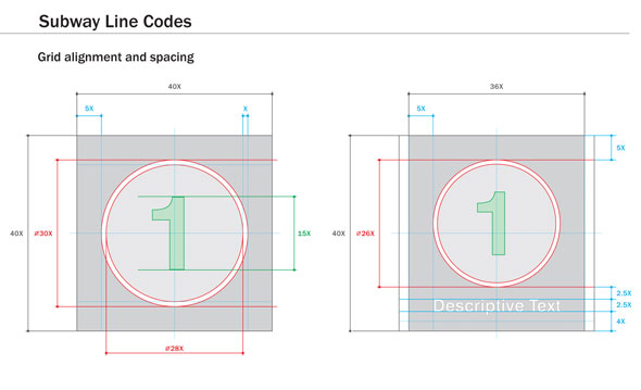
The new icons for the subway lines, shown at the top of the page, bear a striking resemblance to those used on the New York City subway, which uses numbers and letters in coloured circles to label various lines and trains.
We asked what you thought of the idea, which is up for approval with a brand new system map at the next board meeting on October 23.
Chris Bateman is a staff writer at blogTO. Follow him on Twitter at @chrisbateman.
Images: Toronto Transit Commission
Latest Videos
Latest Videos
Join the conversation Load comments


