A survey of the newly redesigned Globe and Mail
The newly redesigned Globe and Mail is here, with full colour images and even a few glossy pages thrown in. It also features a new font (though I didn't notice that right away) and a shorter page length. Along with these significant changes to the print edition, the paper's web page has also been overhauled.
So, yes, this is a major update -- one that Editor-in-chief John Stackhouse calls "the most significant redesign in the Globe's history" -- but the question on many people's minds is how much any of this will matter. Will the paper's commitment to print ultimately pay dividends, or will it prove to be a costly investment in what some call a "dying" medium. No one, of course, can answer such a question on this, the first day of its distribution.
Nevertheless, a survey of the paper reveals that, at a very minimum, a few questions are worth posing. Chief among them is whether all these changes amount to a radically improved reading experience. Although some will surely disagree, my first impression is that this is not the case.
To be fair, as someone who works for a so-called "new media" outlet, I come to this answer with considerable bias. But, putting that aside for a moment (if, indeed, that's possible), I'm also a regular reader and fan of the publication in question. And, despite that I get the vast majority of my news through online sources (including the Globe), I still enjoy the act of reading an actual newspaper from time to time. But, as much as this is the case, I have certain readerly habits that have formed over the last few years that lead to my being underwhelmed by this redesign.
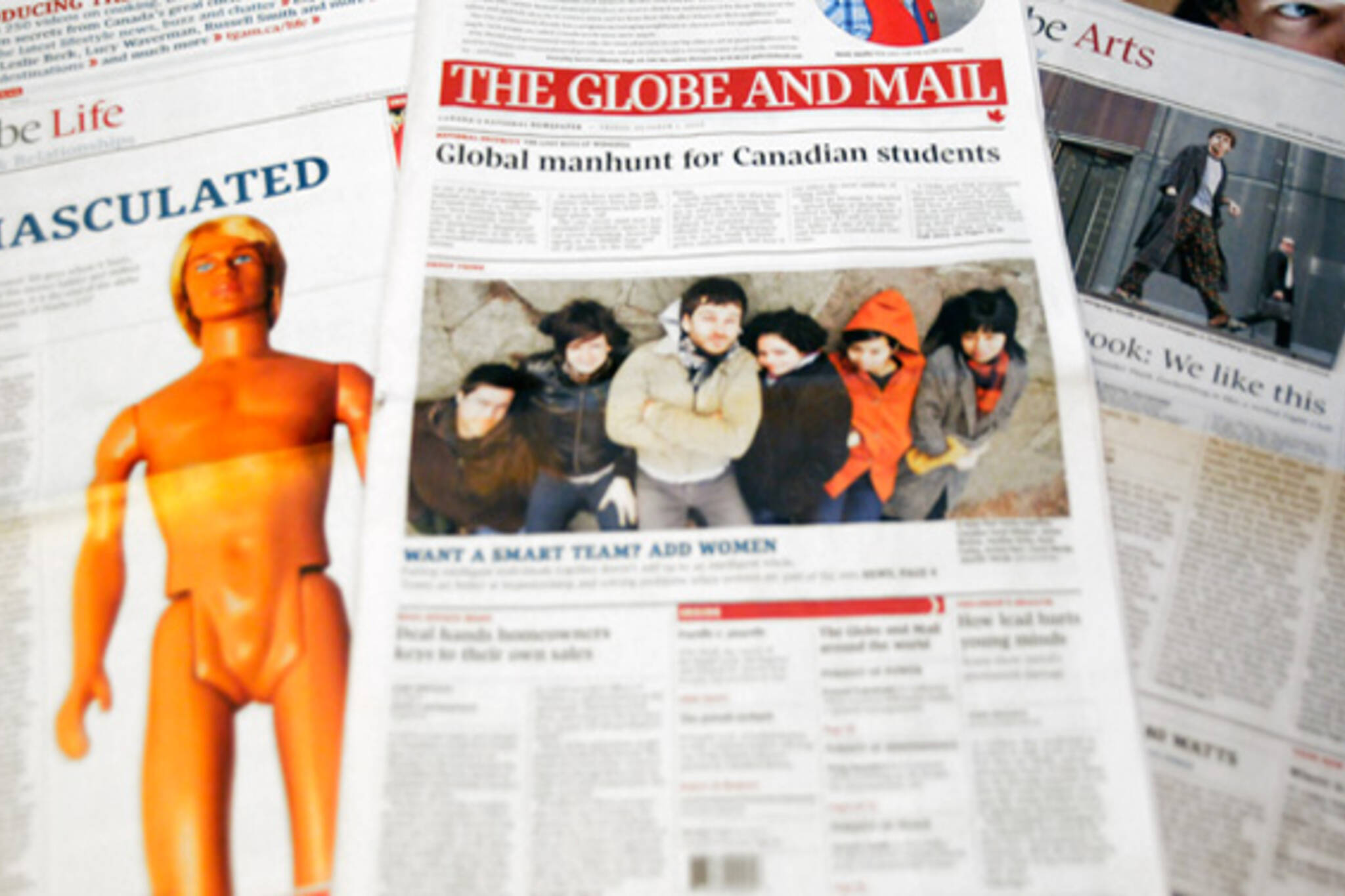
Perhaps even more so than the shorter page length, the two most obvious features of the new look Globe and Mail are the presence of a limited number of glossy pages and the full colour images. With regard to the former, I've yet to form an opinion I'd want to hold myself to. But here are some initial observations.
Insofar as the entire "Life" section is glossy, I like the way that it acts as something of a magazine-type insert. This strikes me as a good use of the form, and may even draw me to a section that I don't find myself reading altogether that often. Here the images really pop, and the full colour definitely adds value.
But, when it comes to the front page, I'm less impressed. Perhaps it takes some getting used to, but I've always hated it when publications enclose regular newsprint with a glossy front and back page. It's reminiscent of Hollywood films in which a briefcase that's supposed to be full of money turns out to contain nothing more than a layer of cash and, you guessed it, a stack of newsprint. Moreover, considering that not much of a reader's actual time is spent on the front page, the showy cover strikes me as just that and little more.
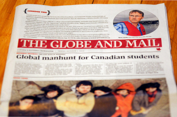
As for the colour images in the rest of the paper, these are nice enough. But, at this point, I can't completely agree with Stackhouse's claim that the Globe is "a visual medium, showcasing outstanding pictures and colours." Sure the photography featured in the paper is regularly exceptional, but this is an area in which newspapers -- even those with a few glossy pages -- just can't compete with magazines and web-based publications. A colour photograph on newsprint will never look as good as it does on glossy stock or a backlit screen. And, that's not to mention, of course, that the layout of the Globe (and most newspapers in general) doesn't allow for the image-rich content that graces these other forms.
Is the paper more visually appealing than it was before? Absolutely. Will this lead me to renew my subscription? Nope. And given that I'm the type of reader who's being targeted with the redesign -- the putatively digitally savvy news consumer -- I suspect that that's not a great sign.
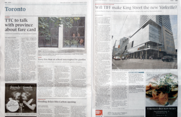
The Toronto section, one of the areas of most interest to me, also doesn't strike me as particularly superior to its former incarnation. While the Globe offers some great reporting, there's far more on offer on the website, even if it doesn't wow with its visuals. But, to take today's edition as an example, will two mediocre photographs really draw in more readers? To be fair, the publication is not oriented around Toronto news, but it's worth noting that there's very little change in this section.
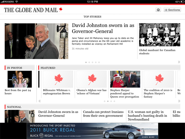
What's perhaps most puzzling about the redesign, however, is the degree to which the iPad app seems to have been lost in the plot. While the website has met generally favourable reviews from the readers I've spoken to (and the comments that I've read), the app remains a bit of a mess. Not only do many of the images still show a Globe-brand maple leaf in place of an actual photograph, but in what is a highly visually oriented medium, the images -- with the exception of dedicated galleries -- remain glorified thumbnails. Yes, not many people are reading the Globe on iPads. But, surely with the rise of tablets from Samsung, Blackberry and others, this is set to change in the near future.
Stackhouse ends his introduction to the new look Globe today by calling forth the Enlightenment dictum that "if you don't believe in progress, you're doomed to defeat." There's a number of ways one can interpret this statement in the context of the updated paper, but one can't help but wonder if a commitment to print isn't the exact opposite of what he refers to here. Insofar as progress is indelibly linked with technological advancement, it's dubious whether a long term investment in printing presses -- as good as they may be -- is indicative of a quest to "create what others have not yet dreamed."
Latest Videos
Latest Videos
Join the conversation Load comments


