
5 weird and wacky TTC subway maps
The TTC subway map might not have the cachet of the London Underground's iconic wayfinding or represent a system as comprehensive as those in New York or Tokyo, but the yellow, green, blue, and purple diagram first introduced in the late 1960s and tweaked with addition of the Sheppard line 2002 is as uniquely Toronto as the CN Tower and short turning streetcars.
(Interestingly, before the current colour scheme was decided, the Yonge line was briefly coloured red and the Bloor-Danforth yellow. During the short-lived interlining period, the three services dreamt up by TTC management were coloured red, blue, and green.)
The best thing about the TTC map is that its familiarity lends itself to endless reinvention and parody, as evidenced by the examples below.
Here are 5 unconventional TTC subway maps.
The Mario Map
Created by Vancouver-based designer Dave Delisle, this glorious 8-bit rendering of the TTC subway (above) was inspired by the overworld map in Super Mario Bros. 3. Interchange stations like Bloor-Yonge and St. George are marked with a castle, terminal stations are represented by the sprite for Princess Peach's castle, and GO trains are warp pipes. Best of all, it's available as a poster.
The Anagram Map
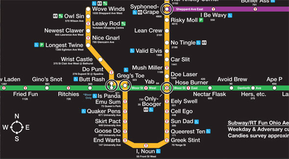
The bizarre and hilarious anagram map (available here in full) turns Wilson into Owl Sin, Davisville into Valid Elvis, and Main Street into Ear Mittens. Best of all, the Scarborough RT is Gut Scab Horror. When it was released in 2006, a distinctly unamused lawyer representing the TTC sent creator John Martz a cease and desist. These days it seems the Toronto Transit Commission at least tolerates people remixing its intellectual property, though using its logo is still a no-no.
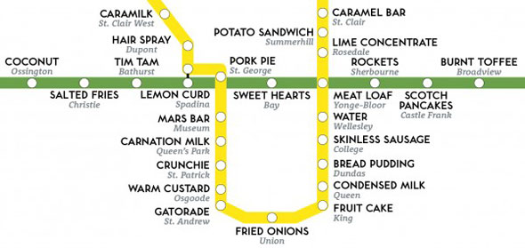
The Taste Map
James Wannerton has synesthesia, a condition which causes his him to involuntarily taste words. Some are delicious, some are awful. In 2013, in an effort to raise awareness for the condition he shares with thousands of other people, Wannerton tasted his way through the London Underground map, swapping the names of stations for the sensations in his mouth. In 2015, he devoured the Toronto subway. Bread pudding and chocolate anyone?
The Scale Map
Ever since designer Harry Beck revolutionized the London Tube map by arranging the underground city like a wiring diagram, transit agencies around the world have followed suit, dispensing with geographic accuracy for the sake of clarity and readability. The TTC does this, too, and William Davis' geographically accurate Toronto subway map shows the extent to which our transit map lies to us. The downtown loop looks particularly wobbly.
The Time Map
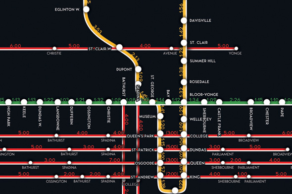
It should take 1:22 seconds to get between Union and King stations. We know because James Rosselet created the Subway by Time map.. In 2011, using data from Google as well as an old fashioned stopwatch on the subway, Rosselet calculated the optimum wait time between any station or major streetcar stop. Of course, traffic and other delays often sadly render these timings moot. (Five minutes from Broadview to College on the Carlton streetcar? I wish!)
Bonus: The Music Map
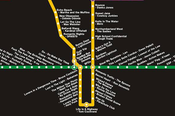
How could I forget to include the TTC music map created by Toronto music fanatic Lonely Vagabond? This guide to Toronto employs the songs of local musicians to make a document that's part wayfinding material, part playlist. Lonely Vagabond put plenty of thought into this: Spiral Beach are at Royal York because the band are alumni of the Etobicoke School of the Arts, "Rise Up" by The Parachute Club is at King because the music video is filmed on King St. Do yourself a favour and explore further.
Chris Bateman is a staff writer at blogTO. Follow him on Twitter at @chrisbateman.
Latest Videos
Latest Videos
Join the conversation Load comments


