Thursday, May 23, 2013Mostly Cloudy 18°C
City

That time the City of Toronto chose a new logo

Posted by Chris Bateman / March 9, 2013

toronto logoThe City of Toronto's ubiquitous logo adorns almost all official civic communications from planning notices to press releases. In it, a stylized outline of Toronto's political nexus is accompanied by an imposing bold face block of text. It's also the symbol the city uses on its road signs to welcome visitors to Ontario's capital.

The logo was selected by city council on May 14, 1998, to replace the six interlocked rings of the soon-to-be-defunct Metro Toronto. Three possible choices, shown above, were presented to council for consideration by a team of graphic design professionals hired by city staff.

Naturally, not everyone liked the choices. Then-councillor Michael Prue refused to vote on any of the logos because they focused on the centre of local government rather than the city itself. "This is absolutely the wrong thing to do. We need something brand new that includes all of us."

Coun. 
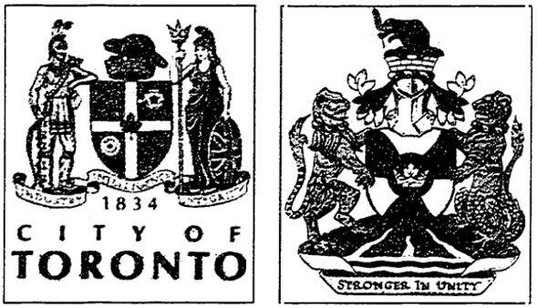
Chris Korwin-Kuczinski suggested holding a public competition similar to the one that produced the city flag in 1974. Coun. Howard Moscoe didn't have as much faith in local talent. "When I want to put in a bathroom I hire a plumber and when I want to write a bylaw I hire a lawyer ... and I don't use amateurs to do that kind of stuff," he told the Star.toronto coat of armsThe city also took the chance to make changes to the official crest, dropping Britannia, a female personification of Great Britain, and a native character in favour of a bear, beaver, and eagle. The alterations didn't pass council first time and the first draft (shown on the right above) was sent back for revisions during the same debate that approved the new logo.

The current coat of arms uses the motto "diversity our strength" and includes symbols of Etobicoke, Scarborough, and the three main rivers of the region: the Don, Humber, and Rouge. An eagle represents Toronto's native heritage above a T (for Toronto) that also matches the outline of city hall.

Which logo would you have chosen given the choice? The centre image was the City of Toronto logo prior to amalgamation. Would you have simply re-used the Metro logo and saved the cost of designing a new motif?

Chris Bateman is a staff writer at blogTO. Follow him on Twitter at @chrisbateman.

Image: City of Toronto Archives.

Discussion

19 Comments

lol / March 9, 2013 at 02:48 am
user-pic
not trying to sound a wiener but seriously what kind of city brands itself after some mediocre concrete building as its face and image.... really that the best we can do?
Critical / March 9, 2013 at 07:12 am
user-pic
They all look like shitty clip art, imho. I wish we had a really cool logo like Montreal or Tokyo.
Ben / March 9, 2013 at 07:58 am
user-pic
How come no one mentions the godawful new Toronto street signs?
Logos / March 9, 2013 at 08:26 am
user-pic
Logo shuld have been a hd photo of my erect cock.
Me / March 9, 2013 at 08:59 am
user-pic
But, wouldn't they need one that was big enough they could actually see it?
Grby / March 9, 2013 at 09:50 am
user-pic
We should go back to the original logo from 1834. It has history and it looks better than that insanely boring logo hat we have right now!
Jacob / March 9, 2013 at 10:06 am
user-pic
That middle logo from the choice of three actually shows up from time to time, like on older garbage bins.

I wonder how that happened, since it was rejected.
Toronto: Grab a Handful of Fun! / March 9, 2013 at 10:09 am
user-pic
The two curved towers thing is nice, but I think maybe a logo with a cupped hand might be more appropriate.

Then we could update the slogan to: "Come to Toronto--Our Wives Are in Florida".
lol: a troll's troll replying to a comment from lol / March 9, 2013 at 10:20 am
user-pic
"not trying to sound a wiener but seriously what kind of city brands itself after some mediocre concrete building..."

Uh, lol...you totally sound like a weiner right now. The CN Tower is Toronto's most recognized symbol, but it's also a little obvious for the people who actually need to know what the crest stands for--citizens.

You'd rather it be the ROM Crystal? Casa Loma? A Streetcar?

Until you can name one really cool idea for a crest, you aren't actually doing anything other than nitpicking. Either put up or sit on your hands.
Ford4ever replying to a comment from Jacob / March 9, 2013 at 02:02 pm
user-pic
That logo shows up from time to time cause it's the old pre-amalgamation Toronto logo. You're seeing leftovers from the old days.

The saddest graphical loss in amalgamation was the ditching of gold leaf trim on the fire trucks. The TFD used to have a very classic look, and lost it in the late 90s.

The Gravy Pumper Ends Here! replying to a comment from Ford4ever / March 9, 2013 at 03:26 pm
user-pic
Are you crazy?! I'm so glad the gold leaf trim was finally phased out. We have fire trucks for utility, not for show. That kind of wildly rampant gravy is what almost bankrupted us in the Miller years! In fact, why do we even need those trucks?? If bucket brigades were good enough for our founding fathers, they're good enough for today. And most people already own a bucket, so there's even MORE gravy the City can phase out.
There's a Hole in my Bucket / March 9, 2013 at 04:12 pm
user-pic
a true Renaissance Gravy Pumper there. And the bucket brigade can do double duty bailing out the flooded subways subways subways.
Jacob replying to a comment from Ford4ever / March 9, 2013 at 07:56 pm
user-pic
Ah, that explains it. I didn't spend much time in the city pre-'97. I was a suburban teen and hadn't fully embraced the GO Train yet.
Jake / March 9, 2013 at 08:04 pm
user-pic
I kinda miss the old Metro Toronto logo. I see on old bridges and other stuff from time to time. I wish it could be brought back...
iSkyscraper / March 9, 2013 at 10:31 pm
user-pic
The logo is great, they got it right. NYC just went through the same thing a couple years ago and the result was decidedly weird, generic and ugly:

http://www.underconsideration.com/brandnew/archives/i_wolff_olins.php
Jacob replying to a comment from Jake / March 9, 2013 at 10:40 pm
user-pic
When I heard they were ditching the old Metro logo I emailed city hall and asked if I could get one of the flags.

A month or two later I got a parcel in the mail with a blue and green Metro flag enclosed. I still have it.
OhPlz replying to a comment from Logos / March 11, 2013 at 03:07 am
user-pic
Maybe if we needed a logo to represent the working women of Jarvis...
Alex / March 11, 2013 at 10:21 am
user-pic
They definitely chose the right logo, the far right one is by far the best.
Ben Smith / March 13, 2013 at 05:21 am
user-pic
I never liked the current city logo, the text is far too squished together. If they were to change it for the new city, the left one would have been much better.

Add a Comment

Other Cities: Montreal