What TTC subway stations were meant to look like
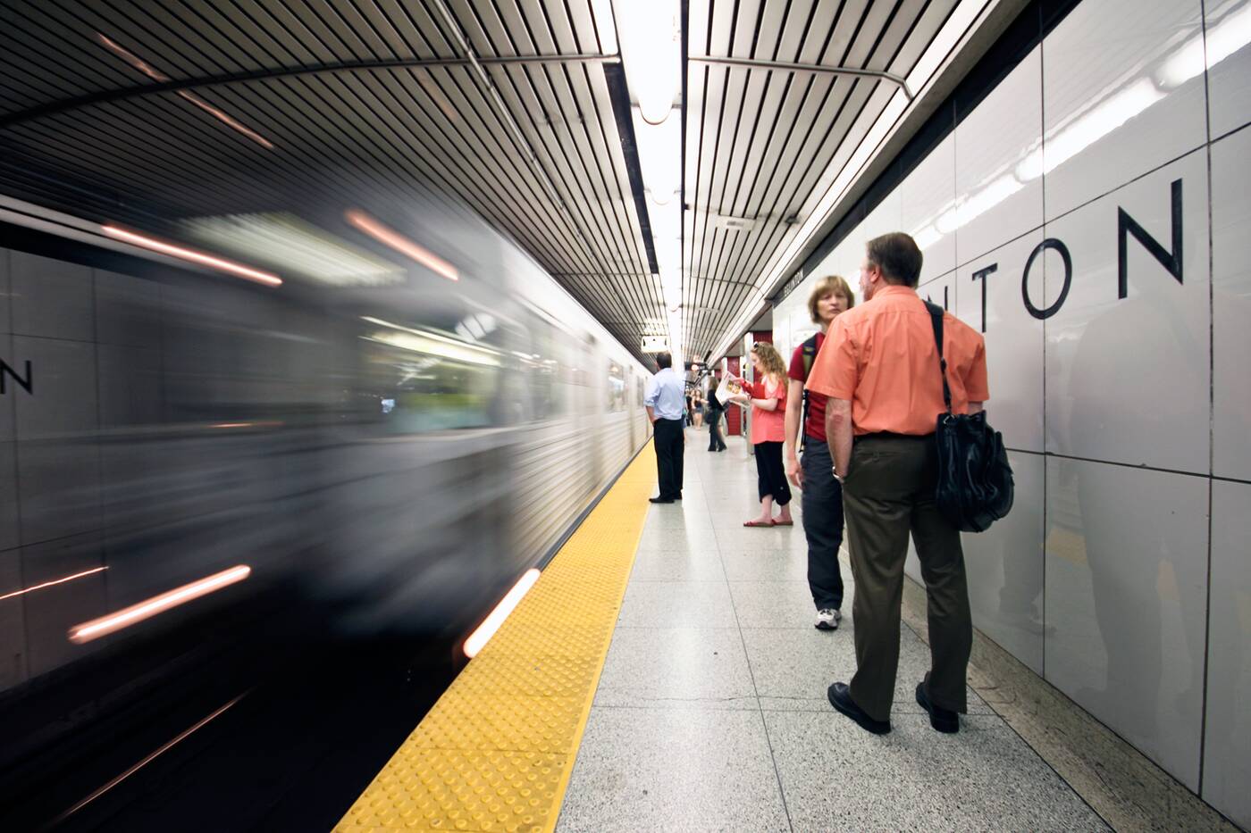
Since its opening in 1954, numerous renovations and adaptations have altered the look of the Yonge line between Eglinton and Union as well as the stations on the lower portion of the University Line.
Gone is the uniform TTC font and original Vitriolite tiles - the reflective glass wall panels the system shared with the Woolworth Building in New York - and in their place is a mish-mash of typefaces and tiling jobs that give the system a strangely disconnected look.
A contemporary view of Eglinton Station. Photo by Roozbeh Rokni.
Eglinton Station is the only one of the original 12 stops that has largely retained its original aesthetic, at least at platform level. All the other stops south have had their tiles partially or entirely replaced with lime green (Dundas) and brown (King) textured wall decorations.
At Queen and other stations the original TTC font has been ditched for a tightly-spaced version, though you can occasionally see hints of the original in trim and other markings at these old stations.
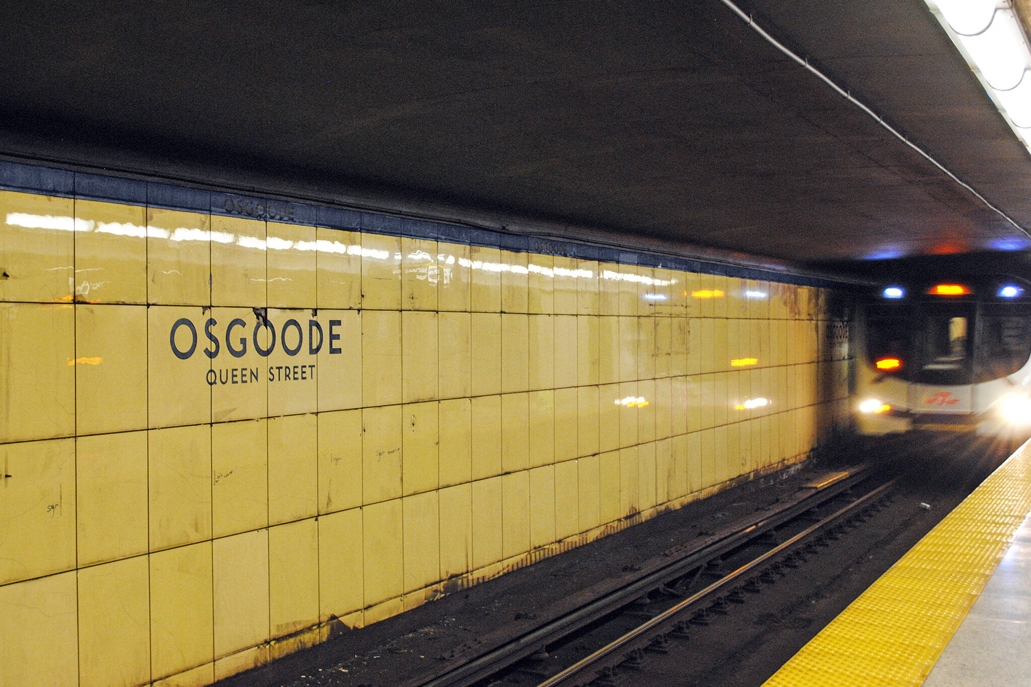
Turning up University, both St. Andrew and Osgoode have been made over with metal panels meant to reflect their original styling, a process which revealed the initial design imperatives at work when the subway was built.
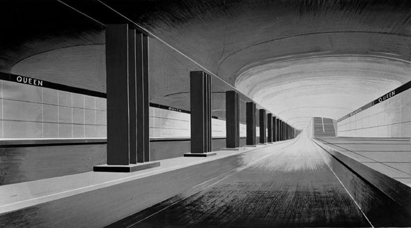
Concept sketch for Queen Station, early 1950s. Image via the Toronto Archives.
Photographs and concept drawings in the City of Toronto Archives show the stations as they were originally intended: minimalist, utilitarian, and clean.
The "bathroom modern" look, as it was derisively known, would be repeated in a slightly altered fashion on the Bloor-Danforth line a decade or so later, but nothing would ever touch the clean minimalism of the original Vitrolite tiles.
With so little of the TTC's early design left on display, here's a trip back to the beginning of the subway system in Toronto just before the startlingly clean and modern stations were used by the public.
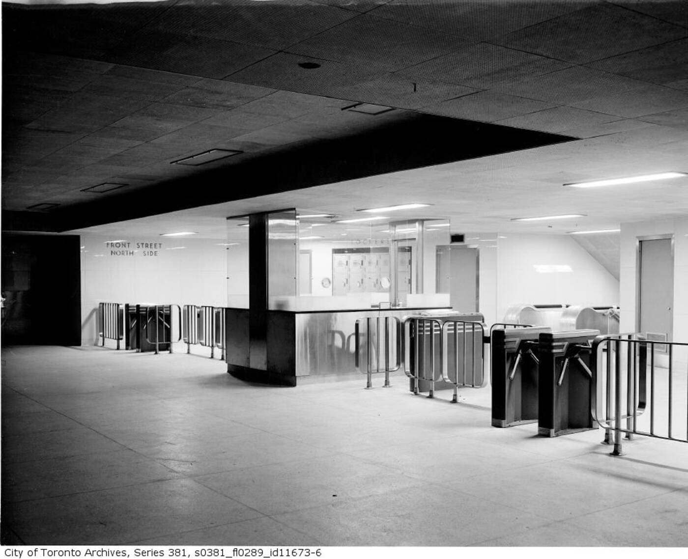
Union Station fare booth and turnstiles before service in 1953.
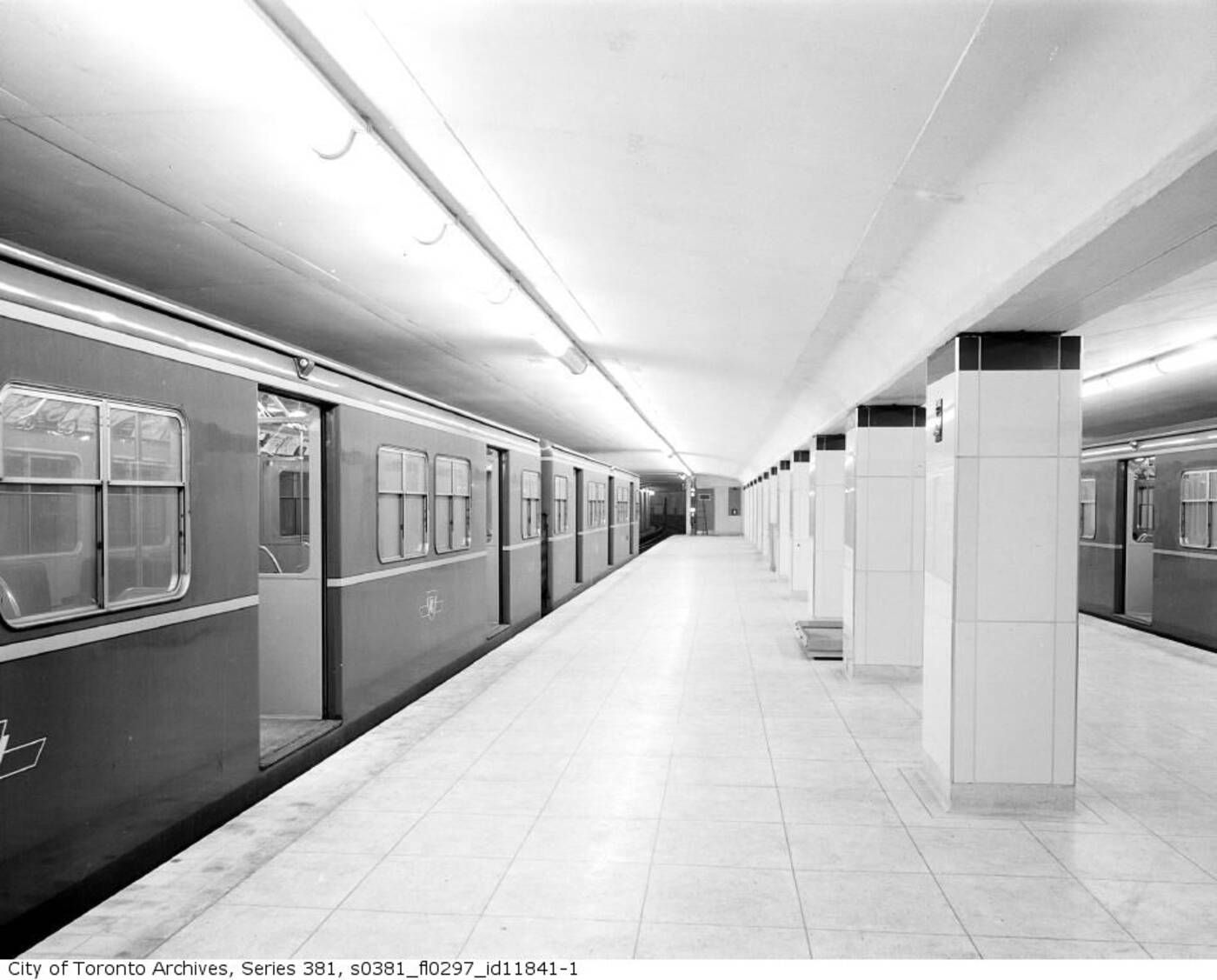
Union Station platform in 1954 just prior to public service.
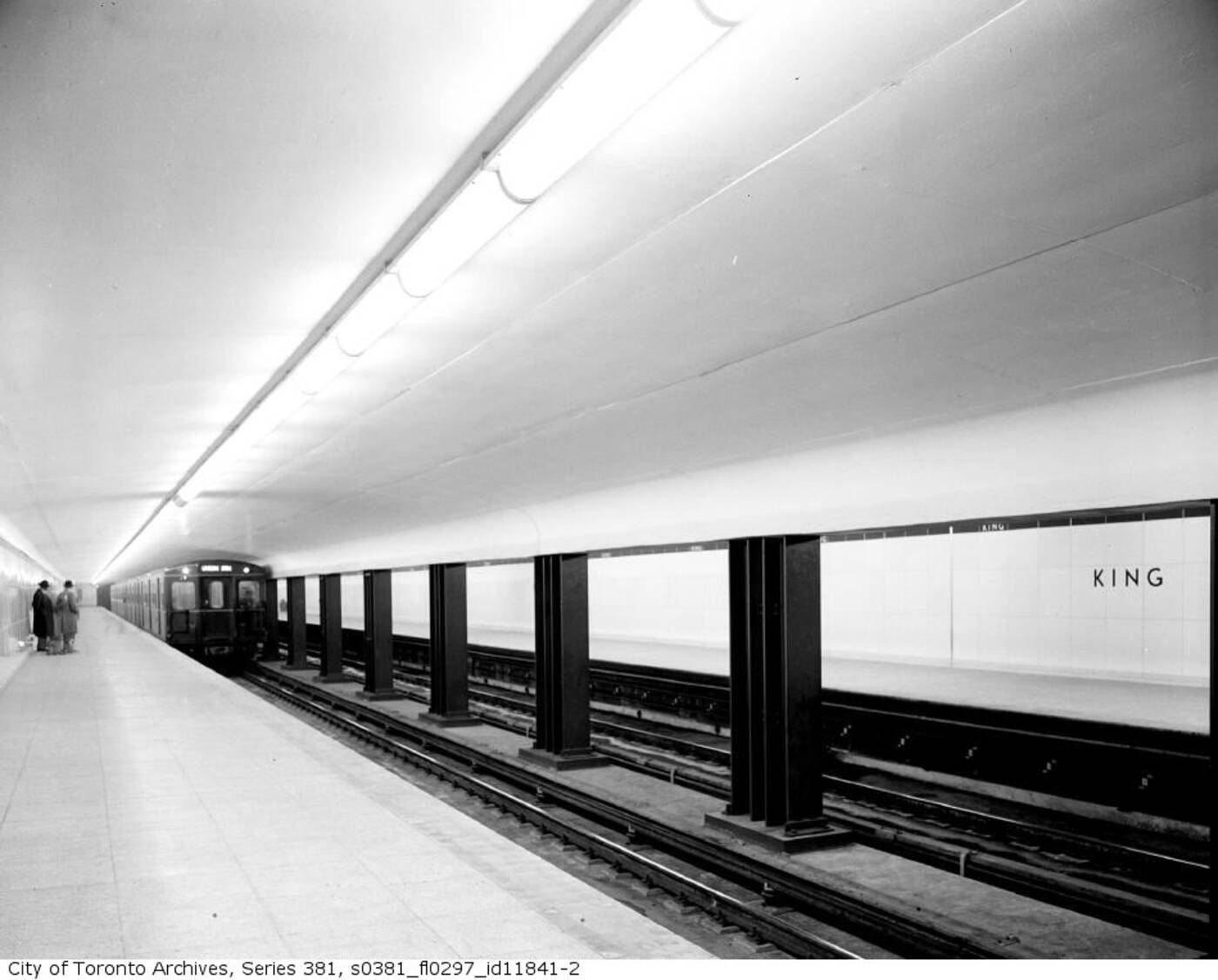
A brand new King Station in 1954.
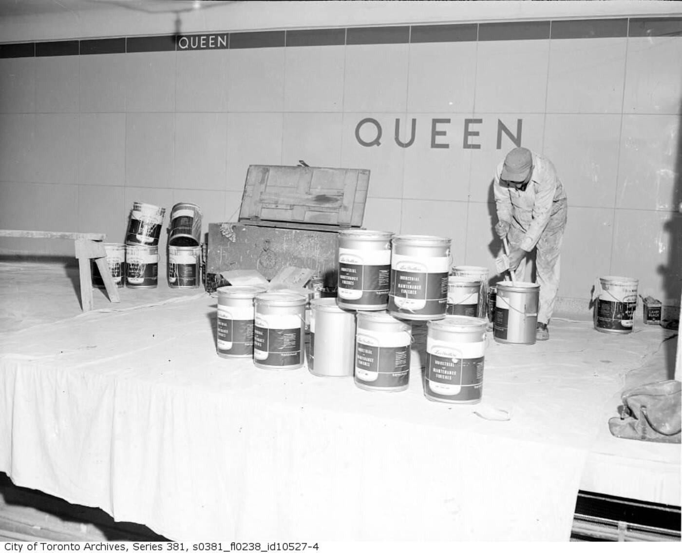
Putting the finishing touches on Queen Station in 1953.
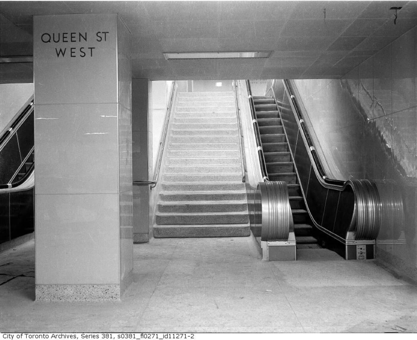
Exiting platform level at Queen Station prior to the commencement of public service.
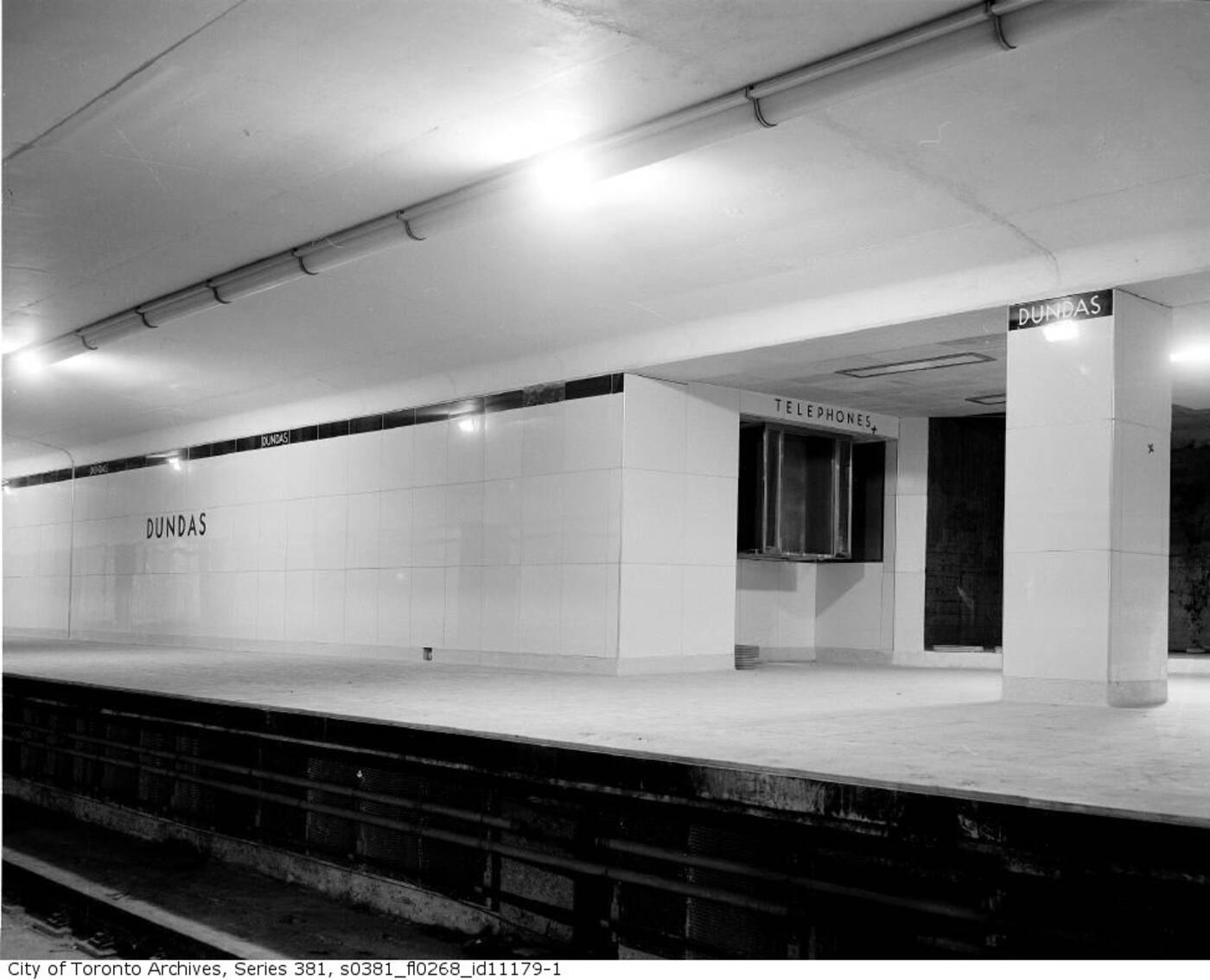
A gleaming Dundas Station in 1953.
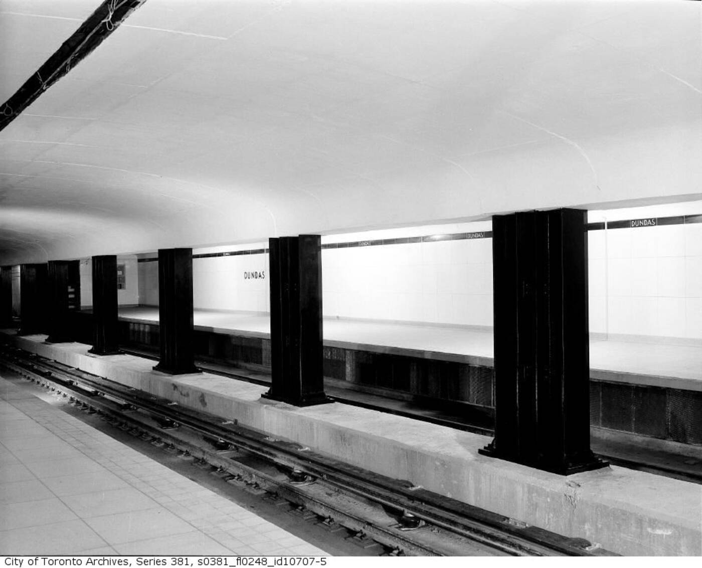
Alternate view of Dundas Station platform.
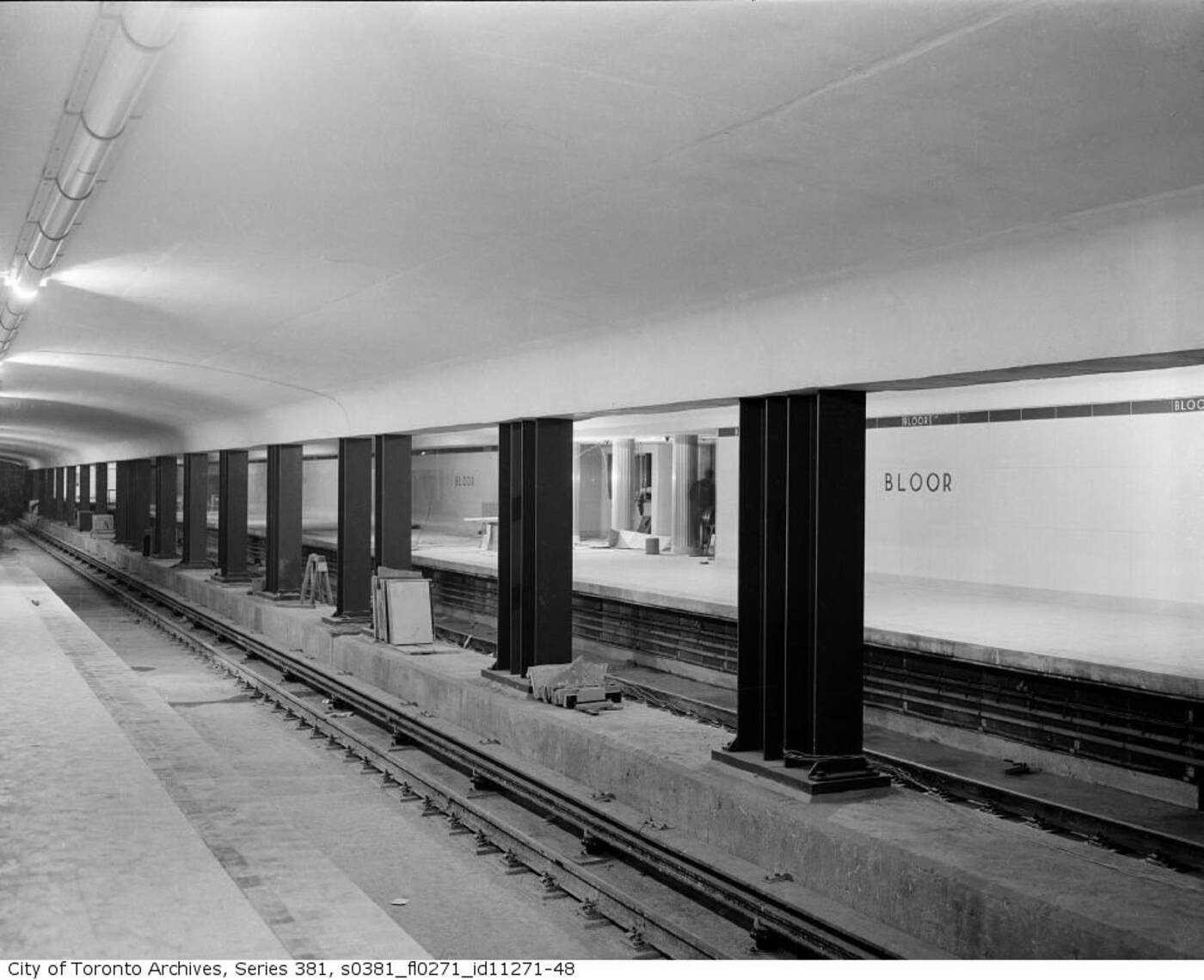
The final stages of construction at Boor Station in 1953.
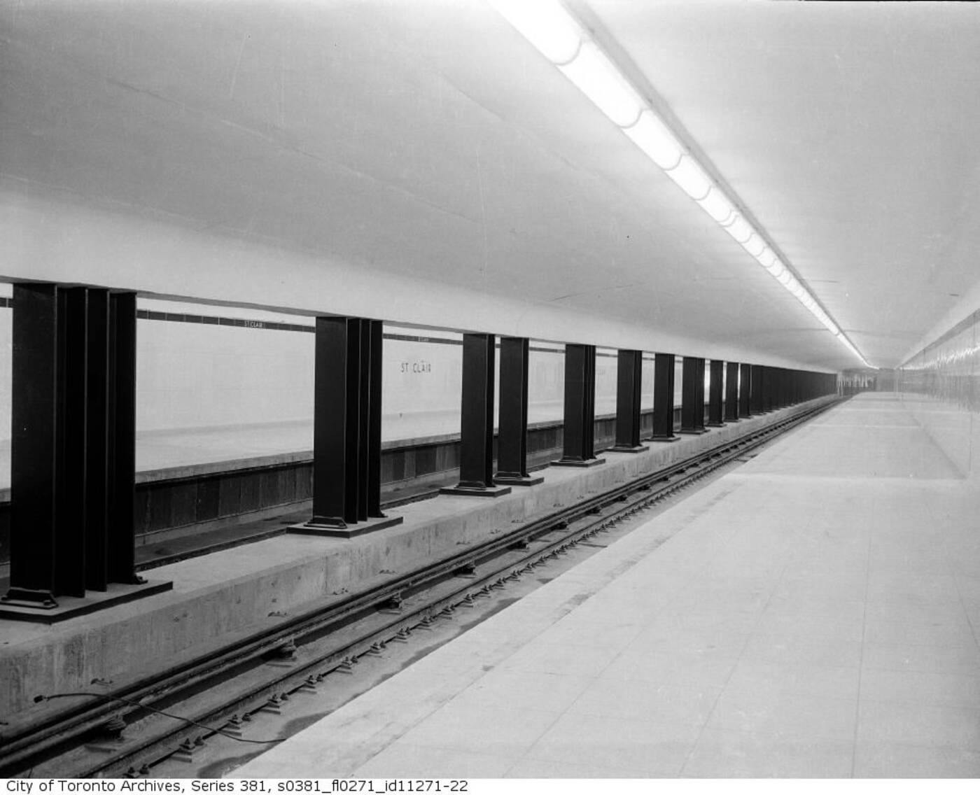
Clean lines to the horizon at St. Clair Station in 1954.
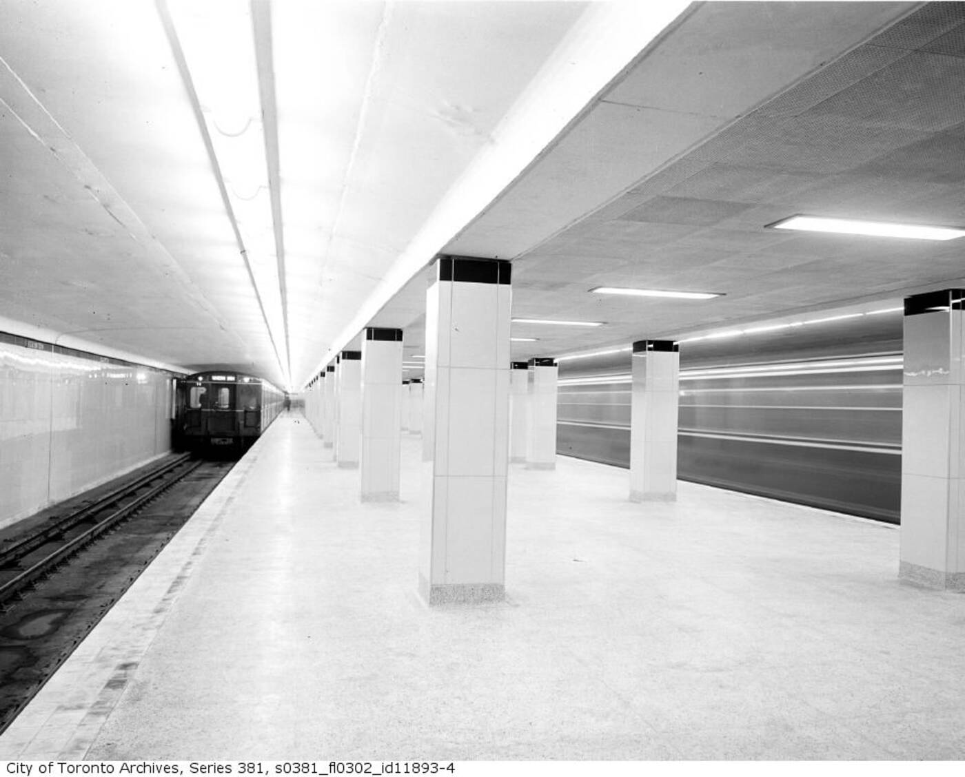
Eglinton Station looking bright, shiny, and new in 1954.
Latest Videos
Latest Videos
Join the conversation Load comments