
The 10 ugliest buildings in Toronto
The greatest challenge with making a list of Toronto's ugliest buildings -- or, more accurately, its worst architecture -- isn't where to start, but where to end. Of all the people I consulted on these lists, only architect Graeme Stewart, author of Concrete Toronto, declined to name names: "At my firm, our philosophy is that there are no bad buildings," he said. Everyone else was happy to contribute, and like the top 10 landmarks list, it would have been a cinch to name 50 buildings. Unlike the landmarks list, you probably wouldn't have had many disagreements.
The problem with Toronto isn't that we have so much bad architecture, but that so much of it is mediocre, a legacy of being the country's utilitarian "second city" for so long, combined with a "developers first" municipal bias that's encouraged expedience over excellence, even after we overtook Montreal decades ago as the country's business nerve centre. A lot of very dull buildings have gone up in the wake of our condo boom, but it's as hard to be offended by most of them as it is to get excited.
This list, then, is a collection of real clunkers, notable for either their wildly failed ambitions as their aggressive, daunting mediocrity. Compiling and shooting this list left me with a lingering sensation of collecting locations for a horror movie; not the creaky, dim Victorian haunted house type, but the cold-daylight-and-green-fluorescent-lit urban modern creepshow pioneered - no coincidence - by Toronto residents like George Romero and David Cronenberg. These are Toronto's worst buildings; be afraid, be very afraid.
1. ROM Crystal - I've tried to warm to Daniel Libeskind's showpiece addition to the Royal Ontario Museum, but the three years since it opened have seen my wary curiosity turn to impatience, anger and disgust. The interior spaces are alternately claustrophobic or disorienting; the exterior is a flailing assault on both the original building and the adjacent neighbourhood, and now that the hype is past its half-life, we're starting to get some inkling of how dispiriting it will be to live with it ten, twenty-five, or even fifty years from now.
Which might not be our problem; the Crystal is, after all, a mulligan by the museum, which tore down the 1984 Queen Elizabeth II Terraces to make way for Libeskind's starchitect turn. With that sort of precedent, some future ROM board might not consider another shot unthinkable, and since Libeskind's buildings have a spotty record for holding up to weather - Toronto has a lot of it - it might actually be imperative.
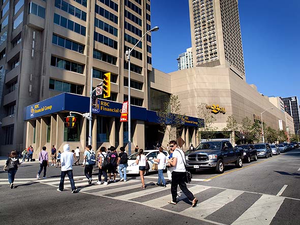
2. Hudson's Bay Centre - Located as it is at the very heart of the city, it's hard to ignore this brutalist monstrosity, and Shawn Micallef has no intention of doing so: "People bemoan the Eaton Centre for turning its back on the street, but this is worse, at arguably Toronto's most important intersection. This one puts the brutal in brutalism - another thing I'm a fan of, but it's important to call out the bad stuff. I kind of like the Bay store inside - am nostalgic for the big department stores though I wish they'd spruce themselves up British-style - but the wall of concrete along Bloor is unforgivable."
"That entire side should be blown out and replaced with glass, then we'd have a glittering box and we could see the people shopping, and it would continue Bloor's Mink Mile east of Yonge. The squat and dumpy Royal Bank branch sitting high and snooty above the intersection should be completely renovated or destroyed. It is a shame the G20 vandals didn't go further up Yonge Street and attack this one."
Adam Sobolak is willing to play contrarian, admitting that "my treatment of the place practically became a love letter, invoking Black Sabbath and rock-star debauchery, primordial ooze and sludge, gates-to-hell metaphors...and with genuine admiration of how Toronto's "worn" this oft-loathed bunker through the years." He adds, however, that "where while others might single out the Hudson's Bay Centre in toto as Toronto's worst, I'd rather focus upon the astonishingly crude pasted-on refacing of the NE corner of the HBC's parking-garage base on behalf of a postmodern condo tower looming above. As I often like to say: "if you think brutalism is bad, 'fixing' it can be worse."
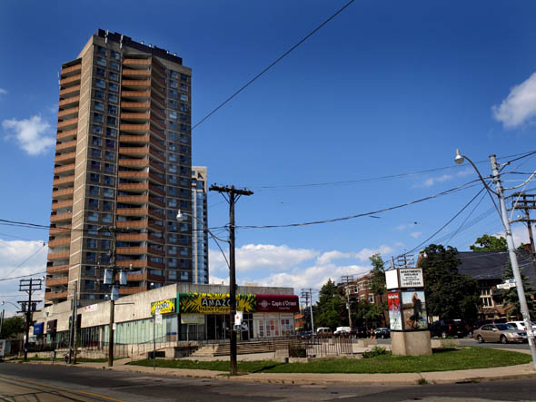
3. St. Clair Place (Bathurst & Vaughan) - "I write about this building in the Bathurst chapter of Stroll and call it 'poo-brown,' says Shawn Micallef. "The brown is fine but it represents one of problems with modernism (of which I'm generally a big fan): they often screwed up how the ground floor meets the sidewalk. This could be a fantastic 'flatiron' building (Vaughan meets Bathurst here at a 45 degree angle) greeting people as they come up Bathurst towards St. Clair, but we're met with a wasteland of wasted opportunity."
"If it was redone (not torn down, but make that podium hospitable for humans) it would be a link from St. Clair to the Bathurst retail strip and the gem of a Library (a Carnegie branch) across the street wouldn't be overshadowed. Now that there is another tower on the northwest corner of St. Clair and Bathurst, it isn't the only thing that catches the eye, and it's beginning to disappear into the neighbourhood more."
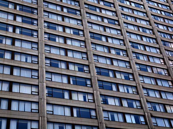
4. Sheraton Centre - Many sins were committed in the name of modernism, and the Sheraton Centre is one of the worst. The area around old City Hall was once startlingly shabby, with the slums of The Ward on what would be the site of the new City Hall, and a slightly shabby but undeniably urban row of theatres and storefronts facing what would become Nathan Phillips Square.
The burst of civic pride following the opening of Viljo Revell's City Hall meant that they all had to go, and it was Toronto's tragedy that we replaced them with this monstrous slab of hotel rooms and pedestrian-repellent concrete. This is the point where modernism took on a dystopic edge, embodied in the Sheraton's "forest behind glass" atrium, which feels like something right out of '70s bummer sci-fi flick Silent Running.
Even its relationship to the civic centre it faces is dysfunctional; there's a bridge over Queen Street linking the hotel's mezzanine to the pedestrian walkway overlooking Nathan Phillips Square but if you try to enter the hotel from the bridge, you'll find the door locked.
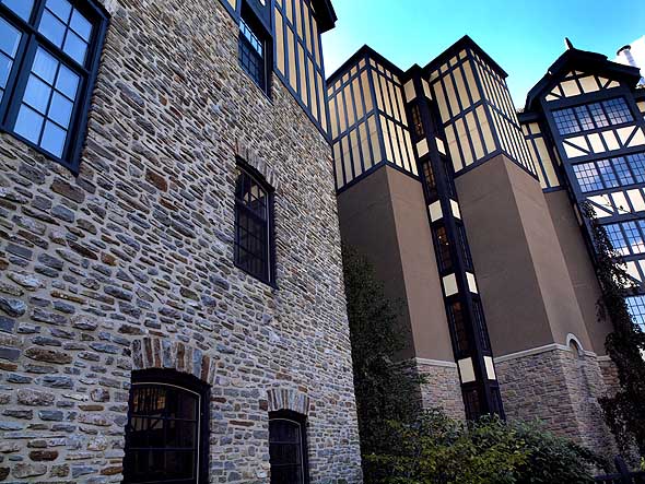
5. Old Mill Hotel & Spa - "I still can't help singling out the Old Mill Inn & Spa as Toronto's most astonishingly wrong-headed act of heritage destruction over the past generation," writes "meta-preservationist" Adam Sobolak. "Out of an Etobicoke heritage realm of Mariposan naivety combined with McMichaelesque stiff-upper-lipped 'we know best,' the ruins of the Old Mill, whose fundamental ruinousness became an emblem of the Home Smith real estate empire as well as Etobicoke and the Humber watershed, were dismantled and rebuilt into an insultingly de-ruined, faux-timbered (but 'useful') concoction, curdling the Home Smith 'old English' vocabulary into overbearing Disney kitsch - an insult to the memory of the Old Mill ruins, an insult to Home Smith, an insult to Etobicoke, an insult to heritage, archaeology, and what have you."
"Such a solution would have been laughed out as destructively time-warped retro-Viollet-Le-Duc absurdity most elsewhere within the GTA; but Etobicoke, I suppose, constituted its own stunted heritage microclimate. Believe me, those of you who want to condemn the ROM Crystal on monstrous-carbuncle grounds - when it comes to disrespect for heritage, the Old Mill Inn is a far worse case in point. Roughly speaking, it's like Richard Serra versus Thomas Kinkade."
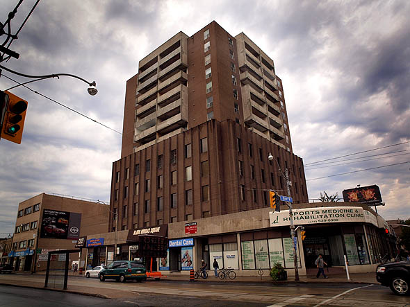
6. Bloor Dundas Square - My sister and her husband lived in this building in the '70s, not long after it was built, and they've both confirmed my salient memory of the place - a ghostly, moaning wind that came from the unfriendly corners of Bloor and Dundas West outside and seemed to seep through the windows and balconies. It was an atmosphere straight out of a J.G. Ballard novel, or an early Cronenberg film like Shivers or Rabid.
Sonics aside, this building is an eyesore, even without the Soviet-style stained and crumbling concrete. (Concrete was invented by the Romans - you'd think by now someone would have figured out its poor response to Toronto's rain and sun, freeze and thaw?) From a safe distance, it's more like three buildings - a banal low-rise apartment stuck on a stump of "poo brown" office block, crowning a bland stretch of retail storefront squatting on a much-tortured intersection. My sister endured roaches and abusive landlords, but a few unsettling months here sent her running to Mississauga.
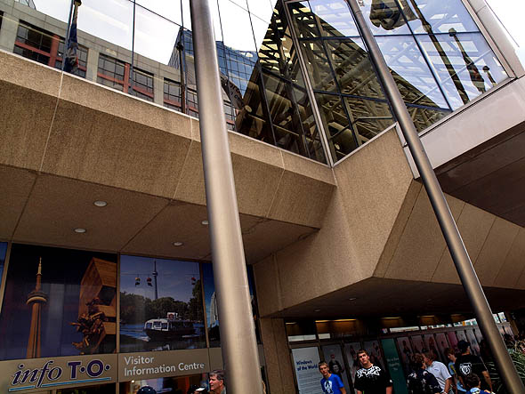
7. Metro Convention Centre - The words "convention centre" tend not to evoke architectural excellence, and designing a stylish wrapper for a large, utilitarian space is probably an unwinnable war, but did anyone remember that the much-used MCC was located on a downtown city street? The MCC did manage one unlikely miracle, in making smoked glass a plausible surfacing for a bunker-like design; trudging unhappily along this inhospitable stretch of Front, there's never really anything to see behind all that glass. Not that you look, since you're either speeding your pace to get to a more pleasant stretch of street or looking for the next crossing.
The MCC also proves the inverse of my ad hoc "great architecture" rule, discovered while shooting Robarts Library for the landmarks post: I walked the whole circumference of this porridge-brown concrete hulk, and couldn't find a photo-worthy vista anywhere.
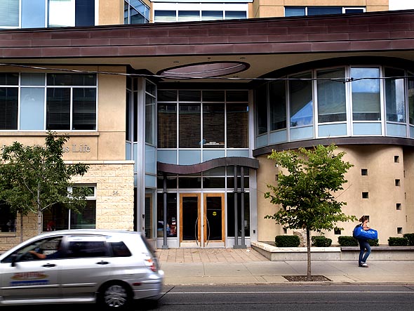
8. Wolfond Centre - Phil and Margaret Goodfellow, architects and authors of A Guidebook To Contemporary Architecture In Toronto, nominated this recent addition to U of T's architectural makeover for its inability to do one thing well. "Chock with every architectural reference imaginable," they write, "this campus life centre does not communicate strongly what it is and its relation to the overall campus."
Postmodern without being particularly playful, the jaunty copper awning slammed through the upper stories evokes a dull but pun-addicted junior faculty member donning a lampshade to help liven up a tedious mixer, to no one's particular amusement. There's not a lot going on with this building, but it still seems like too much, and probably wouldn't be much improved if it was allowed to spread out or grow a few more floors.
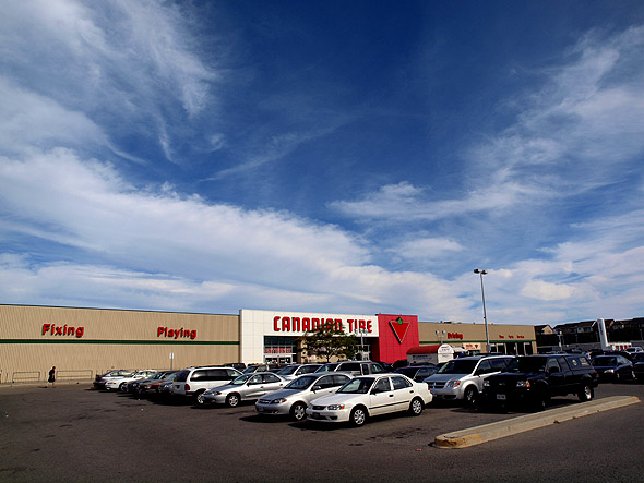
9. Canadian Tire (Main & Danforth) - "Canadian Tires are fine," writes Shawn Micallef. "They sell actual useful stuff, not frilly letterhead or cupcakes or special cheeses, but they seem unable to understand that when they build a store in an urban environment it's different than when they're out in the 'burbs or on the outskirts of Orillia."
"They plop down the same cookie-cutter, one storey design everywhere, so on the Danforth we're left with a 100+ metre wall of dead sidewalk. Same with the Lake Shore and Leslie location. The urban neighbourhood eventually created here will have to deal with this big box blight. Happily, they're not built very substantially and a wrecking ball or tornado could easily take care of them quickly."
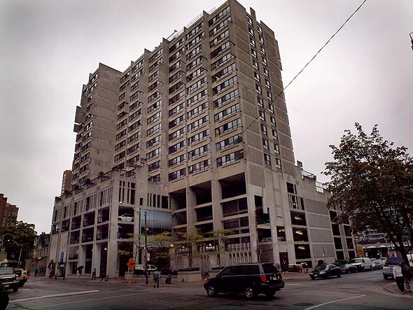
10. Alan Brown Building (77 Elm) - Architect Uno Prii filled the Annex with at least half a dozen apartment buildings that showed the antic side of modernism, which are probably as close as mid-century Toronto ever got to the high style of Miami Beach or Palm Springs, and he even managed to infuse a bit of that into his Jane Exbury Towers. He tried to bring that playfulness to brutalism with this later project, and might have succeeded were it not for the massive, glaring flaw where this hospital district building meets the street.
Look up and notice the sculptural concrete work on the terraces, looking down on the street below like minimalist gargoyles, and the vertical slab window shades, now considered cutting edge passive climate control. The only problem is that they're perched atop a five-storey parking garage that treats the street below like a potential war zone, to be defended against at all odds. Those five floors of parking will doubtless come in useful when Lake Ontario rises thirty or forty feet, or when they're barricaded and booby-trapped to defend residents from a zombie holocaust.
This the second in a series of top 10 lists on Toronto architecture and landmarks. The first entry was the top 10 Toronto landmarks, which was followed by an impromptu part II, and the conclusion will come later this week with a list of the best architecture in Toronto.
Latest Videos
Latest Videos
Join the conversation Load comments


