Wednesday, May 22, 2013Mostly Cloudy 19°C
City

Rebuilding effort on Queen Street leaves much to be desired

Posted by Derek Flack / August 5, 2010

Dukes Cycle Toronto
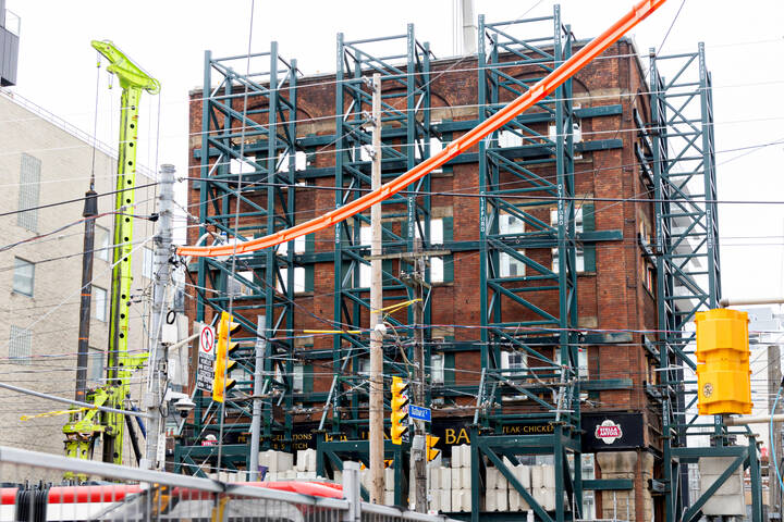
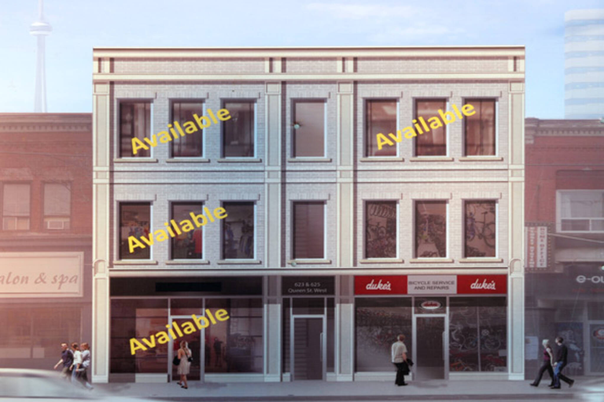
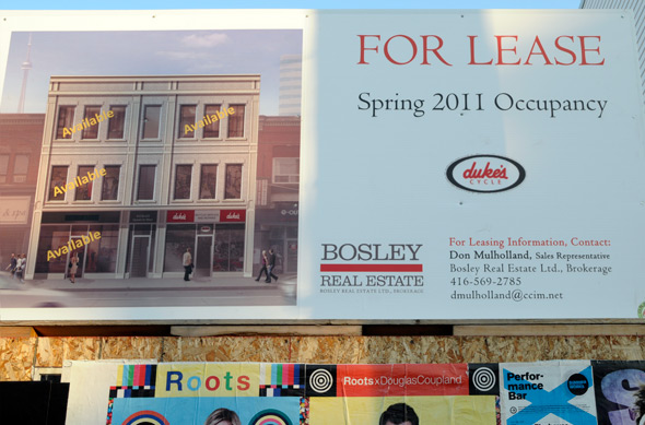
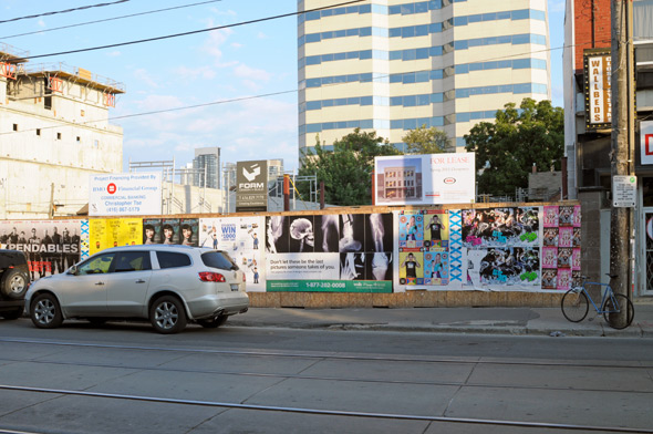
Earlier today Urban Toronto reported on what appears to be the first obvious indication of what the post-fire rebuilding effort will look like on Queen near Bathurst. The lot had been sitting mostly empty until construction began on a new home for Duke's Cycle in February of this year. And while it's still difficult to get a sense of what the structure will look like based on what's been built so far, a rendering depicting the finished product has popped up on the site in the last few days.

Pictured above, the proposed building is a less than inspiring re-addition to the neighbourhood. Not only does it pay little heed to the architectural heritage of the area, the three-storey storefront is rather bland.

Dukes Cycle TorontoUrban Toronto labels the building of the proposal a "regrettable piece of trash" that "abandons the facade to a never-was vaguely historical and meaningless ornamentation which has neither function nor aesthetic merit."

This might be taking it a bit far, but is it too much to ask that the building utilize the red-brick of the original exterior?

As sad as it was to lose the original buildings, events of this kind challenge cities to respond with innovative solutions for the re-integration of new structures into existing neighbourhoods. In other words, the empty lot on Queen Street was an opportunity to rise to the occasion and do something worthwhile with the empty space.

Unfortunately, it looks like that's not going to happen.

Queen Street Fire Toronto

Discussion

27 Comments

Marc / August 5, 2010 at 10:35 pm
user-pic
Well it better be a building that is almost a duplicate of what the original building was! It also better be a building that matches with the style, function, format and period of the place.
bob / August 5, 2010 at 10:44 pm
user-pic
Why not put something more contemporary there?
Kevin / August 5, 2010 at 11:11 pm
user-pic
Gross. Attempts at history don't seem to work these days unless you have someone with talent.

It seems those people are usually too expensive for this city. If only we could find a way.
James / August 5, 2010 at 11:31 pm
user-pic
I really don't think it's that bad....

Aside from the fact that the brick (likely precast brick I suppose) is lightly coloured instead of red, is it really a poorer design than any of the buildings around it?

It's great to see the building replaced with another low-rise mixed-use building that will blend in to the streetscape.

Would people rather see an ultra-modern building here? Or some faux-historical tacky building with fancier ornamentation to make the facade less "bland"? I'm not crazy about either of those options and I think this building will do a good job as a compromise.
Ryan L. / August 5, 2010 at 11:38 pm
user-pic
Seems like yesterday when people on these comment sections were claiming the fire was an intentional conspiracy by land owners who wanted to build a condo there. Ahh...the memories.
piero / August 6, 2010 at 12:06 am
user-pic
Diversity makes cities interesting. As long as the building is of architectural or artistic merit and fits the surroundings, , not necessarily the same, it works. In this case, the building is just plain ugly and lifeless. Boo.
mr hate / August 6, 2010 at 12:18 am
user-pic
The new building is crap. This precast garbage makes it look like cheesy American semi-mall shopping zones that make me throw up in my mouth.

If they rebuilt the facades of all the burned down buildings and put new windows on, it would look kind of like the MARS building at College/Uni. Kind of cool but not a historical treasure. Just a smart updated building with a slight nod to the past.
Daniel / August 6, 2010 at 12:30 am
user-pic
yeah....lets put up a nice building so another grubby weed store or fast food place can go there...
John / August 6, 2010 at 12:52 am
user-pic
Its well scaled vertically and horizontally, solid and ugly, just like most other buildings on Toronto's commercial streets. It will be much easier to absorb this into Queen St. than the banal block-wide glass condo podiums popping up at gladstone and portland.
iurban / August 6, 2010 at 12:52 am
user-pic
why don't they donate the property to habitat for humanity. and then build a cafe where the poor could work to pay off the morgage. but i don't think the wannabe urban, iphone texting, purse dog walking, psuedo loft living kids would really enjoy that in there back yard.
john / August 6, 2010 at 01:33 am
user-pic
shhhh.
Jared Maiile / August 6, 2010 at 08:17 am
user-pic
I think this site needs a glass and white pillar condominium actually. Think of what it'd do for the neighbourhood?
waxy replying to a comment from iurban / August 6, 2010 at 08:29 am
user-pic
--------------------
iurban / AUGUST 6, 2010 AT 12:52 AM

why don't they donate the property to habitat for humanity. and then build a cafe where the poor could work to pay off the morgage. but i don't think the wannabe urban, iphone texting, purse dog walking, psuedo loft living kids would really enjoy that in there back yard.
--------------------

Ah, so the guy who owns the building should DONATE IT to Habitat for Humanity? He isn't allowed to make money off a multi million dollar asset he probably worked very hard to obtain? It f'ing burned to the ground and you want him to rebuild it and then just POOOOF give it away? Righhhht. Get back to us when you have a clue.

james replying to a comment from iurban / August 6, 2010 at 08:42 am
user-pic
iurban: how can one "pseudo live" somewhere? what does that even mean?
TokyoTuds / August 6, 2010 at 08:52 am
user-pic
Its dimensions and proportions fit perfectly with Queen Street. I don't know how anyone can decipher the building materials based on this single rendering. It could indeed be grey brick, and I hope it is at least real brick. It is better than 90% of commercial buildings built in the GTA.

The one thing I don't like by the looks of the rendering are the doors which seem to be the standard Canadiana commercial door out of a catalogue. A better canopy for the office entrance in the middle, and some nice door treatments for the retail shops would be the biggest improvement to this as shown at this time.
me / August 6, 2010 at 09:36 am
user-pic
The look of this building reminds me of those 'Smart Centers' that are popping up all over suburbia. Ugh...
Ryan L. / August 6, 2010 at 09:41 am
user-pic
The structure looks nice to me. It's fitting with the area and consistent with what was there before. If its too bland, the owners can paint the masonry. The light colour would provide a better base than red brick would have. I think it could look really nice with colour on some of the accent structure
Adam / August 6, 2010 at 09:44 am
user-pic
Don't worry, it will fit right into the neighborhood with a couple of squeegee kids, a pile of 905'er vomit, and a dirty and yammering Native American in front of it.

Seriously though, this seemed like an opportunity for something with character and it failed miserably.
The Shakes replying to a comment from TokyoTuds / August 6, 2010 at 09:45 am
user-pic
I agree. The building itself really wouldn't be that bad if they made the brick red. After a few years of city grime the precast won't look much different than if had it been made of stone. The only really god-awful part of the building are the generic 80's bus-shelter-style store fronts, but those usually end up changing to suit the store occupants.

There are definitely bigger architectural atrocities out there. If you want to vent your spleen, take a look at what Pizza Pizza has done to the Sterling Bank Building at 260 Church St (at Dundas St E):

http://maps.google.ca/maps?f=q&;source=s_q&hl=en&q=%22pizza+pizza%22&sll=43.654987,-79.376607&sspn=0.022418,0.055661&gl=ca&ie=UTF8&radius=1.67&split=1&rq=1&ev=zi&hq=%22pizza+pizza%22&hnear=&ll=43.656299,-79.377044&spn=0,0.055661&z=15&layer=c&cbll=43.656404,-79.377088&panoid=wHMMctp0gOP-PhVc-4PerQ&cbp=12,243.55,,0,-10.4
Jer / August 6, 2010 at 10:24 am
user-pic
I am just disappointed that it is not taller (maybe 6-8 storeys) and set-back (as it rises - so minimal shadowing) from the street. We need multi-use density not token nods to a historicity that valued low-cost, abused, last-century artisans trying to emulate post-industrial imperialist european values on the whim of nineteenth century homesick architect immigrants with little creative prowess beyond what they were forced to copy day-in day-out from talent-free architecture schools. Give the talented (and aspiring) designers of today a chance to redesign and re-characterize this city on a lot by lot basis with open, public-guided architectural competitions and juried feedback -- and yes, City, let's get you back in the development business - cowboy developer capitalism is doing a really lousy job of relevant place-making - or even adding real value (financial) to an area. Developing is such a high-profit, idiot-proof way of making the City money and 'making' the City, that it should embrace it. Time to stomp on developers who are taking countless billions out of the city's coffers developing varied and interesting sites throughout.
John / August 6, 2010 at 11:23 am
user-pic
I seem to recall shortly after the buildings burned that everyone was saying they wanted a replica of what had been there. Now you're getting what you asked for and you want something different? Look, it sucks that those buildings burned, and folks lost businesses and homes, but the buildings themselves weren't all that great to begin with; not a ton of "character", just a bit of history. This new building is pretty much what people wanted. You can't have it both ways.
Ryan L. replying to a comment from John / August 6, 2010 at 11:28 am
user-pic
Welcome to Toronto and BlogTO
Jason / August 6, 2010 at 11:57 am
user-pic
It would be fine if they used realy brick, but I'm guessing it'll be brick veneer. And I bet those ornamental columns will be styrofoam covered with some stucco. It's sad. I think movie sets have better build quality these days than what goes up in Toronto.
TokyoTuds / August 6, 2010 at 12:27 pm
user-pic
Brick veneer is real brick; many confuse this with brick masonry which is structural and double-brick. Brick veneer is real brick, but only one brick thick, and is decorative rather than structural. I didn't explain that very well. When people hear veneer they think it is like wood veneer 1mm thick and expect brick veneer to be only 1 cm thick or something: brick veneer is real, full bricks.

An exercise .... look at any brick wall and count every 6 or 8 rows and you should find 2 short bricks. If so, this is brick masonry and is holding up the building structurally. If there are no such "header" bricks, it is likely a veneer brick wall.

http://www.zimbio.com/Model+houses/articles/2/Brick+Houses+Solid+Masonry+vs+Brick+Veneer
Tokyo Tuds / August 6, 2010 at 12:52 pm
user-pic
Brick veneer is real brick. Almost everything is brick veneer now and has been for over 30 years. It is a single layer (wythe) of brick and is decorative rather than structural. Brick masonry walls are 2 layers (wythes) and can be spotted by counting every six rows and looking for short "header" bricks. These walls hold up the building, whereas with brick veneer the building holds up the bricks. There is nothing wrong with brick veneer and is the better application in almost all scenarios.

The term veneer confuses people because they think of wood veneer of 1mm, and imagine brick veneer must be only 1cm thick and tenuously pasted onto walls.
bob replying to a comment from John / August 6, 2010 at 06:42 pm
user-pic
@John

Did you really just call Toronto's Victorian buildings ugly?
nonanramr / August 6, 2010 at 06:46 pm
user-pic
They should build something taller (6-8 storeys maybe?) and put apartments there.

Add a Comment

Other Cities: Montreal