City
The New Red Rocket
Unlike New York and London that have woven intricate subway systems through the heart of their cities, Toronto's transit system is still relatively young and has a lot of growing to do. Having a strong and speedy transit system is an important part of creating a better Toronto, which is less reliant on the car and more focused around public transportation.
Currently, more than 200 of our subways are over 30 years old: tattered, worn and in need of replacing. But with the extension of the Yonge-Spadina line to Vaughan and the introduction of the city's new Red Rocket, at a cost of a $499-million, the TTC is taking great strides in providing public transit to an average of 1.5 million daily commuters.
As a part of Dalton McGuinty's proposed MoveOntario2020 plan, 39 new subway trains are quickly taking shape at Bombardier's assembly plant in Thunder Bay.
Featured at this year's CNE, the metallic beasts have a sleek and modern exterior with new and subtle features that riders can look forward to in late-2009, exclusively on the Yonge-University Line.

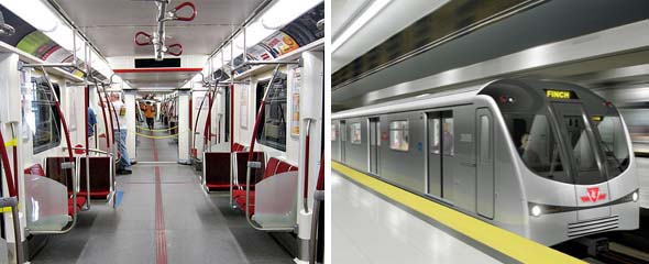
The interior design borrows from Hong Kong's subway system. The subway cars are connected together by an open corridor which allows commuters to walk freely from one end of the train to the other. This addition makes traveling between cars safer because it means that passengers don't have to exit the train.
Splashed with New York ingenuity, the new trains have active route maps which are conveniently equipped with LEDs that tell you the present location of the train and the direction it's traveling. (Until now, finding out what station was next always felt like a game of Clue, as drivers would announce the next station through a static-laden speaker system. Surprisingly, they have now included extremely-helpful electronic displays similar to those seen on TTC streetcars in addition to arrows identifying which pair of doors will open.)

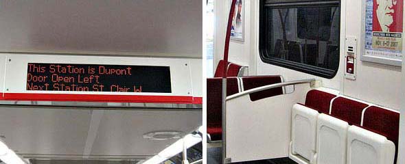
On each subway car, blue flashing lights on the exterior of the train point out the twelve designated wheelchair accessible areas in each subway car. These seats fold up, providing room for baby strollers, bulky bicycles and large luggage. However, my only problem with the new trains is that they kept the rock-hard seats and the distressed red fabric - all too familiar and not at all comfortable.
Lastly, there is an emphasis on safety with four closed circuit cameras, six intercoms per car, and evacuation ramps at both ends of the train. Other interesting features are the new red anti-microbial covers, on handrails, that claim to provide better sanitation.
The new subway makes me feel supercalifragilistic. But do you believe that the TTC is taking steps in the right direction? Is the new Red Rocket well thought out and is it going to make a significant improvements?
Photos by sillygwailo and R. Flores


Discussion
44 Comments
Sort By Oldest First / Newest First
Subscribe
Oh, and as for knowing which station is next being like a game of clue...use your eyes and ears. The station name is only about 400 pt font on the walls of the stations and the announcements are now made via a quite easy to here recording as per the court order issued earlier this year after the TTC was sued for not complying with accessibility laws.
the first picture reminds me - why are so many of the current subway cars missing the route map over the doors? are people taking them as souvenirs?
Our subway goes in a straight line... not terribly difficult.
I'm interested in some hard numbers on where the most effective route improvements should go. Of course getting commuters out of cars and into the trains are good, but you can't have a large subway system with so few lines. only a few lines serving such a large geographical area need more redundancy to make up for a single train failure paralyzing an entire section of the line. (though I'm no transport expert by far).
The last photo makes me sad though. Why is anyone still using those terrible individually lit LED signs which are difficult to read and force the operators to have to abbreviate text like "Door Open Left".
I can't imagine actual LCD screens would be that much more expensive to install to allow for a more attractive, flexible design. For example, showing the available services at the next station such as streetcar connections, elevators, and so on.
Blind people appreciate it, I'm sure.
----------
I quite agree with you. Maybe someone can come up with an
all symbols way of replacing the text. The only text allowable would be the name of the station.
Any graphic arts students out there with ideas?
How would a written sign help blind people in any way? They can't see it to read what being displayed!
That would take care of the hearing impaired riders.
I was under the assumption that the train door opening side would be revealed both visually and aurally.
In response to Jer, the Yonge-University line will be extended all the to Vaughan. Stopping at Wilson, Downsview, Sheppard West, Finch West, York University, Steeles West, Highway 407 Transitway and the Vaughan Corporate Center. Likewise, there are talks of a new automatic system being put into place which will increase the frequency of trains during rush hour.
In response to Daryl, yes people to get lost occasionally. It happens to the best of us especially when we're late.
In clarification of Adam, at the ends of each of the signs are an X as well as an arrow which lights us indicating which side the doors will be opening; however, I am unsure whether this feature is revealed aurally as well as visually. They do have LCD Screens, but they aren't a major feature as their only function is to instruct people how to use the intercom. I do agree that what you're suggesting would be helpful.
Details on Bombardier's website: http://www.bombardier.com/en/transportation/products-services/rail-vehicles/metros/toronto--canada?docID=0901260d8000f949#
http://www.flickr.com/photos/ryanfelix/2207800842/
1) USE A LINE MAP. No one, not one transit agency, not a single bureaucrat anywhere, tries to squish a whole system map over the door. Put a freaking line map over the door - much easier to read, LED or not. This is what New York and London actually do. The entire network map can go over a seat somewhere, where there is more space to show connections, etc. (Yes, you have to lean over someone to read it sometimes, but this is how the world works. Get your head out of the sand, Toronto, and do what works elsewhere.)
2) SHOW THE STREETCARS. We're spending billions on new streetcars downtown and LRT lines all over Transit City but they apparently don't count as part of the rail transit network? That ought to make it fun when trying to go crosstown on Finch LRT then the Yonge subway then the Sheppard subway then the Sheppard LRT. It's all one network. Show me a single city in the world that does not put all rail vehicles on one map. This is a local psychology that visitors to Toronto do not understand.
This is not (red) rocket science. Put all rail lines on the map to create a new simplified network map, and display this (without LED) on an ad poster over a seat. Show an LED line map over the door like the Bombardier cars that New York has (complete with changeable stops, screens, diversion alerts, etc.) Don't blow this, TTC!
And its really not that hard to navigate. Once you understand what the major transfer points are, what lines go to and fro, it can be pretty simple to navigate. Besides, they got cool station names like Hoyt-Skimmerhorn.
A friend from Toronto is also here and we discussed their rule of no eating or drinking in the station as well as on the train. I don't think Toronto could implement this. There are just too many commuters who need their morning coffee.
In response to uSkyscraper, I do agree that the map needs to be reworked. While our transit does what it needs to do and is fairy efficient, I can't help but think how complicated the map would look. Likewise, streetcar routes should be incorporated in the present map and not treated as a separate aspect of our transit system.
Toronto will never be world-class without a world-class public transit system.
And Mexico City while having a much larger population is actually smaller than Toronto in area, so the subway seems really paltry here. The only downside to the Mexico City is, of course, how ridiculously crowded it gets... I still miss it though.