Arts
Toronto street signs given the poster treatment
Few things conjure up nostalgia for an older, grittier Toronto as readily as the weathered acorn-stye street signs that still dot many intersections around the city. Cast out of metal, these often rusted specimens are somehow so much more appealing than their contemporary replacements, which can't help but look like shitty imitations of the real thing.
As the old signs are steadily phased out, there's been talk of making some of them available for purchase, but Toronto illustrator Dave Murray has now given us another option. The artist behind the popular neighbourhood word cloud maps, Murray painstakingly documented the old street sign font in an effort to memorialize this iconic bit of the Toronto streetscape in poster form.
"The inspiration for the typeface primarily sprang from my love of the old-style street signs, specifically the models with the embossed type," Murray told me by email. "I obviously encounter a lot of them while making my maps, and I've come to really appreciate iconic, acorn-topped signs. While I fully understand the reasoning behind the transition — legibility, durability, cost, etc. — I believe that the new signs lack the character of the old signs."
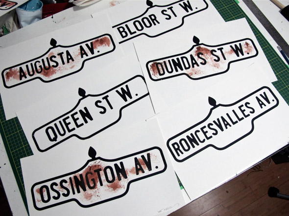
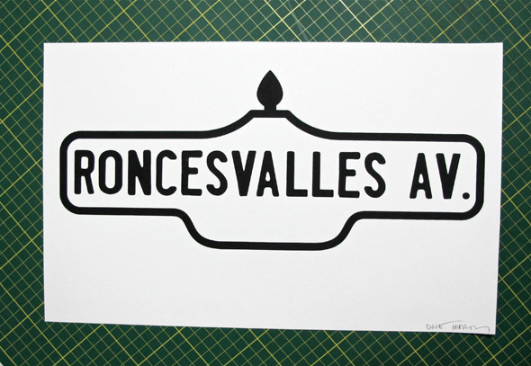
Available in both rusted and non-rusted forms, the posters may lack the 3-D nature of the signs themselves, but the printing process — which mirrors the weathered characteristics of the originals — gives them the illusion of depth. The font's a pretty accomplished facsimile as well. As was the case with David Vereschagin's reproduction of the Toronto Subway font, Murrary took hundreds of photos for reference.
"Each letter is based off of a composite of the best examples of each letter I could find. Some of the signs really are in terrible shape, so a few of the letters were actually somewhat tricky to find," he explains. "I definitely ended up far from home to find usable reference."
The posters are hand silk-screened, and the rusty versions feature hand-applied effects. The fist series of prints include Queen St. W., Ossington Av., Bloor St. W., Dundas St. W., Roncesvalles Av. and Augusta Av., which cost $20 each. Custom options are also available for $60. Purchasing information is available here.
Images courtesy of Dave Murray


Discussion
19 Comments
Sort By Oldest First / Newest First
Subscribe
Do you have the guts to steal stop signs? One way signs?
Again, my apologies.
There's his simplified style bird illustrations which are pretty derivative of Lumadessa's bird prints: http://grainedit.com/2009/09/17/josh-brill-flora-fauna-bird-editions/
His derivative type maps cashing in on Ork's city posters popularity: http://www.orkposters.com/toronto.html
Not to mention this very post where he's basically taking a designers work (no that sign didn't just grow off of the pole it was on) printing it out again, and taking money for it.
Once I see this much lack of creativity in a portfolio I basically write all the work off as I'm pretty sure it's also far from original like the rest of it.
First things first, I want to address the street signs, as I also have a few problems here. Sure, it's cool that he took the time and effort to create a typeface based on the weathered lettering of the old street signs, but simply printing replicas of signs seems a bit…tactless. I can understand HOW this fits in with the rest of his work (specifically the mapping), but it does seem, well, a bit scummy. But maybe that's just me.
The maps are where I draw my first point of contention, specifically the "rip-off" accusation. I have to ask: did you even take a good look at examples of both Murray's maps and the ORK maps? Because if you did, you'd see that they're completely different concepts. From what I can look up (the internet is a wonderful place), ORK maps are based in Chicago, and released their first map (Chicago, of course) sometime in 2007, and didn't release a Toronto map until 2010. I'd like to draw your attention to this: http://www.toronto.ca/demographics/profiles_map_and_index.htm
It would seem that the ORK maps pretty much traced the work of some city-staffer, and filled int he blanks (albeit very nicely). Murray's map started as a school project in 2008, based on "words used in signage at street level". One is an outlined map of the neighbourhoods, the other is a map of what's actually in these neighbourhoods, which Murray is actually exploring to create his map. The ORK maps are beautiful, don't get me wrong; but both artists/designers are working on a different core concept. Perhaps more interesting is that the concept of "word mapping" predates both ORK and Murray, and has been done by far more notable people - Maira Kalman (her 2001 cover for the New Yorker) and Paula Scher (any of her word-map paintings).
Onto the birds. HAL, did you even look at the rest of Murray's portfolio? I did, and I see a pretty well established style. The birds were also done for a client, who most likely requested a series of birds, in his style. Whatever similarities there are (the only really one being that they're both a series of birds) are probably highlighted by the fact that both series are probably produced in Adobe Illustrator, which has a tendency to bring a distinct "look" to work. If anything, both Brill and Murray owe a debt to Charley Harper (seriously, look him up). He's probably the master of abstracted bird illustration, not to mention illustration in general - he was amazing.
While you're right in calling him out not he signage, the rest of your accusations (calling him a joke, and a rip-off) are completely reactionary, and hold no ground under even the easiest of research.
Interstate Condensed - woot woot... I AM SO SMART S-M-R-T.. I mean S-M-A-R-T