Arts
Toronto neighbourhoods mapped via word clouds
It's always exciting to come across novel or unique maps of Toronto. In fact, just a couple of weeks ago, I wrote a post that rounded up some of my favourite examples of Toronto cartography. And, had I known about local illustrator Dave Murray's Toronto Word Maps at the time, you can bet they would have made that list.
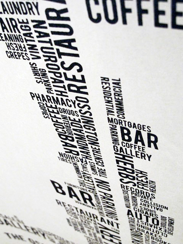
Offered as posters and screenprints, Murray's maps are immediately reminiscent of the Ork neighbourhood maps, which were started at around the same time and also use words to chart urban space. But, upon a closer look, that's really where the similarities end. Rather than covering Toronto's many neighbourhoods in one map, Murray offers a more detailed overview of individual areas and the words affiliated with them.
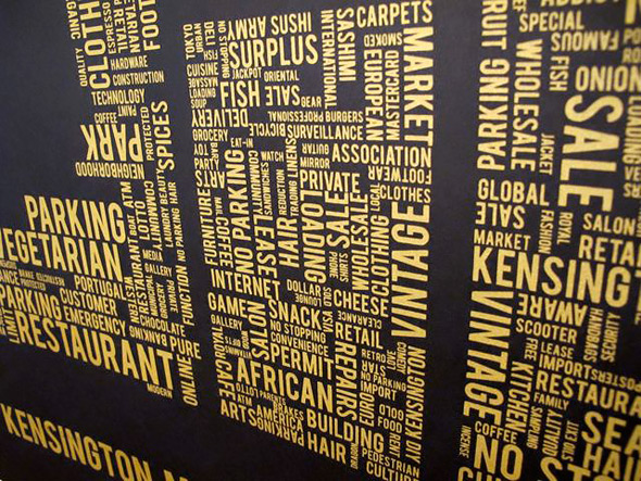
Here's how it all works. First the illustrator surveys a given neighbourhood on foot and records all the words that he sees. Once this raw data is collected, he uses a computer program to transform it into word clouds, which place greater visual emphasis on text recorded more frequently. From there, Murray uses other software programs to organize the information in a manner that spatially represents the neighbourhood in question.
So far, Murray has completed maps of Kensignton Market, the Ossington Strip and West Queen West & Parkdale. On a macro level, it's pretty easy to discern each neighbourhood, but what's really fascinating is to try and pick out the differences between them based on what might be termed their "lexical concentrations." I find that certain intersections and stretches of street are easy to imagine, while others take a bit more work. But, in both cases, the identification process is fun and even a bit enlightening.
To see more of Dave Murray's maps and for information of purchase and pricing check out his website or check them out in person at Kid Icarus and Function 13.


Discussion
24 Comments
Sort By Oldest First / Newest First
Subscribe
Just my opinion, but it's very sparse. Can't say that single words can re-create the feeling of a neighborhood in the same vein that Ork name maps can.
sparse? did you even bother to look at the density of the information? just because you see a lot of negative space in the queen and parkdale map doesn't mean it's "sparse". it's conforming to the geographical constraints of the neighborhood.
"Can't say that single words can re-create the feeling of a neighborhood in the same vein that Ork name maps can."
because single (or sometimes double) word names-of-neighborhoods more effectively communicate what's actually in a neighborhood? you essentially just crapped on your own argument here.
And no, Parkdale isn't a geographically constrained neighborhood, in fact outside of St. Jamestown and Cityplace, Parkdale is one of the most dense neighborhoods in the city. Not that you would garner that about a map that describes purely commercial use of land, rather than recreating the sense of place that Parkdale has.
the association anyone attributes to the name of a place, a person, a thing is due to the attributes of that place, person, or thing, what it's composed of and what qualities inhere in it. from a geographical or neighbourhood perspective, when i think of "west queen west" i think of galleries, boutiques, restaurants, trinity bellwoods, etc.—nominally, what goes into making that neighbourhood what it is. the emotion that one associates when thinking, even of a purely numeric street name (5th avenue, for example) is, for me, largely made up of what i know that street consists of. jameson, i'm not saying you're wrong by any means, i just think that you aren't recognizing that the associative, attributive qualities you get from the name of a place stem from what the place is composed of, what it's used for, etc. to me, seeing "trinity bellwoods" on the ork map is evocative of what i see in the present maps. the difference to my perception is that these maps seem more representative of what it's like to actually walk the streets or live in any of these neighbourhoods as opposed to the general and merely topographical information the ork maps present. i can get that same information from google maps. it won't be as pretty, but it will do the job.
also i'm having a hard time seeing what's "excessive" and "unethical" about an info-art piece that was completed and released prior to the ork maps having hit the presses (http://network.nationalpost.com/NP/blogs/toronto/archive/2009/04/04/reading-the-land.aspx)
I'd love to see one of these in an Upper Beach or Leslieville version!
I think these designs are nicer and the idea is more interesting... but, that doesn't make it ok.
i dont get what the big deal is. there are tons of word maps out there.