
Toronto gets another quirky neighbourhood map
I'm a bit of a Toronto map junky, always on the look out for vintage or quirky efforts that chart various elements of this city, be they geographic, historical, social or whatever else. Although many of the documents I've taken interest in lie outside my economic bracket — man, do I ever wish I could cough up the cash for one of Flavio Trevisan's works — there are other intriguing that won't break the bank. Ork Posters fit this bill, as do Dave Murray's neighbourhood word cloud maps. And, as of a few days ago, there's a third option for local map lovers on a budget: Ben Brommell's Typographic Toronto map.
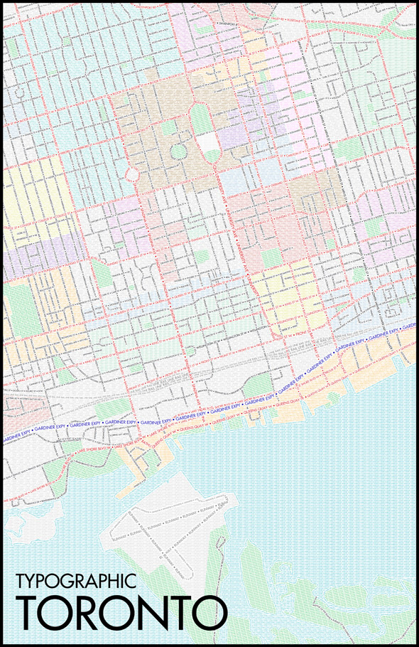
Pretty much exactly what it sounds like, Brommell's map renders Toronto's neighbourhoods and streets solely through the use of multi-coloured text. "The inspiration for my map came from a similar series of maps I saw online for several U.S. cities," the second year Film & Television Production student at Humber College told me by email over the weekend. "There wasn't, as far as I could find, any maps for Canadian cities, so I thought I'd rectify that and make one myself.... I thought it would be cool to see a map of Toronto that functioned both as a map and as a piece of artwork."
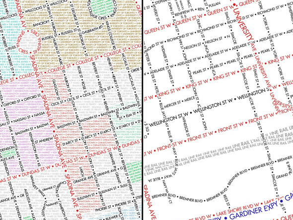
Although the concept is pretty straightforward, it was a labour-intensive process to fashion the final documents, which come in a few variations (in addition to the full map, there's also a roads only version and a black & white option). Brommell thinks it took anywhere from 50-100 hours to put the map together, much of which was spent plotting out Toronto's streets (the font is Futura in case you're wondering). It was a little easier to do the neighbourhoods, he explained, thanks to resources like blogTO's neighbourhood map and City of Toronto ward maps.
The price of the maps depend on what size and material one is looking for, but they start at $15 (for a small 7" x 10" print) and go up to $122 (for a framed 26" x 38"print), with lots of different options in between. I particularly like the stretched canvas ones, but chacun à son goût. The Ork folks probably don't need to worry about their Toronto market share falling off, particularly given the downtown focus of Brommell's map — but it's always nice to have another option out there, especially one as nice as this.
For purchasing options, check out Brommell's Society6 page.


