Dufferin Station's Bittersweet Upgrade
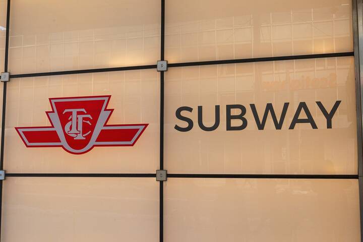
I like gritty subways, and I like Dufferin subway station. I feel a part of urban history as I descend underground into the minimalist platforms and lean against institutional-coloured tiles meant to curb rowdiness while I wait for my ride.
I recount to myself my admiration for outdated subway aesthetic while walking to the open house of the Dufferin station revamp on Monday. Dufferin's reno is part of the Station Modernization program announced in 2007 that revitalizes the Bloor-Danforth and the University line stations. The event was at Dovercourt Baptist Church, Dufferin station's neighbour. I walk in and hear the rumbling of the subway mix with the chatter of people pouring over design plans placed on easels throughout the room.
I join the crowd and reluctantly echo their "oohs and ahhs."
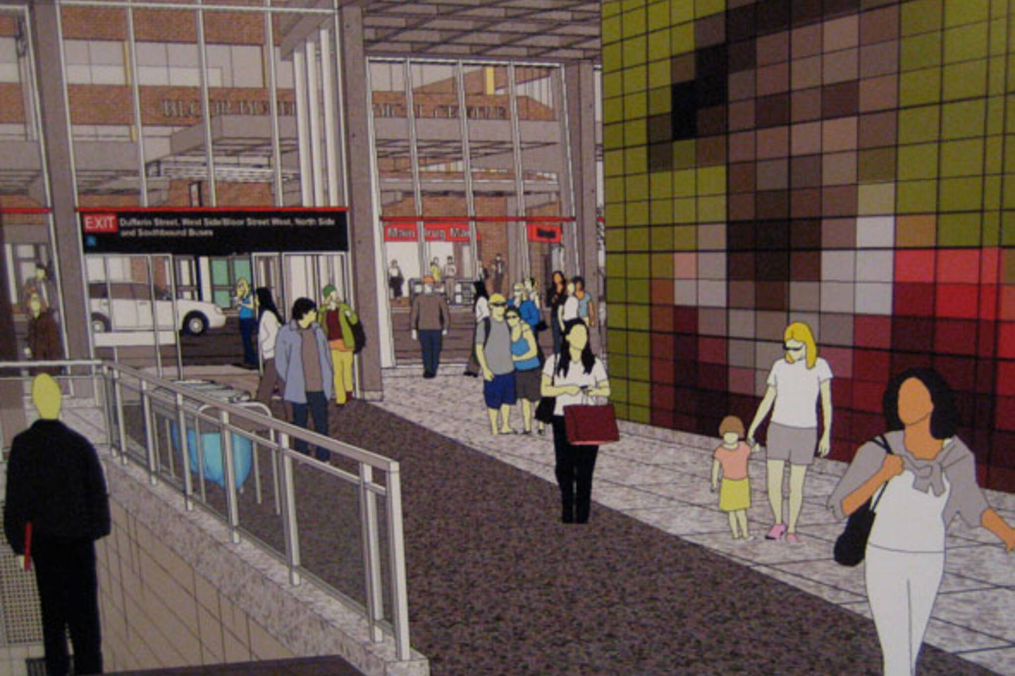
The Dufferin station reno isn't the kitschy and pointless facelift of Museum Station. Instead, the $41 million project that starts this fall integrates practicality, accessibility and environmental aspects.
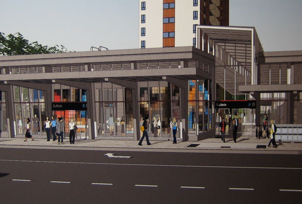
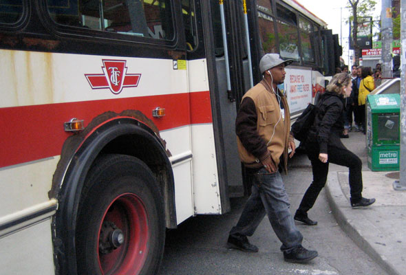
New additions to the overcrowded station include: a green roof top, bicycle storage, two new exits, elevators, an expansion of the waiting area on the west side, canopies attached to the outside facade (so you don't get soaked or scorched when waiting for a bus), and increased curb indents for two buses to fit at the stop without halting traffic.
I would only add washrooms as missing from the shopping list.
Adrian Piccolo, one of the architects, says the over forty-year old station is "run-down and met its time." "The new design is airy, modern, with lots of natural light... and allows for the freer movement of pedestrians and TTC riders."
The modernization projects are also changing the harmonized datedness I like and expect from each station. But if I have to deal with change, then Dufferin's public art integration is actually a step up. The concept by Eduardo Aquino and Karen Shanski is pixelated murals that look like super-enlarged images best seen from far away. The final images, meant to reflect the neighbourhood, will be created after community consultations.
I asked David Grigg, the project manager, how subway purists (like me, to some extent) will react to the new look. "We're retaining the existing font and size of the station name on the platform," he says. It is a unique typeface specific to Toronto's subway lines. Take comfort in its preservation, purists.
Not everyone crossed-over to the "modernization love" platform. The noise and dust when construction starts concerns some residents of the seniors home next door, attached to the baptist church. Part of the expansion is right behind the retirement home, where, as one resident tells me, "seniors like to open their windows in the summer."
Photos by author.
Latest Videos
Latest Videos
Join the conversation Load comments