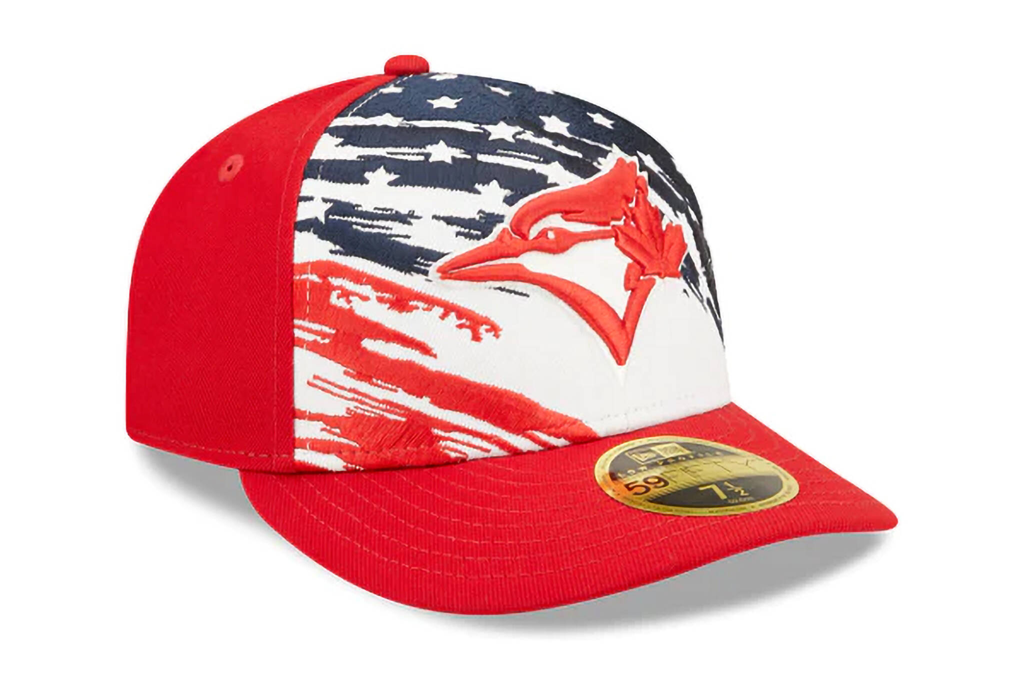
Shockingly ugly U.S. flag-inspired Toronto Blue Jays hat has fans confused and angry
The Toronto Blue Jays are — since 2004 — Canada's only Major League Baseball team, and the team's fans are reminding the organization on which side of the border their allegiances should lie after the reveal of a cringey United States flag-themed hat licensed with the Jays logo.
The NewEra Toronto Blue Jays Independence Day 2022 hat looks like the kind of design you'd see on the head of a trucker in line to buy Ivermectin from Tucker Carlson at an NRA convention.
It features a prominent, stylized field of stars and stripes overpowering the logo's distinctive maple leaf the same way American culture and food seep across our borders, clogging our airwaves and arteries.
It's undoubtedly attracting the attention of at least a few Jays fans living south of the border, but needless to say, the team's intensely loyal Canadian fanbase is having none of it.
I cannot believe this is real pic.twitter.com/stZexqnSeo
— Paul Ross (@RealPaulRoss) June 20, 2022
The hat was designed to commemorate the 4th of July, a celebration the Americans stubbornly hold three days late every year, consistently failing to realize that Canada Day is actually held on the first of the month.
But that's pretty on-brand for those forgetful yanks, who also space on Thanksgiving and hold it late every single year, and can never seem to remember the letter 'u' when spelling out words like colour and harbour.
Instead, they call their little summer shindig Independence Day, which is definitely not named after the 90s alien invasion blockbuster starring the newly-exiled Will Smith.
1. The Blue Jays aren’t an American team. 2. Where is the Canada Day Hat?! Why should the Blue Jays be forced to celebrate the Americans on July 4th (the only Canadian Team) but none of the 29 American teams have to wear a Canada Day hat. This is disgusting! #NextLevel https://t.co/lu5xoyTAfu
— Alternator (@foreverlys) June 20, 2022
There is bad, and then there is shockingly bad. This really feels like it falls in the latter category.
Sadly, it doesn't get any better when I take off my glasses.
— Ruth Kapelus (@RuthKapelus) June 20, 2022
Perhaps the proud Canadian Blue Jay logo over what could be interpreted as a tattered U.S. flag is a dark reference to the U.S. getting their butts handed to them in the War of 1812, also known as "that time we burned down the White House."
I think you can buy it with Camel cash or your old Marlboro bucks.
— Jesse (@Anthem_design) June 20, 2022
Heck, even Americans are wondering who this product was designed for.
I'm an American Blue Jays fan, I do not want this
— Paul Ross (@RealPaulRoss) June 20, 2022
The team released another 'murica-style hat worn on-field to commemorate the 4th of July in 2021, and in recognition of the Jays' temporary stint spent playing home games in the U.S. due to border restrictions.
The Toronto #BlueJays, in recognition of their temporary(?) home across two U.S. states, will wear a cap featuring a USA Flag pattern on most of their logo (but not on the maple leaf) for the Fourth of July.
— Chris Creamer (@sportslogosnet) June 14, 2021
The entire 2021 MLB collection here: https://t.co/piZCLowCAY pic.twitter.com/QlUxmhIFl0
The 2021 design had an inlaid American flag in the Jays logo, but still stuck to a mostly red design with prominent TOR and CAN text on the side. This was a bit easier for fans to stomach at the time as the Jays had just played the better part of two seasons abroad.
But this time it feels just a bit more confusing for fans.
UPDATE: It seems the backlash reached NewEra. The company has taken down the link for the design and new images have begun to appear showing a toned-down version with most of the stars removed.
NewEra
Latest Videos
Latest Videos
Join the conversation Load comments


