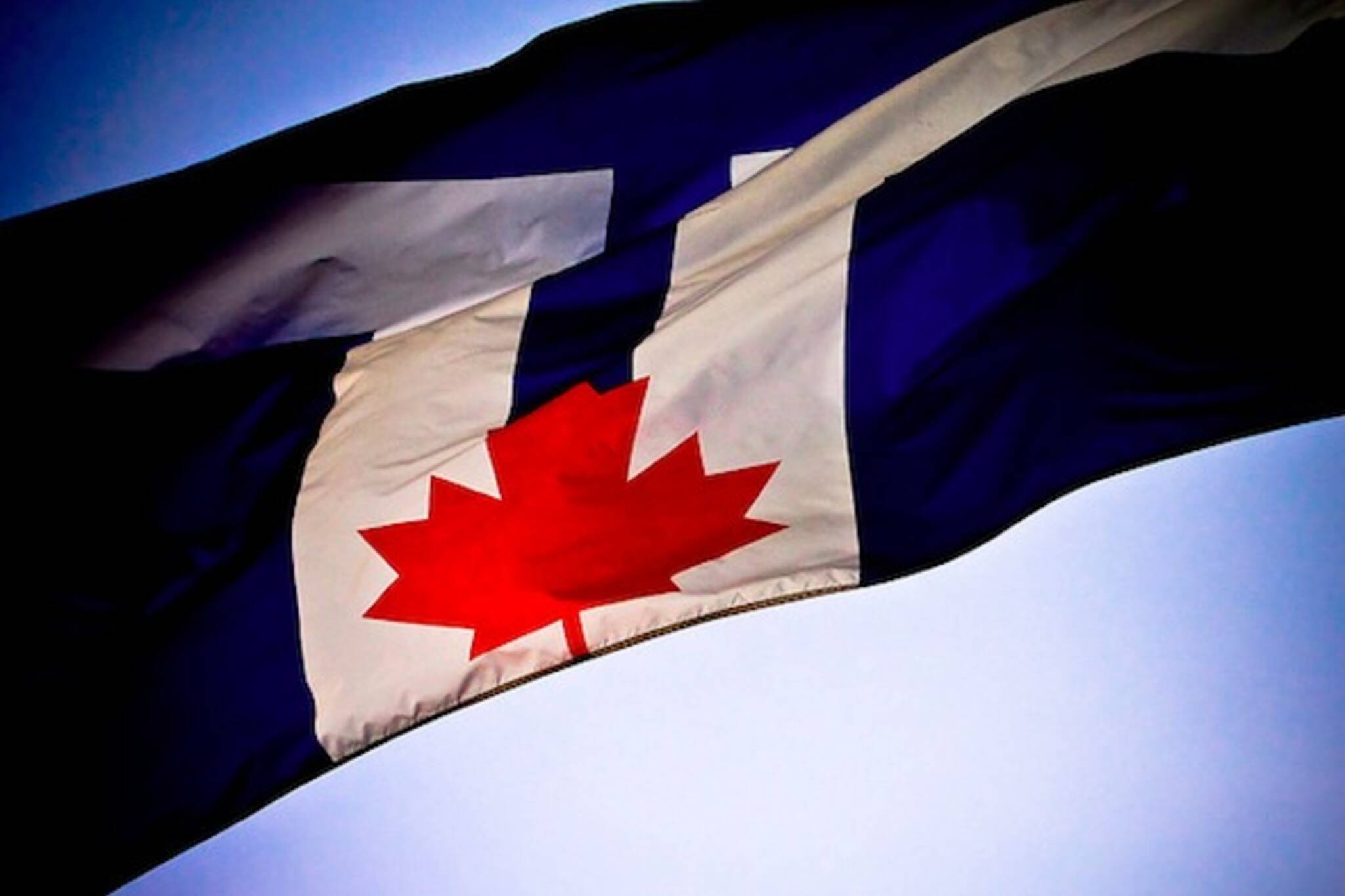
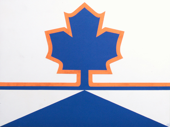
What the Toronto flag might have looked like
You can't tell to look at it, but the design of the blue, white and red city flag flying on Toronto's public buildings - always on the right when flown beside the provincial and national flag - is a competition entry from the 1970s submitted with close to 700 other hopeful designs.
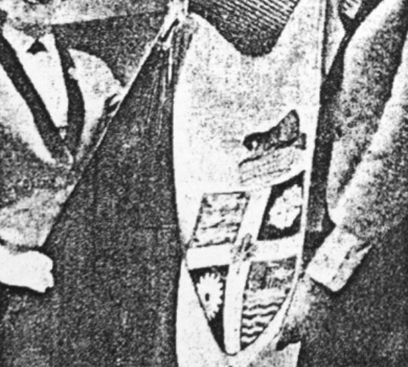
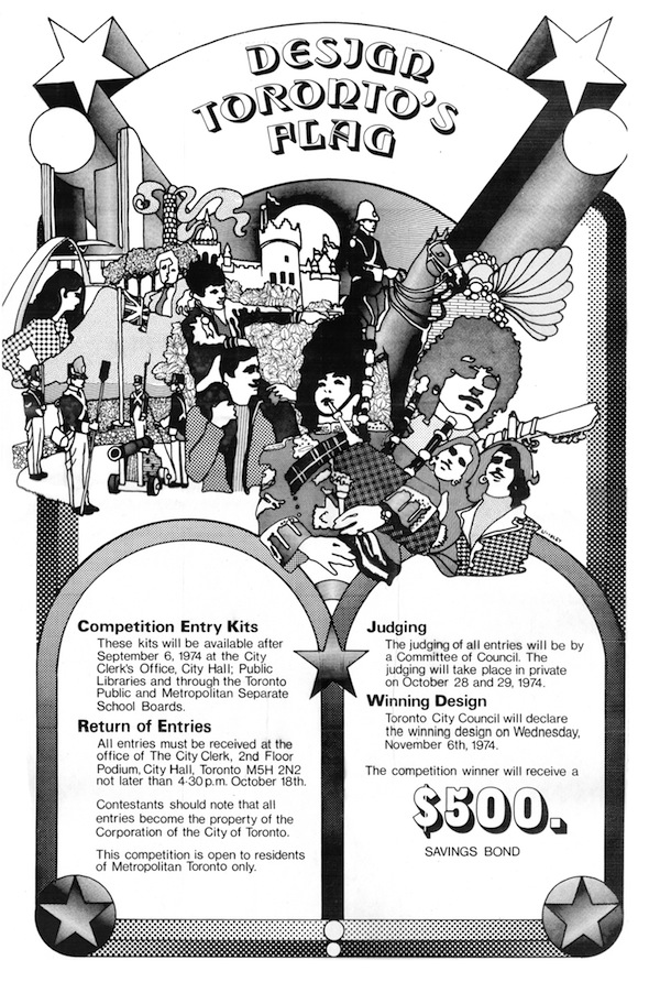
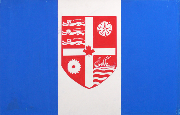
In August 1974, council, dissatisfied with the existing flag, assembled a five-member committee to come up with a bold new design that truly represented the city, its people and vision for the future. At the time, the flagpole at 100 Queen West flew a flag of the city crest (shown here between a Mississaugan man and Britannia) on a white background beside a blue column. Then Mayor William Dennison complained to the press: "It's not really a flag at all. It's just another way of displaying the city's coat of arms."
With city archivist A. R. N. Wouden leading the project, the committee decided to hold a public competition to find a suitable new image to represent the city. The rules were simple: any resident of Toronto could enter provided they submitted a viable design, an explanation of the motifs and a signed waiver to the image rights. The winner, selected by the committee and voted on by city council, would pocket a $500 Canada Savings Bond.
In the months the competition was open, city hall received over 700 applications from children, adults and design professionals. It's difficult to say what criteria were used — Wouden was extremely secretive about the project — but a document in the Toronto archives with marks next to each entry containing a maple leaf provides a hint at his thinking.
As you might expect from a public competition, the quality of the entries was extremely varied. Many young entrants decided to focus on themes of friendship, equality and optimism mixed with famous city landmarks. The newly completed CN Tower, City Hall, TD Centre and O'Keefe Centre (now Sony Centre for the Performing Arts) appear in various forms in many of the designs.
Flags submitted by adults tended to include the letter "T," city hall, and the colour blue — all things the winning entry would have - in abundance.
To ensure a level playing field, Wouden assigned each entry a number and locked the original entries in the basement of city hall with the archives. The committee didn't see any of the designs until the competition had closed. Meanwhile, vexillologists (flag experts to you and me), including Rev. W. R. Crummer of St. Michael's Cathedral, wrote to the committee to suggest the should flag remain simply the city's crest, of which Crummer wrote: "The colours are splendid, the heraldic symbols apt, and the whole has a professional and competent air about it."
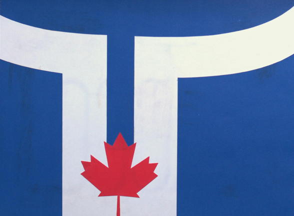
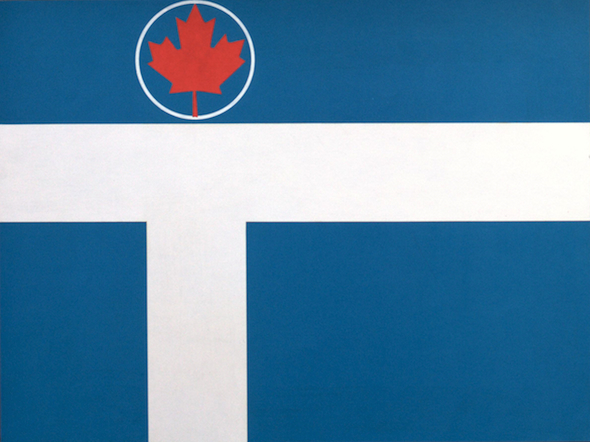
City council announced its unanimous decision on November 6, 1974, declaring 21-year-old Renato De Santis' blue, white and red design that included city hall, a letter "T" and, perhaps crucially, a maple leaf, the winner. His description of the white shape at the centre read: "T for Toronto, outline of city hall, diversity of streets in Toronto." The maple leaf is meant to double as the dome of city hall and, obviously, a symbol of Canada. A third year graphic design student at George Brown, De Santis was presented with his prize at a ceremonial flag raising outside city hall on November 7, 1974.
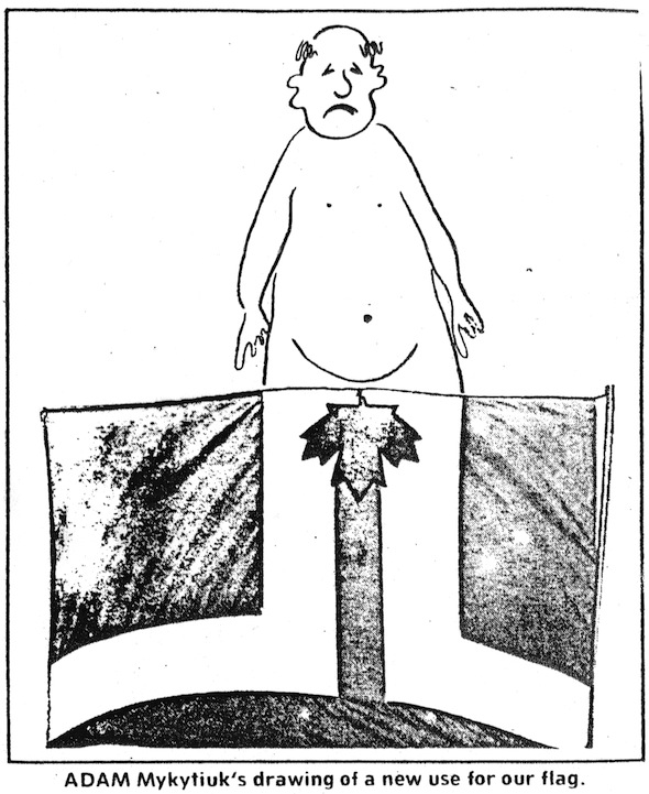
The new flag wasn't without its detractors. Adam Mykytiuk, a dissatisfied resident of Ellis Avenue, sent a cartoon to the Toronto Sun shortly after the raising ceremony showing how, if flown upside down, the flag looks like a pair of cartoon legs with a maple leaf covering the crotch. H. E. Skelton, a commander from the Toronto Power Squadron, a boating safety organization, claimed the flag looked strangely similar to their pennant.
The first copy of the flag, produced for free by Scythes & Company Limited, was stolen from the flagpole outside city hall and had to be replaced. Distribution of the De Santis flag to the various public buildings around the city was held up in Ottawa while the design was officially registered under the trademark act.
A second competition held 23 years later in 1997 to coincide with amalgamation failed to produce a new design accepted by city council. Instead, Renato De Santis suggested his flag be slightly altered to suit the new specifications and kept in place. A modified version of De Santis' design was approved in October 1999 and remains at the top of city flagpoles today.
Had archivist A. R. N. Wouden taken a shine to a different entry, who knows what we'd have for a flag today? Here are some of the best unsuccessful entries with some information about the artist and their original description of the design, where available. Let us know what you think of the entries. Could some of these have better represented Toronto?
Unsuccessful Toronto flag candidates
1) Vivian Beattie, 3rd Year - George Brown College. "Toronto (Blue + White) a city of people living and growing (out-stretched arms and circle) contributing to the identity of Canada (maple leaf)."
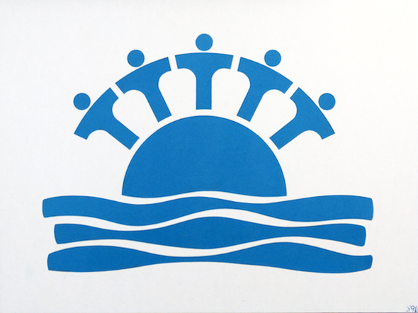
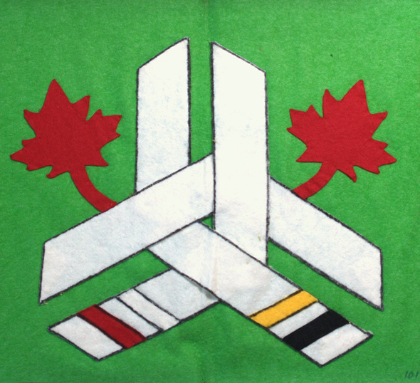
2) Bill Conner, 21, 2nd Year - George Brown College. "T-Shaped body forms represent people from all corners of the world living harmoniously in the city of Toronto. The semi-circular form on the water signifies Toronto's cosmopolitan aspect, as well as its connection by water to the rest of the world showing it as a main hub involved in all round-world communication."
3) Karen Birken, 21, 3rd Year Special Art Course - Central Technical School.
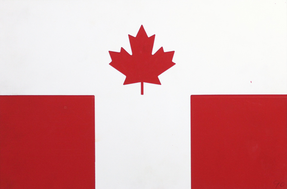
4) Lisa Cabral, 22, 3rd Year Special Art Course - Central Technical School. "Blue and white for Toronto's basic colours. A red shield signifying Canada, Toronto's shield because it is part of our heritage and its symbols stand for what Toronto represents."
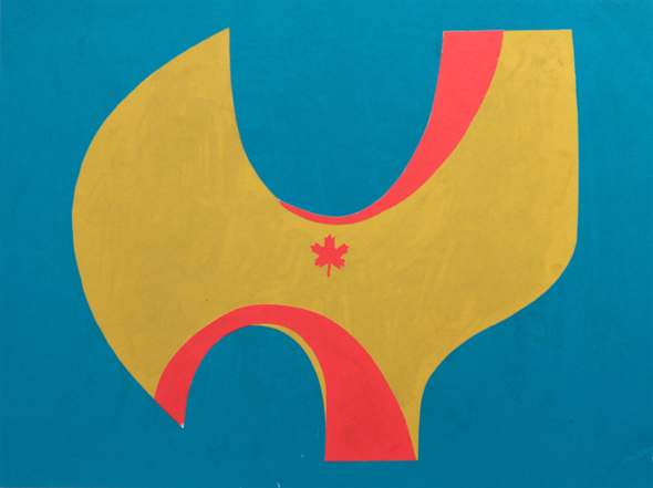
5) Gibson Gaye, 20, George Brown College. "I used the city hall because it is central and easy to recognise. City hall is white because it is clean and new. Blue symbolises Lake Ontario and the St. Lawrence Seaway which leads to the sea and other countries. Green is Toronto itself and the rest of Canada.
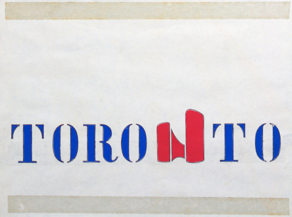
6) Menahem Mendel Greenberg, 26, 1st Year - School of Architecture. "The design consists of the word Toronto as a picture. It is bold. The type I used for the word Toronto has been in use for many years and will not be dated."
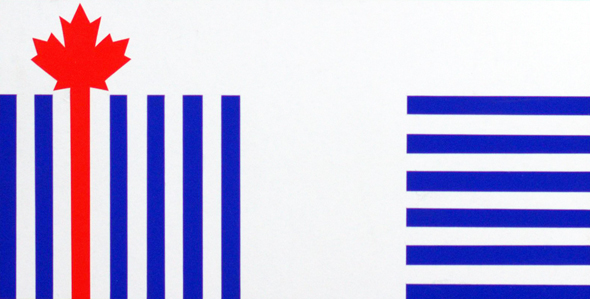
7) David How, resident of Toronto. "The basis of this design is the letter "T" over which is laid two series of lines. The right horizontal ones depict water, on which we are situated. The left verticals signify the growth and development of Toronto, combined with Canadian identity. The lines in conduction are a "coming together" which is the translation of the word Toronto."
8) Margaret Martin, 20, 3rd Year Graphic Design - George Brown College. "My design is based on the Indian word "Toronto", meaning meeting place. The curves represent stylised crossroads which lead into the centre of the city hall."
9) Frank W. McNair, resident of Toronto.
10) Anna Myers, resident of Toronto. "Toronto is a growing and thriving city that is developing its own individual personality. The flag that has been designed represents growth, individuality and prosperity. At the same time the flag does not isolate Toronto from Ontario or Canada.
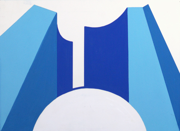
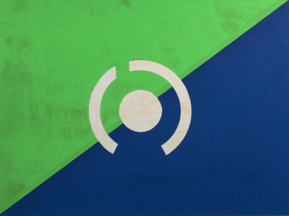
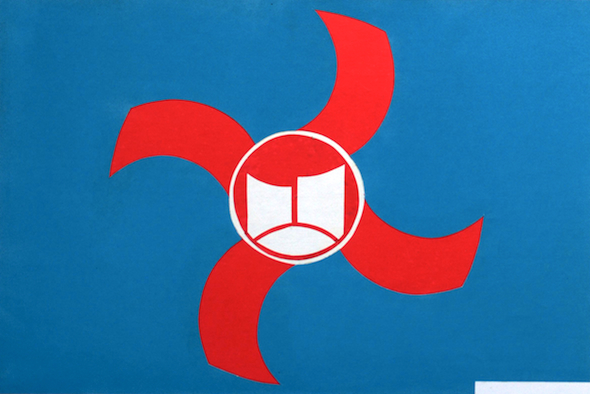
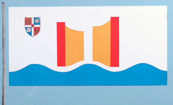
11) Brigitte Pfau, 19, 2nd Year - George Brown College. "The archer was bought by the people of Toronto and shall remain with us forever. New city halls will always be built and with it will stand the "archer." It represents us "the people" and that's what Toronto is all about."
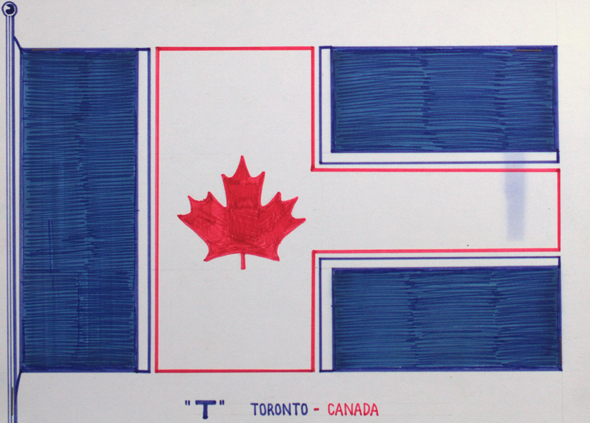
12) Sam G. Pupo, resident of Toronto. "Theme: "T" - Toronto, Canada. Bold "T" white with red border - a modern, vibrant city with plenty of human colour. Red maple leaf - a strong, bright Canadian city. Blue - bordered by plenty of fresh water for recreation and economy."
13) David Wa, 34, resident of Toronto. "Green area represents the curve shape structure of city hall. White area is alphabet "T" - the first alphabet of the word "Toronto"."
14) James Peter Honor, resident of Toronto. "The colours are the same as the existing city of Toronto shield, which is placed in the upper area closest to the staff [pole]. The wave base indicates movement as well as showing Toronto as being an important great lake port and having growing waterfront recreational and residential facilities. The city hall is symbolised as it is the seat of government for the city of Toronto. The red bars show an affinity with the Canadian national flag, red and white being the official colours of Canada, gold indicating wealth in people, industry and intelligence.
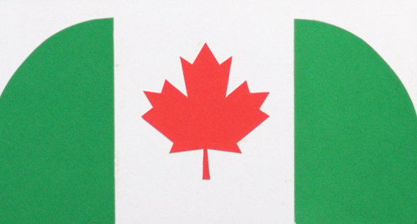
15) Joyce Wong, 22, 2nd Year - George Brown College. "White - faith and purity, blue - piety and sincerity, orange - strength and endurance. Design consists of water, land, horizon, sky and maple leaf."
The best of the kids' entries:

16) Vincent Finnegan, 8, Grade 3 - St. Mark's. "The red stands for Canada. The tower stands for our country. The tower stands for people."
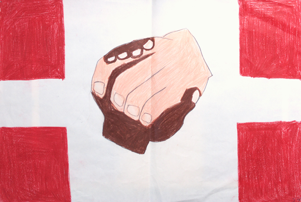
17) Hara Zalzal, 10, Grade 5 - St. Brendan School. "Indian and settler's hands symbolising "meeting place" the Indian meaning of Toronto. Squares - if you take them away you will have a cross so may God be with Toronto. I coloured the squares red because that is an Indian colour."
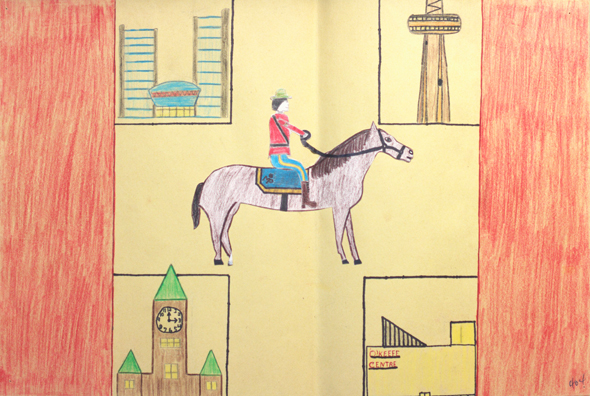
18) Michel Senecal, 12, Grade 7 - St. Martin de Porres. "I have the two sides in red which represents the sides of the Canadian flag ... my symbols of Toronto show Toronto is in Canada. The mounted policeman is just a symbol of the oldest police force in Toronto. The other symbols are four of the many sights of Toronto."
19) Laura Murray, 9, Grade 4 - Allenby School.
20) Marcia Minott, 14, Grade 8 - Winona Sr. School. "This flag is representative of Toronto - composed of many different cultures and nationalities but coming together to form one united country."
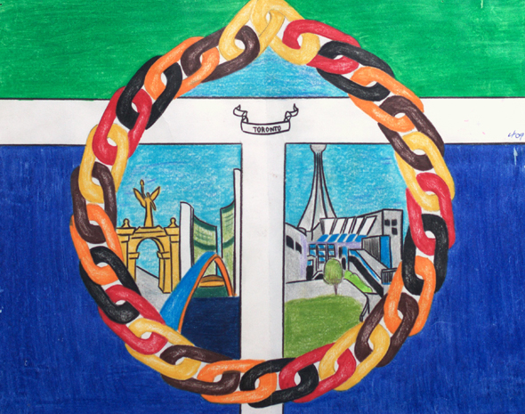
21) Denise Guillemette, 13, Grade 7 - St. Martin de Porres. "The chain is a symbol of unity - the colour in the chain represents different races. The large white "T" symbolises peace. T is capitalised because it is the capital of Ontario. Blue of the base represents Lake Ontario and the green on the top is for the green parks in Toronto."
Lead image by Alexindigo in the BlogTO Flickr pool. Flag cartoon from the Toronto Sun, November 14, 1974. All other images from the Toronto Archives. Thanks to Paul Sharkey for helping locate these images.
Latest Videos
Latest Videos
Join the conversation Load comments


