Saturday, May 18, 2013Mostly Cloudy 20°C
Tech

Local startup Vizualize.me reinvents the resume

Posted by Staff / July 6, 2011

visualize meVizualize.me, a local startup, is riding a wave of public interest after winning first prize at the Toronto Startup Weekend last month. The web-based app takes user data from LinkedIn and turns it into a customizable infographic. At long last, employers can read about your typing speed in a tastefully-rendered flowchart complete with Helvetica typeface.

Eugene Woo, CEO of Vizualize.me, brought his idea from concept to reality in only a few short months with the help of his seven-member team. "We do live in the age of data overload," he says. "We're constantly assaulted by text and images." After seeing Chris Spurlock's visual CV go viral in February (and landing him a job at The Huffington Post in the process), Woo saw an opening.

"I thought: we could automate this," he says in reference to Spurlock's innovative resume. Other obligations, including another startup he was working on at the time, kept Woo from capitalizing on his idea immediately, but he continued to work out the details of his concept
until the end of May.

On June 3rd , the opening night of Toronto Startup Weekend, he pitched his idea to attendees by printing it on a t-shirt. "I think I called it 'Resume Graphics' or something like that," he recalls. "I put it on a t-shirt to show the idea that this was about visual information."

The following day, Woo formed a team and created a website. By Sunday, Vizualize.me had gathered 3,000 signups, 20,000 views, and won first prize of the weekend. Woo credits his team's early success to the support of his fellow entrepreneurs in the Toronto startup community. "From my point of view, the Toronto scene definitely has helped," he says. "It's a great group of people, very active...doing lots and lots of stuff."

Visualize.meAs of this post, the site has around 30,000 unique users signed up for the service; a number that is made even more impressive by the fact that Vizualize.me has no active marketing to speak of. All of their traffic comes from local interest, blogs and word-of-mouth.

The site will enter a private beta phase within the next two weeks, and Woo plans to have a full public beta running by the end of the summer. Signing up to the site now gets your name on the list, and sharing the link with your friends (also known as "The FarmVille supremacy") moves you up the list.

As the popularity of Vizualize.me grew, its target demographic changed. "We started targeting creative professionals, but right now the target is anyone," says Woo. "Any professional that has an online presence with LinkedIn."

Once a user has synced up Vizualize.me with their LinkedIn data, they can customize the template, layout, colour scheme and typeface of their infographic. Woo hopes to add drop-in functionality, so users can upload their resume as a document file and have it automatically converted.

Woo even says that a long-term goal of his team is to allow users to even run their Facebook data through Vizualize.me, but he realizes that they have a long way to go before they can climb Mount Zuckerberg.

Vizualize.me provides a welcome opportunity to bring colour and personality to the Microsoft Word-dominated world of resumes. Spurlock's story proves that employers are willing to give creative applications the time of day, so why not give your battered CV the summer makeover it deserves?

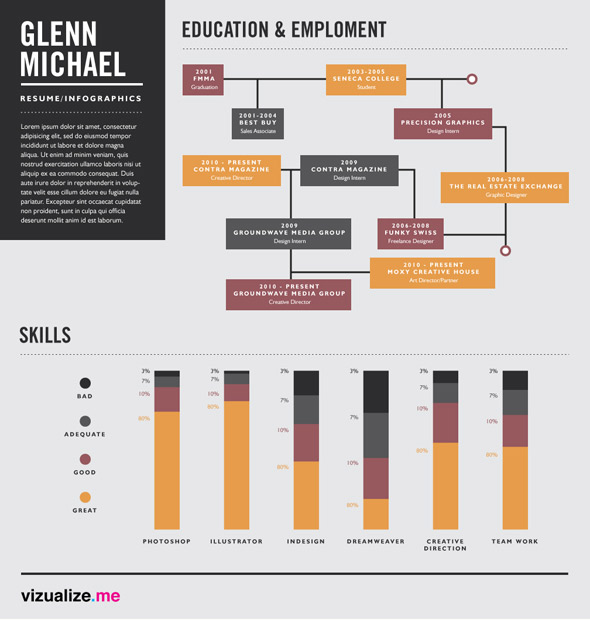
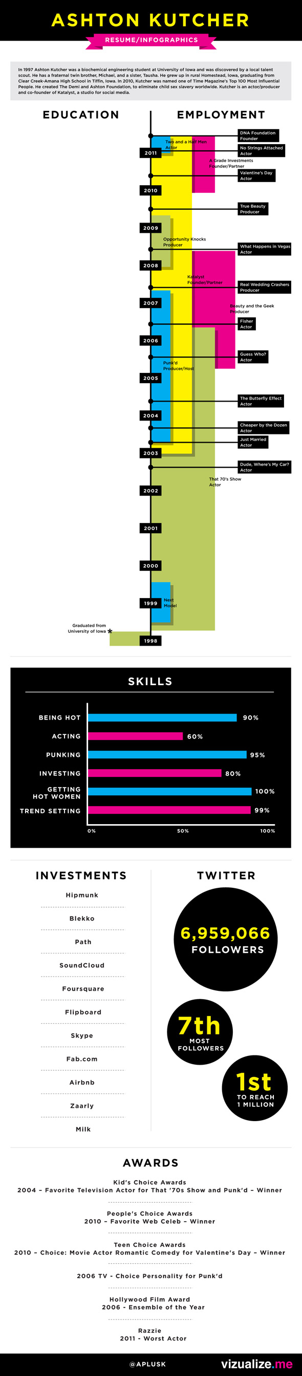
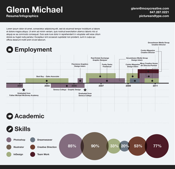
Writing by Mike Scholars. More samples of Visualize.me resume infographics below.

Visualize.me infographicvisualize.me

Discussion

15 Comments

neonshaun / July 6, 2011 at 10:23 am
user-pic
Skills: making cluttered resumes that are hard to read.
Max / July 6, 2011 at 11:33 am
user-pic
Eugene, we're really proud of your work so far. We look forward to seeing you put a major mark on the Toronto tech community and let the world know we're doing great work.

Keep visualizin'
RBeezy / July 6, 2011 at 11:36 am
user-pic
Interesting.
Neil / July 6, 2011 at 12:37 pm
user-pic
I think it is time for the old resumes to die a slow painless death.
Diego / July 6, 2011 at 01:01 pm
user-pic
This is such a stupid idea. Remarkably bad.
Max / July 6, 2011 at 01:31 pm
user-pic
@diego - What's your startup buddy?

;)

Fool replying to a comment from Diego / July 6, 2011 at 01:48 pm
user-pic
@diego - it's ok, people like you who can't think outside the box won't benefit from it anyway.
Dave / July 6, 2011 at 02:06 pm
user-pic
I don't get it.

Sure, for a graphic artist, using the resume to showcase your design skills makes sense. But when you had nothing to do with the design, which was churned out, along with 30,000 others, by a Web site? What does that demonstrate? How would that qualify as "creative" in anyone's books?
Max / July 6, 2011 at 05:07 pm
user-pic
@Dave,

I don't think the point is for anyone to think the resume owner is responsible for the graphic design of their resume. I think the point is to find a better way to visualize data relating to your professional experience. By presenting this data in a more appealing and understandable way, you're making it easier for potential employers to evaluate your skills.

If you own a restaurant and hire a graphic designer to work on your menu, should your patrons spank you for not designing the menu themselves?

Max

SmarterCommunities / July 6, 2011 at 09:35 pm
user-pic
Great design makes a difference, but this kind of design is just fluff. It dumbs down what's important for a recruiter / employer - to the point of just being useless. When I hire someone - I want to know far more detail about whether the person can actually string words together, organize content, and articulate important points. A clever visual display should make a difference, and this kind of graphic design reminds me of really bad corporate annual reports that deceive shareholders and hide any useful details or real content. A strong resume is not just fluff. A candidate that needs this much help to make their resume attractive is likely a really poor candidate who won't perform well.
ife / July 6, 2011 at 09:38 pm
user-pic
I think Ashton Kutcher's 60% score for acting is a little high...
Josh / July 6, 2011 at 10:00 pm
user-pic
Is this supposed to make people look more interesting than they actually are? Fluff Design and graphs just hide hide the real facts and display some colorful shyte.
Greg / July 7, 2011 at 09:36 am
user-pic
Innovation in the area of resume writing and presentation is always welcome provided employers embrace change.

Anything that helps employers and recruiters quickly determine a job candidate's strengths and interests ... has merit.

Good luck!
Daryl / July 7, 2011 at 09:39 am
user-pic
Way to think outside the box! As a recruiter though, it's too abstract and hard to read.
Evan replying to a comment from Daryl / August 3, 2011 at 03:50 pm
user-pic
I think regular resumes are abstract and hard to read. I've seen a lot or resumes and have never seen one that really illustrated anything about the applicant. You find out a job or two that they had and that's it really it. I think if you were willing to invest a bit of attention in reading these resumes, you'd find you can learn a lot more about the applicant. Needing to have a traditional resume just because it's the norm is unnecessary.

Add a Comment

Other Cities: Montreal