
TTC unveils new system map and stop poles
The Better Way is working on a better map. A series of new London-style TTC maps and reworked stop poles are currently being rolled out on the 94 Wellesley route with an eye toward making the new designs a fixture system-wide.
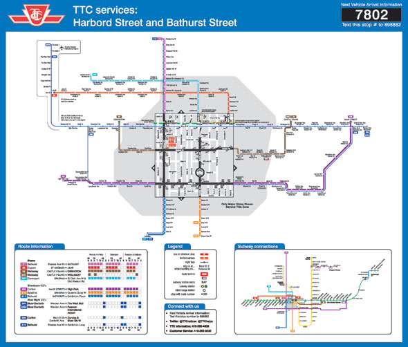
The re-worked maps (high resolution verion here) strip away the clutter of the existing design and opt instead for something closer to the classic London Underground look that's proved popular with other transit agencies for its simplicity and clean lines. A recent presentation by the TTC noted that the current maps, located in subway stations and in existing outdoor shelters, are "very cluttered" and "lack critical information."
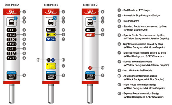
Some of the notable changes include the use of the system's famous font to label subway stations and the addition of a new "you are here" marker, something that's sure to help infrequent riders and visitors to the city. Extraneous information included on the old maps - the region's rivers, major highways, shoreline, etc. - is banished.
Executive director of corporate communications Brad Ross says making surface routes easier to navigate and including alternative routes where they are available is part of the TTC's new focus on customer service.
The TTC expects to have its revised hardware rolled out on the Wellesley route between Castle Frank and Ossington by Friday. On-street interviews and online research will help determine if the new look is successful and if any additional changes are needed. What do you think? Will new maps make it easier to navigate surface routes?
MORE IMAGES:
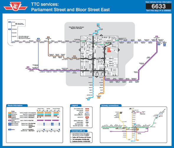
Parliament Street map with key (
)
Harbord Street map with key (
)
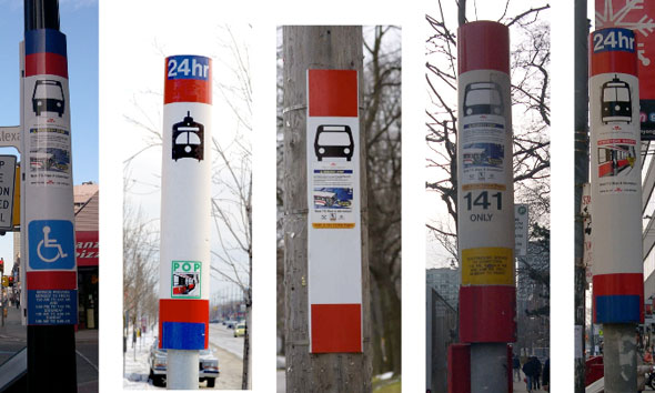
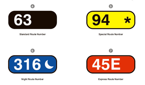
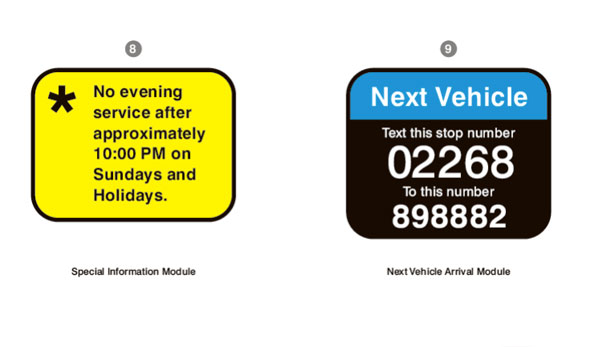
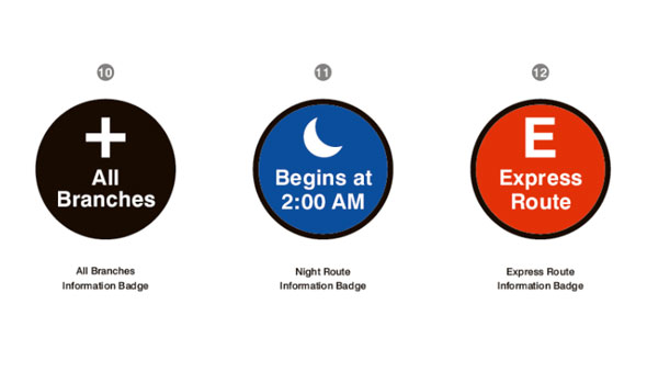
The existing versionClose up of the new stop pole badgesSimplified messagesClearer information on service levelsExisting bus and streetcar stop poles
Chris Bateman is a staff writer at blogTO. Follow him on Twitter at @chrisbateman.
Images: TTC


