Saturday, May 26, 2012Mostly Cloudy 24°C
City

The changing face of the Maple Leaf Gardens marquee

Posted by Derek Flack / November 28, 2011

Maple Leaf Gardens Marquee
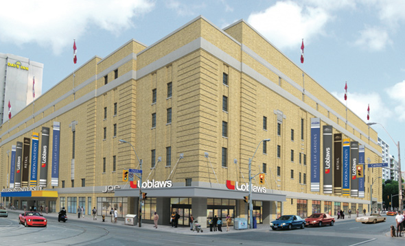
With Loblaws about to open up shop at Maple Leaf Gardens, there's been a flurry of activity around the site in preparation for the formal repurposing of the old arena. Some of this has been a bit disappointing — e.g. the loss of the blue maple leaf logos from the building's domed roof — but the most recent addition should be cause for a small celebration.

Instead of restoring the 1990s-era marquee running along Carlton Street or going with something new altogether, E.R.A. Architects decided to revert to the signage that graced the Garden's about a decade after it opened in 1931, which emphasizes the building's art deco roots. Thankfully, the marquee also still bears the name "Maple Leaf Gardens," even if Ryerson can't officially refer to the building as such.

"The original canopy from 1931 did not include the lightbox... (which was added in the following decade), and the marquee has been subsequently modified numerous times over the life of the building," writes Project Architect William McIvor in a blog post about the marquee. "It was decided in consultation with municipal staff from Heritage Preservation Services to restore the signature element to its iconic, longest-running version; the one which is most clearly defined in the public consciousness."

I tend to lament the loss of Toronto's heritage structures on a regular basis, so I thought it worth noting that once in a while this city does manage to preserve some of its heritage. It might not be perfect, but little steps like this go a long way towards ensuring that Toronto retains a healthy connection with its past.

Here's a look at the marquee over the years.

Maple Leaf Gardens 1950s
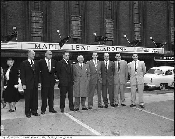
Outside the Gardens, 1950s

Maple Leaf Gardens 1977
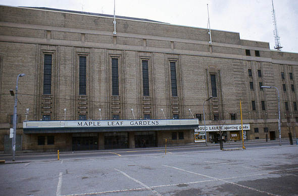
MLG in 1977 (with the 1940s-era marquee in place and the typical Toronto parking lot across the street)

Maple Leaf Gardens
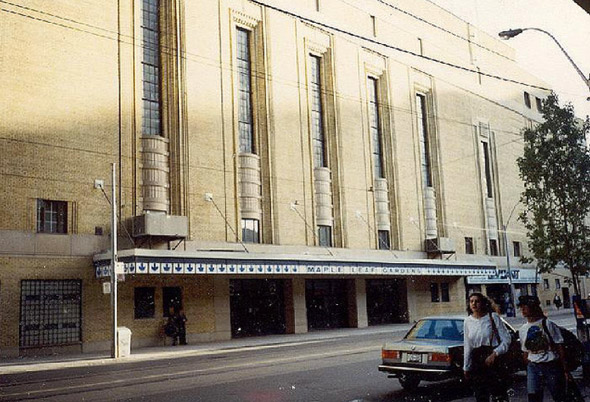
The marque at its ugliest in 1992

Maple Leaf Gardens
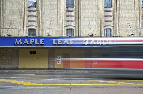
The last version of the marquee when the Leafs still played at the arena

Maple Leaf GardensLeft side: what it might have looked like (barf)

Maple Leaf Gardens
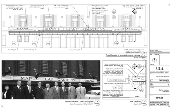
E.R.A. design for new marquee based on archival photos

Maple Leaf Gardens
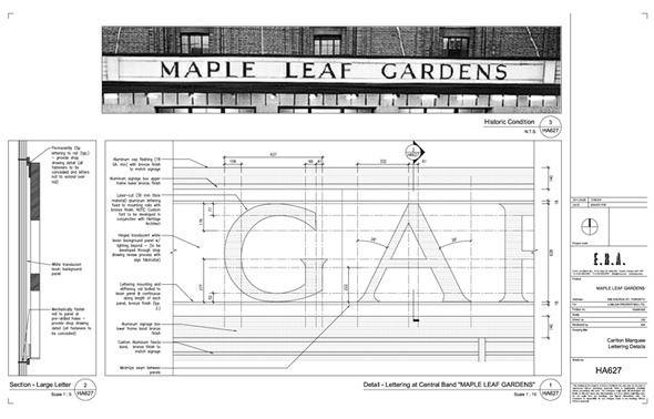
A closer look at the font

Maple Leaf Gardens
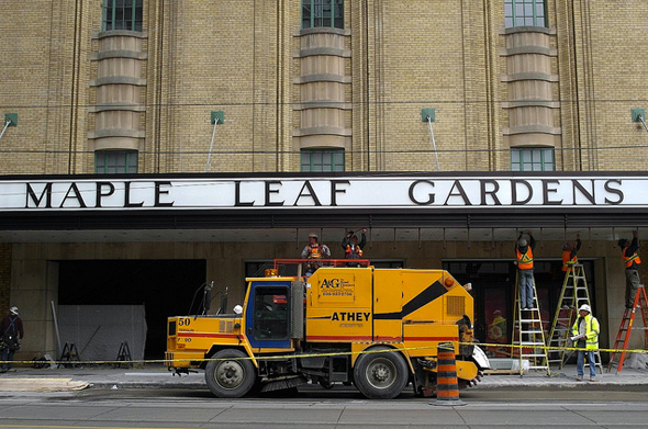
The finished product
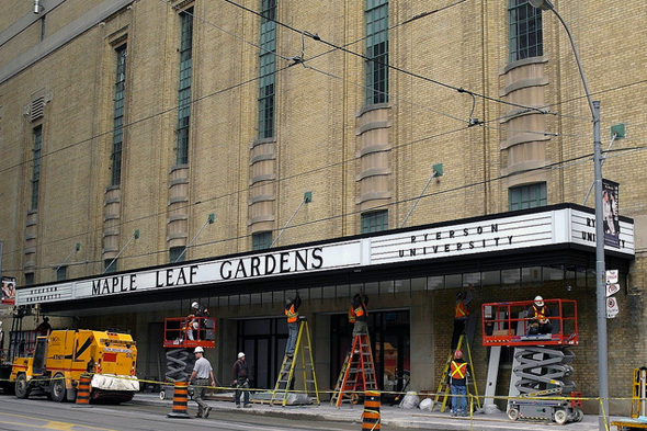
Maple Leaf GardensAlternate angle

Update (8:05pm):

Success! I found a direct photo from the 1970s, which confirms that the marquee was unchanged until then (and perhaps beyond). I have placed it in the timeline above. Photo credit goes to mcwidi_2 on Flickr.

Photos (in order) from the Toronto Archives, ekpei.ca, twurdemann, ERA Architects, and PLTam

Discussion

21 Comments

Colin / November 28, 2011 at 03:28 pm
user-pic
I biked by this as they were installing the sign last week. I couldn't believe it, they did a really great job. Looking forward to seeing the building's interior!
Kieren / November 28, 2011 at 03:41 pm
user-pic
I'm going to nerd-out here, but every time I see Loblaw's ads for this location and now this sign I think, "Welcome to Rapture."
Bill / November 28, 2011 at 03:56 pm
user-pic
Finally a big development in T.O. gets the type and signage right. Or at least no incredibly wrong.
hop replying to a comment from Kieren / November 28, 2011 at 03:58 pm
user-pic
Would you prefer it if they tore down the entire building to make a Loblaws/condominium complex that looks same/similar to all the other new developments popping up in the city?
FC / November 28, 2011 at 03:59 pm
user-pic
RE: your tweet seeking input on the typography, the font choice is a little odd. I find the line widths vary too much - far more than the archival reference (or even the technical drawings) seem to indicate. The font looks weak - parts (like on the A and N) will start breaking up if blurred or viewed at a distance.
FC / November 28, 2011 at 04:01 pm
user-pic
With that said, it's a nice touch that they decided to reference the marquee of old at the very least.
ian / November 28, 2011 at 04:07 pm
user-pic
any photos of it from the '70s and 80's -- i remember somthing pre-92 that didn't look quite like the vintage one...
cobyrne / November 28, 2011 at 04:09 pm
user-pic
I applaud what they're going for here. To me it looks like a pretty accurate recreation of the old sign. But in a way they've been too close to the original because it carries over all the poor type of the old sign.
As was said, they line weight variation looks odd, but worse the kerning is off and the curved letters are very poor. The P, R, D and S all look pretty wonky.
That said, I'll repeat, the intention is good and overall I like it.
Derek replying to a comment from ian / November 28, 2011 at 04:19 pm
user-pic
Although it's hard to believe, there really aren't that many photos of the MLG exterior floating around. Most of what's been digitized at the Archives depicts what's going on inside the building. Having said that, the lead photo is from the 1970s, and it looks like the marquee is similar to the one in the 1992 photo. If anybody has insight into this or additional photos, I'd love the feedback.
McRib / November 28, 2011 at 04:20 pm
user-pic
any odds on MLSE forcing the changing of the name on the marquee?

those bastards.
Hamish Grant / November 28, 2011 at 04:23 pm
user-pic
All you haters gotta get on the nostalgia tip here... things weren't perfect back then but they weren't meant to be. The 'look' of the typeface is deliberate and the new sign does a terrific job of bringing it back. It wouldn't look right if it wasn't 'imperfect'. This isn't the Blue Jays Logo.
Gloria replying to a comment from hop / November 28, 2011 at 04:34 pm
user-pic
I don't think you got Kieren's reference.
Kevo replying to a comment from hop / November 28, 2011 at 05:40 pm
user-pic
@Hop - LOL, he was joking. There's a game called Bioshock that takes place in an underwater city called Rapture and many of the buildings are Arc Deco in style: http://en.wikipedia.org/wiki/BioShock#Related_media (See pic at right for example).

I like the outside of the building - they seemed to have cleaned it up nicely I like how they replaced the sign as they did, as it looks really classy with the Ryerson University beside the large logo.
Mike / November 28, 2011 at 05:46 pm
user-pic
Love it! Now we can shoot a period movie about Toronto, just run an old street car in front! Yes I work in film.
Tracy / November 28, 2011 at 07:12 pm
user-pic
I'm glad that they actually kept the name Maple Leaf Gardens. and the new (old) marquee gives the building it's original look back and looking at the rink looks like a scaled down version of what the rink used to look like. So well done Loblaws and Ryerson, I can't wait to see what it looks like.
Tracy replying to a comment from McRib / November 28, 2011 at 07:16 pm
user-pic
i wouldn't put past them they would do anything to screw the little guy
Adam Sobolak replying to a comment from Derek / November 28, 2011 at 07:20 pm
user-pic
Actually, Derek, the early 70s marquee looks more like the original than the 1992 version.
Derek replying to a comment from Adam Sobolak / November 28, 2011 at 07:50 pm
user-pic
Yeah, I noticed my error earlier, but haven't had the chance to re-comment until now. It would seem the semi-original marquee was around at least into the 1970s when the Rolling Stones were in town.

http://www.efootage.com/stock-footage/25940/Rolling_Stones_Fans_-_1970s_-_2/

I used to own the book the "Memories and Dreams" book the Leafs issued when they moved to the Air Canada Centre, but I donated it when I last moved, a decision I now regret.

Thanks for the correction.
Fergie / November 28, 2011 at 08:02 pm
user-pic
Nice job on the marquee!
Dave / November 29, 2011 at 10:14 am
user-pic
Love it. A great nod to the history of the building.

Can't wait for the grand opening tomorrow!
Dan Levy / November 29, 2011 at 06:22 pm
user-pic
the picture of the last marquee before the Leafs left the Garden by twurdemann is a fantastic shot. Wish it had been taken before they boarded the place up but either way it's SWEET! The way the streetcar is blurring past, amazing.

Add a Comment

Other Cities: VancouverMontreal