
What Toronto-based newspaper websites looked like a decade ago
Here's a fun way to waste a few minutes. Go to the Wayback Machine Internet Archive and pop in a few of the major websites that you visit on a regular basis. The results should lead to a bit of nostalgia and certainly a smile or two. For me, the archive searches that are the most fun involve those sites that have 1.) been around for a long time (obviously) and 2.) undergone radical change over the duration of their existence. Needless to say, Toronto-based newspapers certainly fit this bill.
I'm by no means a web designer, but it's not hard to tell that there's been a significant evolution in the way that the mainstream media displays news. Along with the heavy reliance on the left sidebar, in the past images were either small or non-existent, and the layouts just looked painfully boring. But that's not really a criticism so much as an observation of how much things have changed -- and for the better. I may not be a fan of the current designs of all Toronto-based news sites, but to say that they've improved over the years would be an enormous understatement.
Here's a quick glimpse back into a past when newspapers didn't really have to worry about the web so much. If it proves interesting, I'll grab a few more captures from various redesigns to show how they progressed over the years (though the Globe recently did this for their publication after their last redesign).
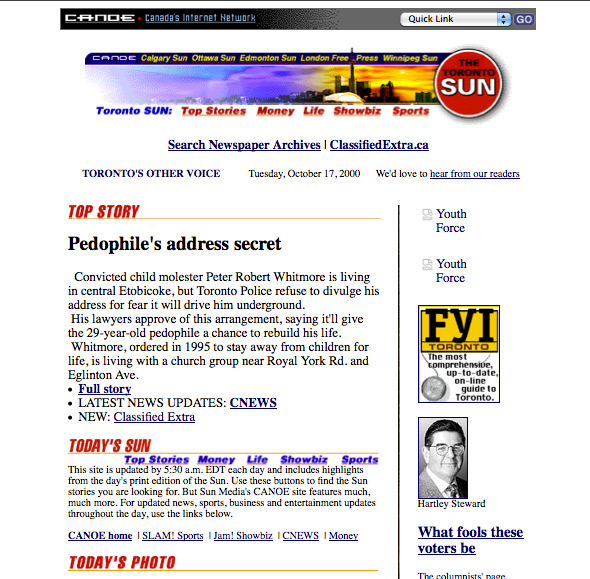
2000
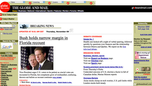
2000
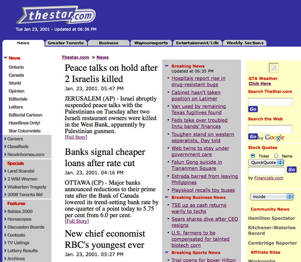
2001
The lead image depicts the National Post's website in 2002.


