The new look TTC (sort of)
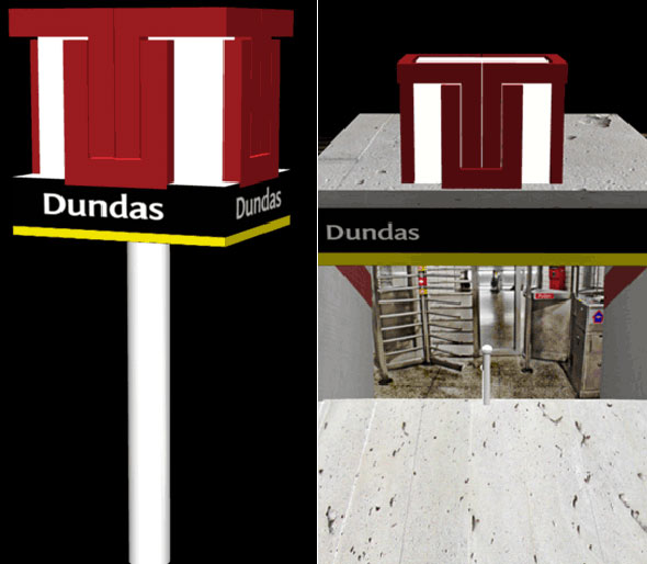
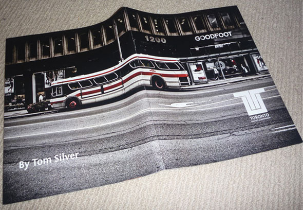
A student in Sydney Australia has come up with a plan for a totally re-branded TTC. After researching transit systems throughout the world, Tommy Silver decided the TTC was "anything but a proud representation of Toronto." So he gave it a major overhaul.
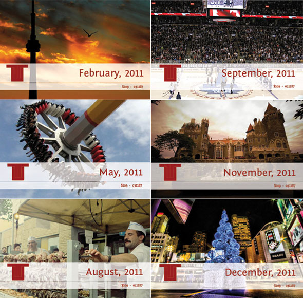
Silver made the logo angular and sleek, based on the Toronto City Flag, City Hall, and the shape of the subway map. His redesigned metropasses feature images of the city, specific to the particular month, and he completely overhauled the website. Citing "too much information," he stripped the site down to the basics and incorporated an iconic Toronto photo as the background.
His plan is featured in detail on Brand New Classroom, a division of UnderConsideration that features student work from around the world.
We like?
A before and after view

The logo guidelines

A promotion piece
The TTC Calendar
New signs at stations and bus stops