City
St. Lawrence Market North building designs are unveiled
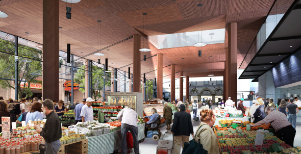
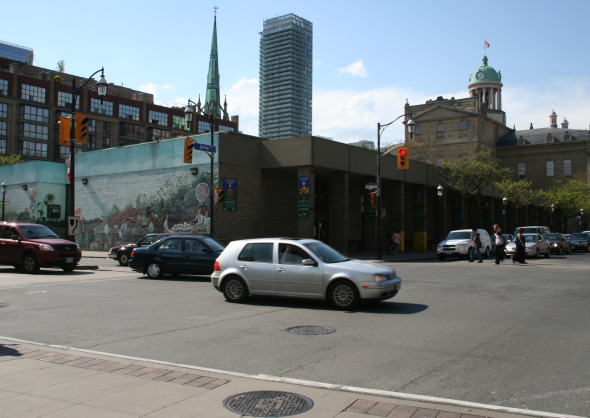
One of the best places in the city to get organic produce is the farmer's market in the St. Lawrence Market North building. While the inside of the building has a lot to offer, its bunker-like appearance makes it a poor companion to St. Lawrence Market South on the other side of Front Street. But big - and exciting - changes are coming to the St Lawrence Market North building.
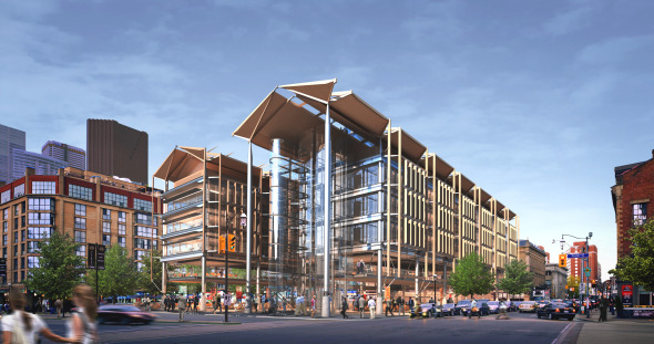
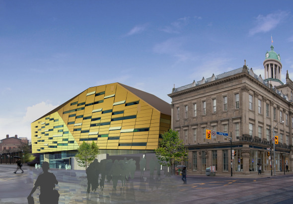
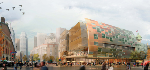
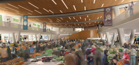
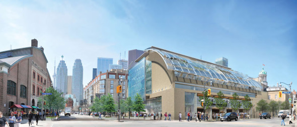
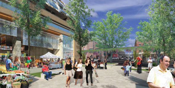
Led by community groups who wanted to see the North Market revitalized, the city launched an international design competition for a new North Market last year. The competition called for a building that will house the farmer's market on the ground floor, a mezzanine level that will include retail, and three additional floors for court services. A fifth floor for the mechanical components of the building will also be allowed. According to the competition's guidelines, the new building will have to integrate the nearby Market Lane park, and "respect" the neighbourhood's design context. The building must also include obvious environmental/sustainable features.
After the call for submissions was made last year, the city received thirty responses, which they have since cut down to a list of five. The list is mostly Toronto-based, but has the surprise inclusion of Richard Rogers' firm.
Rogers is one of the leading British architects of his generation. His most famous buildings are the Lloyd's building and the Millennium Dome. Rogers' firm is in partnership with the Toronto-based Adamson Associates Architects. The rest of the nominees are Cohos Evamy and Hotson Bakker Boniface Haden Architects, Kuwabara Payne McKenna Blumberg Architects, NORR Limited and Taylor Hazell Architects with Montgomery Sisam.

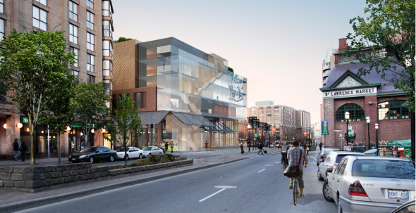
To level the playing field, none of the short-listed designs are identified by name. Instead, they have been assigned a colour: red, green, blue, yellow and orange. All of the designs are distinctive, and some push the boundaries of the competition's guidelines. For instance, the brief suggests that the winning design should "respect" the neighbourhood's heritage context. Clearly, some of the proposed designs look nothing like the surrounding buildings. Interpreting exactly what "respect" means in this context will be the difficult job of the jury.

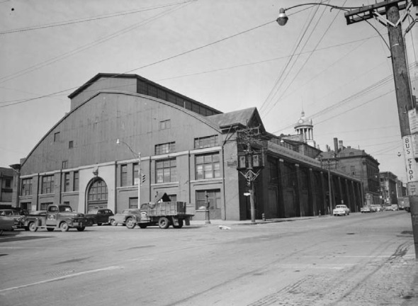
When the new building is completed, it will be the latest of a series on the site. The Great Fire destroyed a portion of one of the original buildings on the site in 1849, and it was rebuilt in the years following. In 1904, the building was rebuilt again in a form that resembled the market building to the south. There was even a metal canopy structure that protected pedestrians who wanted to walk between the buildings. The canopy was removed in 1954, and this version of the St Lawrence Market was torn down in 1968, at the height of the city's demolition-as-urban-renewal phase. The brutalist structure we have now was built in that year.

After the jury has made its choice of the winning submission in June, the current farmer's market and antiques market will be moved to a temporary location at 125 Esplanade. Construction of the new building is expected to start in early 2011, and will be completed by 2014.

The short list of proposals can be viewed in full on the city's website. If you would like to see them in person, there are displays and models being shown in St Lawrence Hall on the third floor. The presentations at St Lawrence Hall will be open today, Saturday May 8th, from 8 a.m. to 4 p.m., or Sunday May 9, between 9 a.m. to 5 p.m.
Further information about the contest can be found on Councillor Pam McConnell's website
Which design do you think is the best?
Images in order by Red, Blue, Yellow, Orange , Green, plus archival and current photos of the North building.


Discussion
36 Comments
Sort By Oldest First / Newest First
Subscribe
The rest are uggggggggggly.
Did no one understand the appeal of the south building or even think of taking a cue from it?
Of the five designs presented, Yellow most successfully achieves this in my view. It harmoniously connects the St. Lawrence Hall and South Market, provides a deliciously appealing, welcoming personality to the neighbourhood. It is elegantly beautiful and modern but doesn't forcefully steal attention. In this way it is polite and supportive - qualities which would not always be desirable in architecture but which are fundamentally important in this context.
With its breathtaking interior market illustration looking toward the St Lawrence Hall, red too has tremendous appeal but I feel that it's overall form is too tall, too imposing. If it were one story shorter, I might love this design.
Despite some individual merits like orange's inspired use of copper, the others are all far too hulking, too obvious, too demanding. Rather than supporting the South Market and St. Lawrence Hall or creating a harmonious whole, their presence seems to overwhelm their more important neighbours.
Orange definitely stands out for me. Its nods to the past aren't obvious initially but the idea of a contemporary pathway using form and colour are quite clever. It's pulled off with a proposal that is new and interesting which civic buildings should be.
A neighbourhood that is as historical as this one can maintain its vibrancy by including such high standards as this project seems to be. By being too concerned with overshadowing the other buildings in the neighbourhood you really risk building something that would be torn down in another 20 or 30 years like the structure that's sitting there today.
I really hope the judges see the potential of the site to be something more than just another building in a wonderful neighbourhood, but another wonderful building in a wonderful neighbourhood.
The many quick reactions to Green as best "matching" the existing south building ignores the awful blandness of the design, its suburban rec-centre look and its blank concrete bunker corner. Besides, it already looks dated, like a Ryerson building circa 1992.
I think many are looking at the idea of "respecting the neighbourhood" a bit too literally. The respect comes through the scale of the new building and its street front integration, not from simply mimicking the curves on the 150-year-old building across the street. Just my opinion.
All the initial votes for green here make me wonder if somebody is doing some ballot-stuffing of the public-opinion box. I agree with the comments that it looks like a suburban sports complex.
I think red frames St. Lawrence hall beautifully. St. Lawrence Hall is a building I've never really noticed before, and it deserves to be framed. I also like how the light/openness makes it kindof like an outdoor market/path between St. Lawrence Hall and the South market. However, I'm a little uninspired by the 'green roof', which while it may be functional, it doesn't seem to be something that the public would get to appreciate.
Orange I wasn't so fussed with at first, but looking deeper into the pdf of the design I like it more and more. The courtroom galleries are beautiful, and i like the multi-purpose public/market space as well as the accessibility of the rooftop gardens. I wish there was more natural light coming into the market area from above tho.
Yellow, I really like the market space with the light wells, tho the rest of the building inspires me less.
my 2c, it's going to be interesting to follow. any of these are a vast improvement imo.
Green looks like a suburban athletics centre.
1. Only design that does justice to the existing architectural heritage of the area without trying to compete with it, like its treatment of St. Lawrence Hall.
2. The open street-level design focuses the social activity at the ground level. Court functions are on the top floors tucked away for good reason; no one casually pops into a courtroom, but a market is supposed to be inviting and open.
This is what good design means. This is a market not a pair of ear-rings. Toronto has enough "beautiful" post-card buildings that don't interact with the public in any meaningful way. Lets not go for another Libeskind Crystal with such little regard for the human-scale that people can't even find its door-handles.
If there won't be public access to the garden then I vote for red. The way that St. Lawrence Hall is framed inside the main court is awesome!!
Please for the love of god. Don't go with the green.
- It is a daring design, for the area, yet still maintains some form of respect for the history in its massing and materials.
- If built as shown in the drawings, it will actually be more 'green' then half the 'green' buildings in the city
- It does not look like the rest of the glass cube condo's, modernistic commercial structures and heritage 'retrofits' popping up everywhere
Notice how all the photo-shopped proposals seem to dispense with the traffic piled up on Jarvis, waiting to get through Front, especially on a Saturday?
I suppose it would be asking too much to have the city ask for a left hand turn lane from southbound Jarvis..? Silly me, what was I thinking?
I like what Orange is trying to achieve, Red looks like it would fit in well with the area. Yellow is nice but I'm hesitant that it would turn out odd once built.
... the other 4 submissions have missed the mark ....
Blue is horrendous, Green looks like a hockey arena, massive + cold, Red exterior looks like a boring condo building.... what is the purpose of all the strapping on the exterior? too busy... and the Red interior is too industrial with all the steel columns + beams, overwhelming.... and Orange is too slick all around ... also strange exterior design, too busy + too playful .... will not fit in amongst the existing surrounding buildings
... what a disappointment.
Hoping the best design wins.... "Yellow" .... compliments to the architects on this project.
I love proper classical architecture, as well as a lot from the Victorian era (they definitely knew how to build urban cities), but to rehash those styles is just plain irresponsible. We should take cues from their massing and planning sensibilities, but pretty much every attempt to redo those designs in the modern era has been a failure.
Red is probably the best proposal here, though I'd like it better if they toned down those awnings and a bit of the fussy exterior details. Orange has a great concept, but looks a little frumpy and overwhelming overall. Red wins by a slim margin.
It vaguely reminds me of the Ferry Terminal in San Francisco, which I really liked.
Go yellow.
you have good taste.... hope the best design wins..... yellow.... timeless + classic