Friday, May 25, 2012Partly Cloudy 20°C
Arts

OCAD unveils its new brand identity

Posted by Tim / May 6, 2011

OCAD LOgo
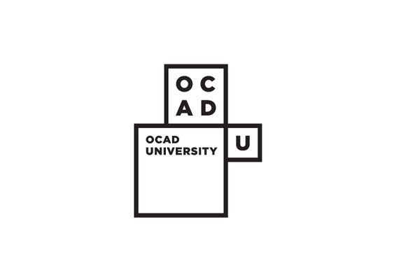
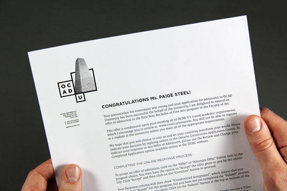
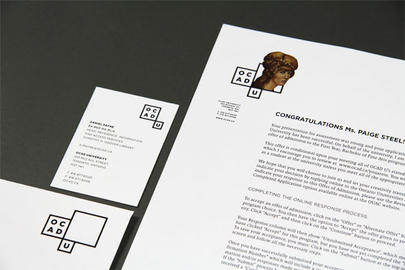
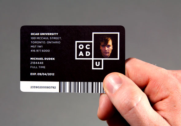
A nondescript brown box arrived at blogTO headquarters yesterday. Inside was a large white shirt, a black tote and a bunch of brochures. What did they all have in common? They were all emblazoned with OCAD's new logo - you know, the one designed by Bruce Mau Design, the same firm responsible for the AGO's new look.

According to the press release sent our way, the new identity was arrived at "through a process that included interviews, workshops, questionnaires, leading classroom discussions and social media - all with the goal of engaging participants and extrapolating the stories and spirit of OCAD U."

So did Mr. Mau earn his paycheck on this one? We want to know....Take our Facebook poll.

Here are more images of the new brand identity plus an excerpt from the press release.

ocad logoocad logoocad logoocad logoocad logoocad logoFrom the press release:

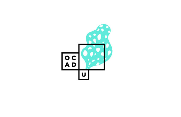
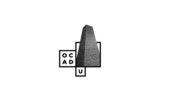
Inspired by OCAD U's iconic and transformational Alsop-designed Sharp Centre for Design, BMD created a base of black and white pixel 'windows' -- modular frames to hold actual student art and design work. Through these 'windows' the core of OCAD U is presented - conceptually strong, relevant, diverse, and compelling. "As we push the boundaries of art and design practice, education and research, so too does our new identity, giving the world a window into what we do here," said Dr. Diamond.

The identity is dynamic and modular in design. Every year, graduating student medal winners will be invited to design a logo within the basic window framework, providing the university with a set of logos for that year. As OCAD U grows and matures, a living library of identities will emerge, recording the ideas and aesthetics that have shaped our culture over time.

Discussion

41 Comments

Dmitri / May 6, 2011 at 11:01 am
user-pic
I like the idea of letting others modify and contribute to the logo. But there's no style associated with it, no personality. Let's see what comes out of it.
Simon / May 6, 2011 at 11:02 am
user-pic
The new logo is not bad, but what if the name would offend to French people? It seem that OCADU is a play on word to the French song called "Agadou Dou Dou"...
Aaron Alfred / May 6, 2011 at 11:02 am
user-pic
I'm sure, this logo design will receive its fair share of negative comments. This is just a natural reaction to change.

Objectively, I think the logo is a win, as it communicates the message of art and design. Its a fresh look that resonates with current design trends.
Jacob / May 6, 2011 at 11:07 am
user-pic
Having attended OCAD, I can assure you that the "window" of the logo, which is open to individual student interpretation, will contain a whole variety of different artistic renderings of the penis.
marie / May 6, 2011 at 11:14 am
user-pic
As a recent grad of OCAD, I second that, Jacob.
I really like the student card design, but am pissed cause now the AGO probably won't let me in with my student ID....
Bonk / May 6, 2011 at 11:15 am
user-pic
Art scho0*o@L
mike in parkdale / May 6, 2011 at 11:16 am
user-pic
I like the design, but the 'U' looks tagged on after. It's got a separate box, doesn't seem to be part of the actual name, and even hangs off the bottom of the logo.

I appreciate it's important for institutions to be properly named (God forbid someone calls Ryerson a Polytech) but I doubt anyone will ever be saying "oh-kayd-you"

Lemmy Caution / May 6, 2011 at 11:24 am
user-pic
Gotham is the wrong font- too generic and essentially a new york typeface. OCAD deserves better
Bubba / May 6, 2011 at 11:38 am
user-pic
that's square man.
anon / May 6, 2011 at 11:46 am
user-pic
@mike in parkdale, students call it 'okadoo'. The administration absolutely *hate* hearing it. I've heard staff joking about it too privately, out of earshot of the higher ups.
nick d replying to a comment from Aaron Alfred / May 6, 2011 at 11:46 am
user-pic
"...resonates with current design trends."

the word "trend" indicates that it is now "au courrant" and might just as easily be scoffed at in the near future.

As a designer myself, I avoid trends at all cost.

Trends are fleeting. Style is eternal.

I give the new logo a passing grade, but it's nothing special.

none / May 6, 2011 at 11:47 am
user-pic
@mike in parkdale, students call it 'okadoo'. The administration absolutely *hate* hearing it. I've heard staff joking about it privately too -- out of earshot of the higher ups.
jam / May 6, 2011 at 11:56 am
user-pic
It's a shame they went with Gotham, the most overused, now un-unique typeface. You would think that they would have had a custom font commissioned, being an art and design school and all...

Failure in my eyes.
Meh / May 6, 2011 at 12:01 pm
user-pic
Definitely nothing too special going on here. If they dropped the awkwardly attached "U" box it's grade would instantly improve from a C to a B+.
SMRT / May 6, 2011 at 12:07 pm
user-pic
Love it.
alex mcleod / May 6, 2011 at 12:15 pm
user-pic
loves it
MAC / May 6, 2011 at 12:18 pm
user-pic
How rigid and lacking in personality. Reminds me of that old Malvina Reynolds song "And they all were put in boxes, and they came out all the same."
nick d / May 6, 2011 at 12:22 pm
user-pic
The Student I.D. should display the student's photo extending beyond the bounding box-- the way they've done it for the letterheads!
P / May 6, 2011 at 12:23 pm
user-pic
Wow...how much did the guys at Bruce Mau get paid for this?
SMRT replying to a comment from nick d / May 6, 2011 at 12:24 pm
user-pic
Yes! That would be awesome...
RogerSterling / May 6, 2011 at 12:26 pm
user-pic
I like it. I understand that they kept the "U" separate, since OCAD is still what most people call it and think of it. It might take "Okadoo" a while to catch on.
Digression: It's funny how OCAD and NSCAD now have a U tacked on at the ends, even though it's kind of contradictory to call each places Colleges and Universities... but it sounds better to keep the C consonants in their names.
I like how that large square encourages and reflects new interpretations and visual ideas to be used,,, which is a fitting metaphor for what an art college should be anyway.
The arrangement of the squares in at least one of the formations above reminds me of a robot. That's a good thing. Might make for a cool animated piece.
j.d. / May 6, 2011 at 12:30 pm
user-pic
hmmm. so it's ONTARIO COLLEGE OF ART & DESIGN UNIVERSITY? or is OCAD now the name in itself? don't mind the look and execution (except using gotham!)
B-
Jason Paris / May 6, 2011 at 01:02 pm
user-pic
Should the title not read, "OCADU unveils its new brand identity"? It hasn't been OCAD in over a year.
engineer / May 6, 2011 at 01:27 pm
user-pic
attaching "university" onto an arts school is a joke and a disgrace to higher learning.
Liz Crawford / May 6, 2011 at 01:31 pm
user-pic
It will always be OCA to me.

class of '93
boohoo / May 6, 2011 at 01:57 pm
user-pic
SamataMason rebranded Ringling College of Art and Design in 2007 with the exact same concept: a box with alternating student work inside. Hmmmmmmm I wonder how original that is http://www.ringling.edu
ooops replying to a comment from boohoo / May 6, 2011 at 02:48 pm
user-pic
nice catch!
Joe Seven / May 6, 2011 at 03:54 pm
user-pic
This new adaptive approach to brand identity really seems to be taking off. Think AOL, London 2012, MAD NYC, City of Melbourne, etc. The thinking is based on the belief that logos are no longer static marks, but rather living organisms that change over time and across different media. Cool. I think it's an interesting strategy, though I can't help but wonder if the OCAD id could have been taken further – the imagery chosen to occupy the "box" in these samples feels a bit crude. Overall I like though; I'm sure the new brand id will better articulate itself as it's rolled out and seen in different contexts. Lots of potential here.

Luke / May 6, 2011 at 04:10 pm
user-pic
Love it, really outside the box =)
Lesley / May 6, 2011 at 05:10 pm
user-pic
I went to OCA in the 90's and this is now the third or fourth logo I've seen. Maybe not the most lame but definitely inside-the-box thinking.
matt / May 6, 2011 at 05:25 pm
user-pic
very nice!
Bruce Mau design. top qual.
stef seaver / May 6, 2011 at 05:50 pm
user-pic
circles are more 2010s. who's running the show they really dropped the ball on this one.
art / May 6, 2011 at 06:03 pm
user-pic
http://chart.apis.google.com/chart?cht=qr&;chs=230x230&chl=http%3A%2F%2Fupload%2Ewikimedia%2Eorg%2Fwikipedia%2Fcommons%2F0%2F0c%2FFrottage2%2Ejpg
Olas replying to a comment from engineer / May 6, 2011 at 07:05 pm
user-pic
What an educated response. Im glad your 'higher education' is paying off. The contributions of art and design to society and culture are immeasurable.
handfed / May 7, 2011 at 01:09 pm
user-pic
Canadian unexceptionalism at its best!
thepapergal replying to a comment from engineer / May 7, 2011 at 01:24 pm
user-pic
You voted for Harper didn't you.
B replying to a comment from Liz Crawford / May 9, 2011 at 12:16 pm
user-pic
Will alway be OCA to me too. Dropped out in '93
Lloyd Walton / May 9, 2011 at 05:38 pm
user-pic
I graduated from OCA, and with a long career in the creative business, i have never used OCA after my name. I never thought to, or thought I needed to. I still on occasion will say I went to OCA. It was a GREAT school in the late sixties.
OCADU is a different place. Time will do that. The boxes and assorted letters in the logo echo my feelings as I step into the entrance of the new building. I do love the exterior though.
Mohammad Mozafarian / May 11, 2011 at 02:23 pm
user-pic
Amazing concept! Posibilities are limitless with this logo. I can already brain storm 1000 ideas to work with this concept.

Love the way they think at Bruce Mau Design. I'll try to get my internship there next year...!
iSkyscraper / May 13, 2011 at 09:41 am
user-pic
What, no pilotes? Seriously though, this is an interesting logo when combined with images that fill in the box. It avoids the cartoonish-ness of so many academic logo makeovers. Bravo.

PS - Ms. "Paige Steel" - a shout out to Page + Steele?
ocadu student / June 7, 2011 at 12:37 pm
user-pic
i really like the new logo its a lot nicer than the previous
the student ids are super slick too

our current ones are incredibly ugly.

Add a Comment

Other Cities: VancouverMontreal