Green P Online Gets a Fresh New Look
Forget about finding the perfect place to park - just a few days ago, you'd have to find your way around the Green P website first.
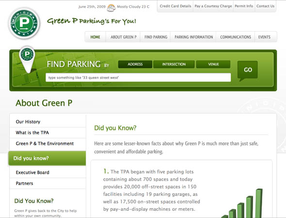
Thankfully, the Toronto Parking Authority is the latest city service to bring their online offering up to speed with the rest of the web, launching a redesigned website today that improves upon its predecessor in almost every way possible.
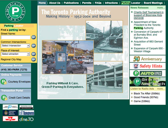
It's no understatement to say that the previous home of Green P online embodied the very worst of 1990s-inspired web design. Not only were users greeted with a maze of links, tables and ungainly search forms, the horrid colour schemes and awkward layout brought back not-so-fond memories of a dial-up past.
Ian Maher, VP of the Toronto Parking Authority's IT department, welcomes the change, admitting the old design was, in fact, "dated." Maher and his department worked closely with design firm Filament Creative in recent months to develop Green P's new look.


"We started with the content management system and redesigned the front end as well," Maher explained earlier today. "The main objective was to get the mapping function improved."
Anyone who's tried to search for parking using the old system knows just how difficult and frustrating the experience can be. According to Maher, at least half of their support calls came from people in search of parking, but who had found the website too difficult to use.
Now, search and map results have become an integral part of the new Green P design. The site has a large green search widget at the top of every page, allowing users to search by address, intersection or venue. The results are overlaid on top of a familiar Google maps interface, which lists results in order of proximity, price, and other variables.
In addition, Maher noted that his department even hoped to add Google Streetview capabilities to the site once the service launches in Canada, to better enhance the results provided.
And all those confused callers, unable to navigate the old site? Maher hopes that the redesign will have "a significant reduction" to the amount of load on Green P's call centers.
Portable parkers need not fret either - a mobile site, also being designed by Filament creative, is currently in the works, in addition to the possibility of an iPhone application as well. Unfortunately, it's Blackberry users who will be left without an app of their own - a matter of cost, explains Maher.
But for now, the desktop version should do just fine. If my initial experiences with the redesign are any indication, finding parking in the city just became a lot easier with Green P online.
Finding an empty parking spot, on the other hand, is another matter entirely.
First image by Chris Marlow of the BlogTO Flickr pool.
Latest Videos
Latest Videos
Join the conversation Load comments


