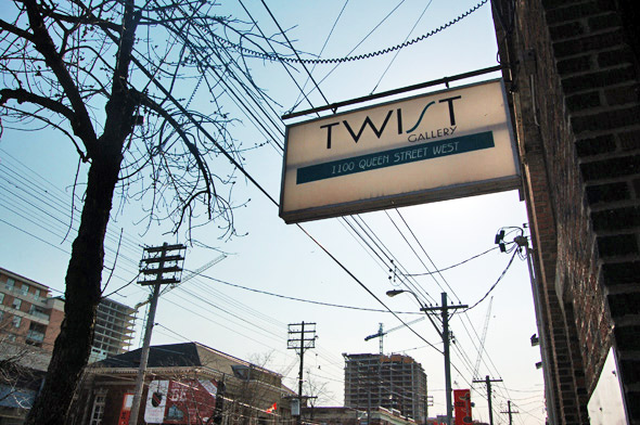
Twist Gallery
Twist Gallery is now officially open after finishing up some recent renovations. Taking over the space formerly occupied by SPIN Gallery, just above the Social , new owner, Nadia Kakridonis, has made a point of trying to capitalize on her predecessor's good name on the gallery scene.
A graphic designer and graduate of Humber's advertising and graphic design programs, Nadia has always been drawn to visual art. When she was making the leap from graphic design to gallery owner, she couldn't resist Spin's huge, beautiful, wide open gallery space.
She's updated the place a tiny bit, aiming to maximize hanging space by adding a wall at the back of the gallery and increasing the drywall so it runs from floor to ceiling, while still maintaining the rustic, unfinished look established by Spin.
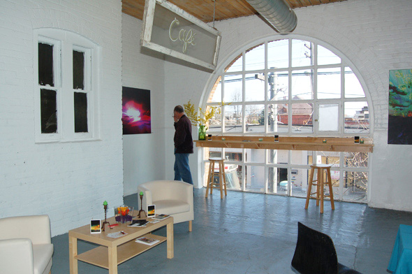
Twist's mission is to become a neighbourhood spot that's less intimidating and more welcoming than some other galleries might be. To that end, she has future plans to create a cafĂŠ at the front of the gallery, overlooking West Queen West . Her goal is to get to know patrons on a first name basis, greeting them when they enter, inviting them to get comfortable, grab a coffee and browse through art in a homey atmosphere open to all.
This mandate is reflected in Nadia's plans for finding future works to display at Twist. Rather than limiting the work she shows to fitting a certain theme or style, Twist's doors will remain open to both emerging and established artists who work in a variety of mediums, from sculpture to painting to photography.
As a former graphic designer, she knows how difficult it can be for artists just starting out, so Nadia plans on sourcing work from both the known and unknown - and she is committed to providing feedback to anyone who contacts her with their portfolio.
Such an approach is exciting because it means anything can happen on Twist's walls, and the future of the gallery is anyone's guess, but it could also backfire, leaving the gallery with a hodge-podge of unsophisticated works.
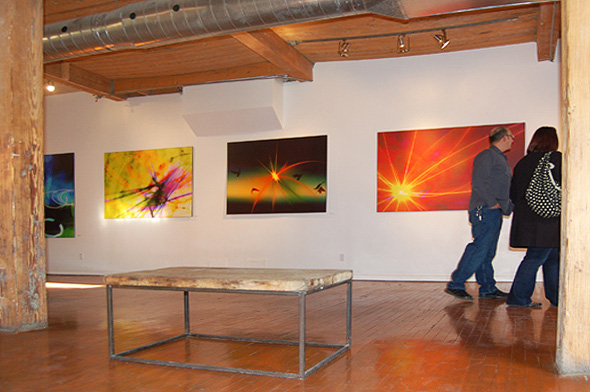
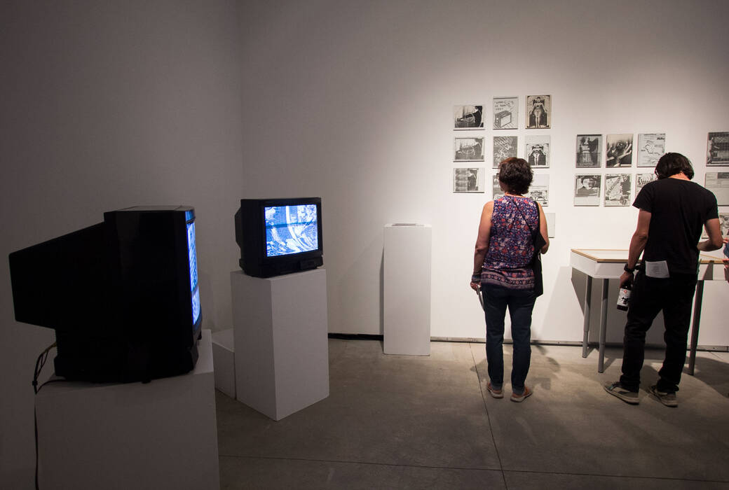
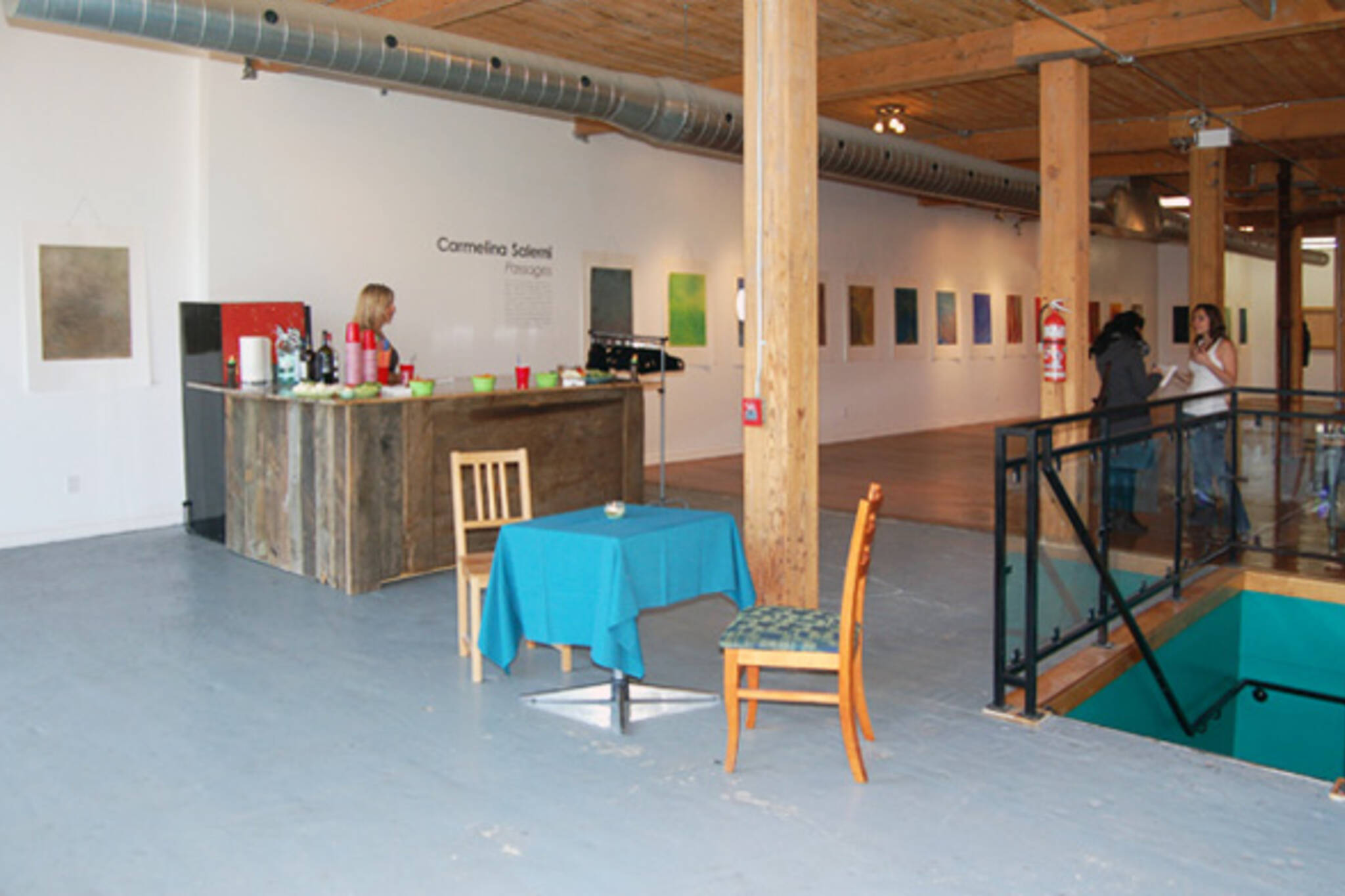
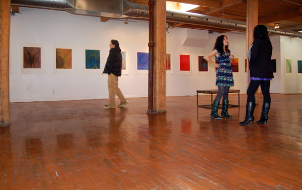
I attended the opening of two concurrent shows, Synergy by Laura Lofaro, and Passages by Carmelina Salerni. The artists are sisters that Nadia has known through a mutual friend for a few years, so it was only natural for Nadia to hang their work, once she checked it all out and enjoyed it.
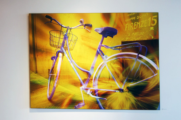
Synergy is billed as manipulated photography that visually interprets "energies released from within" and Passages features a series of chalk pastel drawings on stonehedge paper that tell "the story of a soul's journey from earth to eternity" - both of which sounded promising to me as a New Age-oriented, spiritually open arts lover.
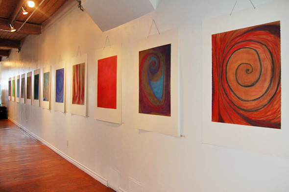
While both shows make a valiant effort to stay true to their descriptions, they fell a little bit short for me; I kept wishing for another layer to what I was seeing displayed on the walls. It might be my own short-sightedness, but I yearned for just a little bit more depth to work that showed a lot of promise, but left me feeling like it was one-dimensional.
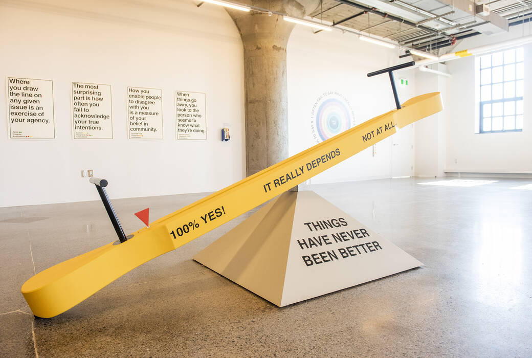
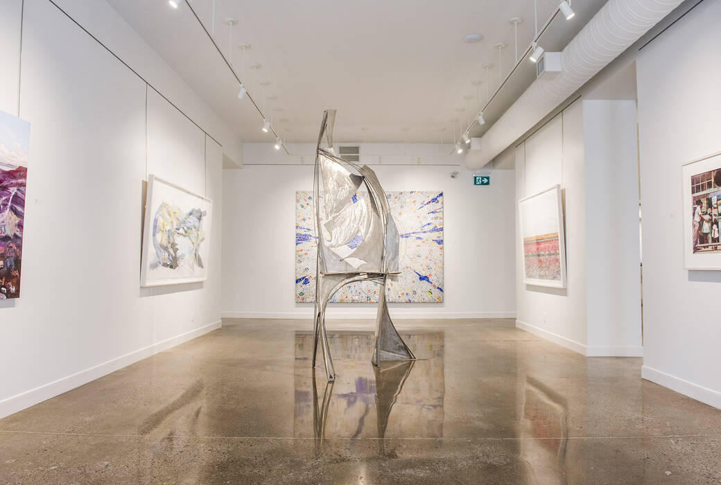
Twist itself shows a lot of promise: it's a perfect art gallery space, and it has a warm vibe. As a social events and arts venue (indie power duo Crystal Castles just played a show there at the beginning of April, and The Trews shot a music video in the space the very next day), Twist provides a sunny yet still slightly rough-around the edges backdrop for all things art.
Right now, however, the gallery still needs to find its way, especially in terms of curation. But the good news is there's still lots of time for Twist to find its groove. Be sure to check it out and watch it come into its own along the way.
Latest Videos
Twist Gallery

Twist Gallery
1 Upcoming Event
-
May 8
Make Your Mother's Day Bouquet with us!
Come join us for a fun and creative night where you can make a beautiful bouquet for your mom just in time for Mother's Day! Our experienced florist at Bloomberry will guide you through the process of selecting the perfect flowers and arranging them into a stunning bouquet that will surely make your mom's day extra special.
Date: Wed May 8th, 2024
...