Saturday, February 11, 2012Light Snow -11°C
Arts

Washington Post Singles Out ROM as Worst of the Decade in Architecture

Posted by Tim / December 27, 2009

ROM
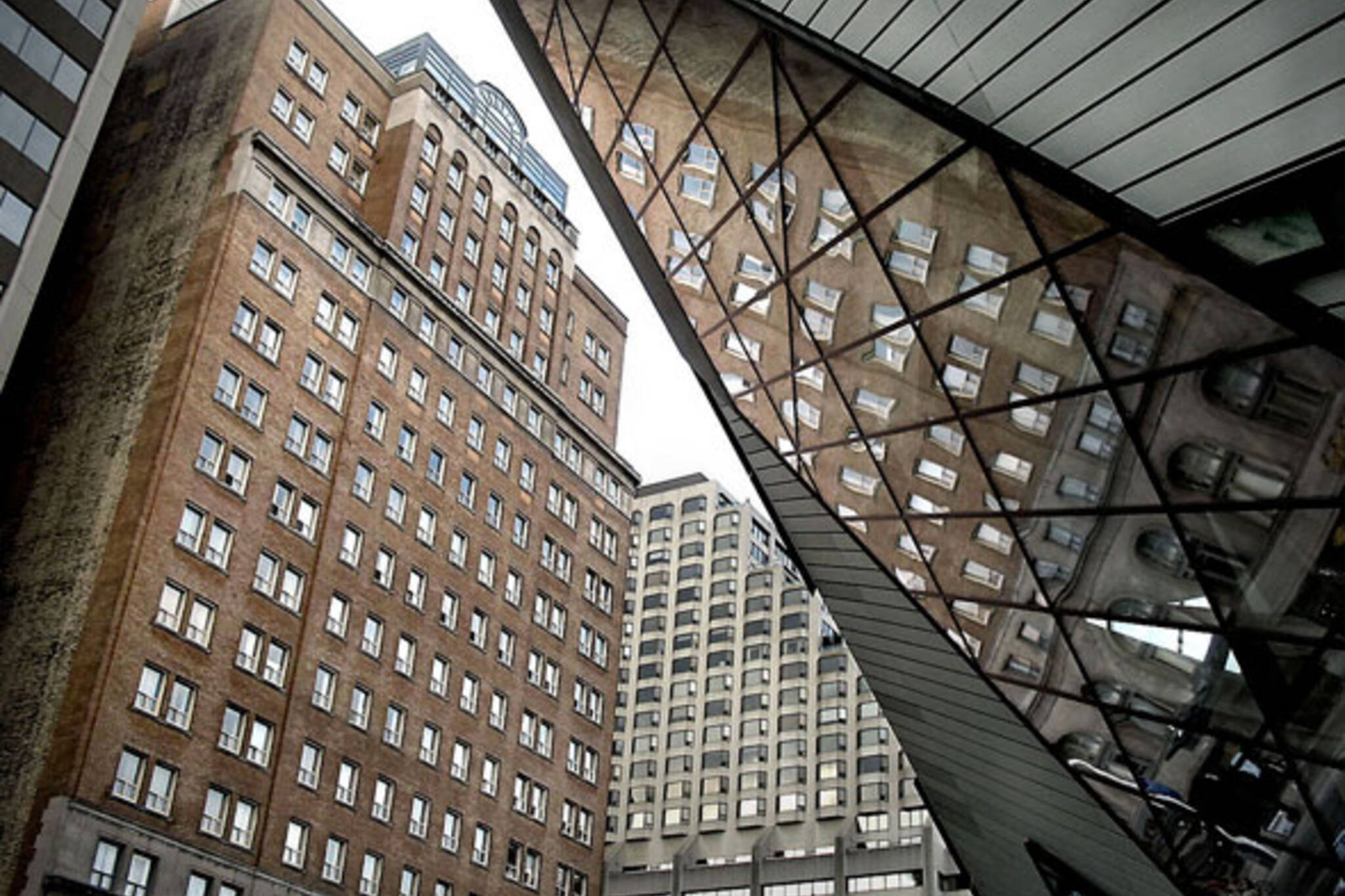
More bad news for the ROM today. The now infamous Michael Lee-Chin Crystal that's probably still the most in-vogue thing in Toronto to hate these days has just been crowded the worst single piece of architecture of the decade by the Washington Post.

According to the article's author Philip Kennicott, the Daniel Libeskind designed masterpiece/monstrosity "surpasses the ugliness of bland functional buildings by being both ugly and useless....go inside and you need a map to move around its irrational and baffling dead spaces. Curators seem as baffled and frustrated by it as casual visitors."

In its defense I will say that the ROM is at least the most talked about building in Toronto. Good or bad, we Torontonians love to be part of the global conversation - any global conversation - and if it happens to be about bad architecture, well, so be it.

Photo by Mr. Mark

Discussion

65 Comments

Tdot / December 27, 2009 at 10:51 am
user-pic
Obviously the guy has never visited Toronto Life Square/Futureshop Square..whatever its called nowadays. ROM is a masterpiece compared to that piece of junk.
Amanda / December 27, 2009 at 10:54 am
user-pic
Unfortunately, they're right; it's an embarassment. They took a beautiful building and turned it into an awkward maze of useless space. From the outside, it's as inappropriate as the Louvre's glass pyramid.
Corina replying to a comment from Amanda / December 27, 2009 at 11:28 am
user-pic
But even the Louvre's glass pyramid has gained acceptance... I suspect that anyone who remembers the INTENDED design for the ROM will always hate the monstrosity that was erected in its place. Other people will pass it off as a terrible example of flawed turn of century design style.
Ken / December 27, 2009 at 11:36 am
user-pic
It really is useless inside but I still enjoy it because I mostly see it from the outside.
Simba / December 27, 2009 at 11:40 am
user-pic
The structure confirms to the world that Torontonians are aliens from Distict 9.

270 million.....I just can't believe it.
Mathieu / December 27, 2009 at 11:48 am
user-pic
The nailed it - this is the worst piece of architecture of modern time. Okay - I'm not schooled in architecture so there are probably worse buildings out there, but from my travels I haven't come across anything uglier or more useless.

A 1/4 of a billion dollars. We could have gotten A-Rod for 10 years for that much money.
sydneybridge / December 27, 2009 at 11:53 am
user-pic
The crystal building SHOULD have looked like the glass pyramid instead someone decided to put aluminum siding all over it. A friend of mine summed it up perfectly by calling it the "Ode to Compromise" and that's exactly what it is. Instead of doing it right or scrapping it to plan something new they forged ahead and built that giant piece of crap. And now they charge an astonishing $28 to see piss poor curation of nothing remarkable at all. I'll never go back. The Dead Sea Scrolls exhibit was dreadfully boring, and the Vanity Fair exhibit felt like a student show. It should've been at the AGO.
john / December 27, 2009 at 12:21 pm
user-pic
Not only that, but it's also unoriginal. Our "avant-garde" crystal is a recycled concept from Libeskind's work in Denver... sheesh.

http://en.wikipedia.org/wiki/File:Denver_art_museum_night_archipreneur_adam_crain.jpg
Clement Greenberg / December 27, 2009 at 01:01 pm
user-pic
Ignorance reigns here, but what can you expect? It's blogTO! Sure, maybe Libeskind is making fun of us, but why shouldn't he? Torontonians are the most deadly boring and provincial people in the western world. No one deserves their faced slapped more by extreme architecture. By the way, architects are constantly reusing forms--ever hear of Greece and Rome?
Patrick / December 27, 2009 at 01:15 pm
user-pic
Geez guys, cheer up. Have some esteem for your own cityscape. If some schmuck from the Washington Post thinks we have an ugly museum, the healthy response is not to chastise ourselves and talk endlessly about how much we agree with him and how sorry we are for doing this to the world of architecture. Any self-respecting city would probably tell him to go to hell. A bit more confidence in your own city, please.

And speaking of IM Pei's Louvre Pyramid, it's twenty years old and is only now generally agreed upon as a useful and handsome addition to the site. Give it some time and people will come to enjoy it. And while you're at it, try to be part of the process yourself. All this hatred, it's unhealthy.
cocoa / December 27, 2009 at 01:24 pm
user-pic
It's the tacky aluminum siding that gets me. Not only is it ugly, it was a patchup for a design mistake. I wonder if Libeskind gave some of his fee back for that one.
Rachel / December 27, 2009 at 01:58 pm
user-pic
I don't understand why people hate it so much. As John pointed out, it is strikingly similar to the Denver museum but it was extremely well-received over there.

Is there anything Torontonians like? Tough crowd over here.
Andrae Griffith / December 27, 2009 at 02:32 pm
user-pic
"A war between architecture and painting, in which both come out badly maimed."

"The snail."

"Indigestible hot cross bun."

"Washing machine."

- Descriptions of the Guggenheim in the 1950s. Time will truly tell.
Jordan / December 27, 2009 at 03:18 pm
user-pic
I love it from the outside.
Tessa / December 27, 2009 at 03:40 pm
user-pic
From the outside, at least - not having been inside any further than the entrance - I actually quite like that building. Seriously, I agree with Patrick. You guys need some civic pride.
Kenchikuka / December 27, 2009 at 04:19 pm
user-pic
They are definitely entitled to their opinions which I hesitantly agree. Yet, I find it hard to comprehend why the best list contains five great Architectures while the worst contains only one. It seems the ROM is singled out as the worst because of flawed design in functionality. There has been a shift in the Architectural criticism towards a more environmental sustainability which I felt was left out in establishing the list. Daniel Libeskind who is a remarkable architect shouldn’t be blame for the final design of the museum. I believe it was initially to be cladded in glazing but a revision was required for the “assumed” safety of the artifacts of the museum. I think the ignorance and lack of confidence in Architectural technologies available is to be blame for revulsion of the finalized design.

James / December 27, 2009 at 04:26 pm
user-pic
I quite admire the outside of the place and admire the vision. However, the inside of the ROM doesn't work either esthetically or functionally. This is unlike The Louvre Pyramid, which is quite attractive inside and out and functional too.

Still, it is most unfair, there are so many worse buildings around.
matts replying to a comment from Kenchikuka / December 27, 2009 at 04:35 pm
user-pic
If Liebeskind cashed the check and put his name on the ROM addition, he should be blamed. The interior is awful, like a rushed job retrofitting an industrial loft and the exterior cladding is the same as you can see on a cheap ass warehouse. I loved the design when the first drawings came out and I still like the shape but the poorly executed details and finishes ruined it for me. Sigh.
Bjorn / December 27, 2009 at 05:38 pm
user-pic
Design by IKEA!
Kenchikuka replying to a comment from matts / December 27, 2009 at 05:40 pm
user-pic
I'm sorry for posting an incomplete comment that misled you. Daniel was force to use metal cladding on the building because the museum felt that the glass finish may not protect their precious artifacts. I believe with use of certain technologies, the glazed finish would have suffice. I do not know the whole story and politics that the designing process when through but I do know that the interior was done by a local architectural firm. It is obvious the design of the interior had influences or input from other parties (owner, politician, charity funder, building code...) So if Daniel had his way on designing the whole building the interior would have complemented the exterior. And beside, Last time I check it was called the "Michael Lee-Chin Crystal" addition not the Daniel Libenskind Crystal addition. ;)
Mark / December 27, 2009 at 05:52 pm
user-pic
Architecture must work functionally, aesthetically, and in concert with its locale, that is, the environment - natural or built - of which it becomes a part. In all of those respects, the Libeskind ROM is a failure.

The original design (sans cladding) did not work functionally or environmentally. The glass was unmaintainable in Toronto's natural environment (moisture condensation), and did not work to adequately preserve the collection. Aesthetics are always a matter of taste. Personally, the Borg-meets-the-Classics is jarring, but not in a thought-provoking, inspiring commentary sort of way. Compared to, say, the AGO redesign, the ROM is garish in my view. Compared to OCAD-on-stilts - an equally controversial but whimsically inspired work, I think - the ROM redesign attempts to take itself too seriously. As well, OCAD students and faculty (at least the ones from whom I've heard) are unanimous on how well that building works for its intended function. No one, save those with a vested interest in justifying the choice of the Libes-wunderkind-du-jour, would claim useful functionality. Recalling the politics at the time, the ROM was a matter of then director Thorsell, in effect, erecting his own pyramid. It can, in one sense, be considered a narcissistic building. In that, the architect matched the needs of the client.
Lucas / December 27, 2009 at 05:59 pm
user-pic
If they hated this, just wait until they see OCAD. Now that is a truly ugly building.
Sean Galbraith / December 27, 2009 at 06:53 pm
user-pic
I love it. It is a building that generates discussion. I love that it is polarizing. It has been SO long since Toronto had a nice dose of that. The alternative, it seems, in Toronto is most of the same ol boring greige (kinda grey, kinda beige) shit.
A.R. / December 27, 2009 at 07:04 pm
user-pic
It's an awesome structure that really makes that stretch of Bloor special. To hell with the Washington Post, coming from a city where every building gets bogged down in committees that force compromises in architecture to conform with the neighbourhood.

The Crystal makes for a great public space on Bloor. The way it projects the music of the street performers and angles normal street noise makes for a wonderfully unique experience. It grabs your attention and also points it at the original architecture. Inside, I've heard many compliments of it actually improving the flow of the interior to the way it was originally intended.

So yes, the Crystal is another worthwhile addition to our diverse collection of architecture.
seanm replying to a comment from Lucas / December 27, 2009 at 07:57 pm
user-pic
Interestingly enough, clicking a link in the Post's article about the Crystal links to an older article of theirs, containing this quote:

"The boldly modern Ontario College of Art and Design was an early example of Toronto's ongoing architectural renaissance."
fed up / December 27, 2009 at 09:41 pm
user-pic
So some half-wit from that crap newspaper, the Washington Post, thinks the Crystal is the worst piece of architecture? Honestly, WHO GIVE A FLYING FIG? I couldn't care less what some American has to say about anything in this country. What bugs me more, is the pathetic drivel in various Canadian media, that seems to think that Canadians should care about what the rest of the world thinks about us or what goes on here.
Chester Pape / December 27, 2009 at 11:19 pm
user-pic
The only thing that bugs me about this piece, and sever of the comments here is that it repeats the FALLACY that there is something wrong with the exhibit space in the interior. I recently had a chance to spend some time with some senior people involved in the ROM and while they made some frank criticisms of certain aspects of the new building they are actually reasonably happy with the new interior space, remember were not talking about a fine art museum where vertical hanging space is critical, most of what they exhibit is 3D and doesn't hang on the wall anyway. They've gained a huge expansion in usable exhibit space with the combination of the new building, even accounting for the 70's addition they demo'ed and massive renos made to the interior spaces in the old building they now have something like 3 times the exhibit space they previously had.

Also keep in mind that more than 1/2 of the $250M was spent on redoing the galleries in the old building.
wendy / December 27, 2009 at 11:21 pm
user-pic
It's not very functional on the inside but I think it looks just fine from the outside. I smile whenever I see it. But okay, whatever. :l
Joel / December 27, 2009 at 11:52 pm
user-pic
As a conversation piece, it's great. Like that random souvenir from your teenage Eurotrip that you hang on the wall by your dining table.

Libeskind is the worst of the "starchitects" of this era. He recycles the same ideas over and over, disregarding the unique context of the site within the city completely. That said, this is definitely NOT the worst piece of architecture of the decade. Maybe there's an ex-Torontonian on staff with a chip on their shoulder?
nnn / December 28, 2009 at 12:24 am
user-pic
Toronto needs a serious look around and realize that the entire city is a laughing stock in awful embarrassing architecture.
Scottd / December 28, 2009 at 12:25 am
user-pic
An absolute failure as a museum space and ugly too.
Fog Light / December 28, 2009 at 12:46 am
user-pic
It's awesome nice building.Unfortunately, they're right; it's an embarrassment. They took a beautiful building and turned it into an awkward maze of useless space.
k / December 28, 2009 at 01:02 am
user-pic
I think it's great.
jeremy / December 28, 2009 at 04:30 am
user-pic
Let's face it. It is a very ugly piece of garbage. An eye sore, that is. In a word, stupid.
Corina replying to a comment from nnn / December 28, 2009 at 07:49 am
user-pic
Obviously you've never studied architecture... what doesn't look "pretty" is often engineered to demonstrate expert skill and workmanship to the trained eye. Toronto is full of great examples, but has no cohesive style. I rather like the mishmash architecture of our city.
nico / December 28, 2009 at 08:39 am
user-pic
It looks like something cheap pretending to be high art and sophisticated. Quite pretentious indeed.
warmflash / December 28, 2009 at 09:36 am
user-pic
It would be best if they ripped it down. It was a mistake. Whoever approved it should own up and then pull it down. And replace it with a park.
Abe Froman / December 28, 2009 at 09:59 am
user-pic
If anyone bothered to read the article, the criticism is that it does not have a functional indoor space for the museum pieces. The article doesn't say anything about the look of the exterior.

When I first saw the concept art I was mortified, but then I travelled the world a little and saw the need for major cities to push the envelope when it comes to design.

Also - for those that say the renovation ruined the original design of the ROM, I ask them to look at the structure a little more closely. The expansion replaced an ugly 60's style expansion of the ROM and hasn't really done anything to change the older structure.

I think the MLC Crystal is one of the nicest, forward thinking and exciting buildings in the city.

Given the recently passed city council restrictions on Queen W and Ossington, I'm not surprised that people in this city don't like the MLC Crystal.

Toronto loves its bland, take no chances, middle of the road lifestyle.
David / December 28, 2009 at 10:18 am
user-pic
I think this is an instance of an architect putting himself and his idea above functionality or his client. Also, a board of directors in love with the attention of getting a "big-named architect over building something worthwhile and spending money appropriately.
TL / December 28, 2009 at 11:06 am
user-pic
At least, it caught everyone's attention, though not necessarily as they would have wanted. It got people talking. Paris Hilton would have said any publicity is good publicity.
Mike O'Hanlon / December 28, 2009 at 11:34 am
user-pic
I find it sad that we are so happy to even be mentioned, despite the fact that the attention is rather negative. Most people can agree that the addition is just bad architecture. It's not functional, and it lacks context in the neighbourhood. What is truly shocking is that no one tried to stop this monstrosity. I am reminded of the story of the Emperor's new clothes, wherein no one had the courage to speak out against the hideous. I also feel that this structure will never become appreciated or beloved in the future. It's not the Eiffel tower, and its already time to rip it off.
Tom / December 28, 2009 at 12:25 pm
user-pic
Liebeskind does this all the time. Make a pretty sculpture out of crystal, hoodwink people into thinking it will actually look like that when built. Take the money and get the **** out of town before anyone realizes it's unbuildable.

The reason the ROM was a compromise was not because Torontonians were too uninspired to realize Liebeskind's true vision, but because Torontonians were too stupid to realize that Liebeskind's true vision didn't actually work.
ian replying to a comment from Kenchikuka / December 28, 2009 at 12:43 pm
user-pic
god forbid a starchitect would ever have to design a building that met building code...
Joe Clark / December 28, 2009 at 12:45 pm
user-pic
Nicely curated comment section you’ve got here, BlogTO.
Jyotika / December 28, 2009 at 01:54 pm
user-pic
That might be, but Vegas just got almost the same thing:

http://exshoesme.wordpress.com/2009/12/28/deja-vu-toronto-vegas-get-crystallized/
Gabe / December 28, 2009 at 04:48 pm
user-pic
I love it (again, at least from the outside). I think people will come around.
Jorge Herrera / December 28, 2009 at 05:52 pm
user-pic
I happen to like the building. It sparked my curiosity when I first saw it, and to this day I enjoy looking at it every time I walk by it.
Minnnie / December 28, 2009 at 10:36 pm
user-pic
Toronto used to hold the record for the tallest free standing tower (CN Tower). Now, Toronto will be world famous for the worst piece of architecture of decade.
Hasan / December 28, 2009 at 11:04 pm
user-pic
It is plain tacky ... yes, as in Vegas-tacky.
ChrisFizik / December 28, 2009 at 11:50 pm
user-pic
I like the crystal a lot because it's different -- fits Toronto's typically mish-mashed landscape of architectural highlights -- it's a landmark ....and despite ongoing criticisms here and in the WashPost article ....the spaces inside aren't completely restrictive or anything for the curators.
Spikes coming out of the 1914 building facade are great ...brings the ROM kicking and screaming into the future, however jagged, metallic, and scary that is. You cannot knock the thing for being standoutish and 'crazy'. It breathes life into the area that sits on the edge of Victorian UofT campus buildings and Bloor/Yorkville commercial standardness.
ayl / December 29, 2009 at 12:20 am
user-pic
I absolutely love the sparkly side walks outside the ROM.
Gus / December 29, 2009 at 02:33 pm
user-pic
I love the ROM's Crystal. Toronto gem.
Andrew Louis / December 29, 2009 at 07:08 pm
user-pic
You have to admit it does look kind of nice in the fog: http://www.flickr.com/search/?s=rec&;ss=2&w=all&q=%22royal+ontario+museum%22+fog&m=text
jan / December 29, 2009 at 07:59 pm
user-pic
fugly is what it is.
Johnny Jojobeans / December 31, 2009 at 12:26 am
user-pic
Just wanted to weigh in here and say, yes, I agree that it's tragically hideous, and those claiming otherwise are either delusional or heavily narcotized.
kenchikuka replying to a comment from ian / December 31, 2009 at 04:42 am
user-pic
I was merely pointing out that changes where required between Daniel's vision and the final design. I insignificantly mentioned "building code" as a possible source of influence in the design. You are focusing too much on the details of my comment rather than understanding the whole of what I was trying to convey. I will re-state what I said; The client wanted a starchitect to design the addition...god knows why. But because the starchitect is not a locally licensed architect, local architects took a fraction of the responsibility of the design. Somewhere along that process someone must have f***ed up the design. So now, some Torontonians are pissed off and wants to blame the starchitect who the client god knows why hired.
Eve / December 31, 2009 at 12:39 pm
user-pic
Several times a week, I pass by ROM. The Crystal looks like it is made up of tin or some other cheap metal. But at least it has attracted many tourists. You see a lot of them taking pictures. For me, I am learning to appreciate it a little bit more as time goes by. I used to hate it a lot. Now, I don't hate it that as, I just dislike it a lot. And that is an improvement.
Photographer / January 13, 2010 at 10:35 pm
user-pic
??? It's a beautiful building, yes, it's an abstract piece of architecture, but it is beautiful. And it works very well with it's hard edges coming out of the old ROM building. I wish we had more constructions like this to make the city streets less boring.
I love it.
Josh / January 17, 2010 at 06:33 pm
user-pic
As bad as the crystal is at least it got built. Remember the Freedom Tower anyone? Sure the Crystal is a building made of comprimise but the Freedom Tower's design is based off fear and paranoia and it shows. Worst yet, nine years later it's still a hole in the ground!
user-pic
Great idea, but will this work over the long run?
book of ra download / February 22, 2011 at 03:38 pm
user-pic
Theoretisch ne super Geschichte, ich frag mich nur, ob das auch langfristig brauchbar sein wird!
Roulette American / August 5, 2011 at 01:54 am
user-pic
Unglaublich dass sowas wirklich funktionieren kann :)
Systeme Roulette / August 26, 2011 at 06:58 pm
user-pic
Also ich denke das ist nur eine Mode
knacken / September 8, 2011 at 01:02 am
user-pic
Also ich bin mir sicher das war eh nur ne Trendsache
Greg / September 8, 2011 at 01:41 am
user-pic
At least one of Toronto's nicest new buildings is right across the street.

Maybe a little like Paris. The best view of Toronto is from the place where the crystal cannot be seen. Unfortunately it is so badly designed that you can't just look out a window. You have to awkwardly bend and look out a window.

I'm calling the emperor's new clothes on anyone that likes it.

Add a Comment

Other Cities: VancouverMontreal