The Underpass Project

Posted by Lisa
Filed in Arts
June 24, 2008

underpassproject Bloor LansdowneThe bleak Bloor underpass just west of Lansdowne is sporting a whole new look, thanks to Toronto artist Richard Mongiat. The Underpass Project is sponsored by the City of Toronto's Clean & Beautiful committee, but Mongiat's 400-foot minimalist mural is very different from the super-bright "cover-ups" I'm used to seeing in city murals.

Underpass Project Richard Mongiat
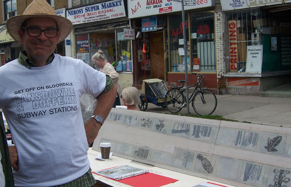
I talked with Mongiat at Saturday's first annual BIG festival. He says he originally conceived the concept for the Dupont underpass, but he was convinced by local artist & activist Dyan Marie of DIG IN to create the mural to coincide with BIG. The change in location meant that Mongiat had to rethink his original idea, but he was obviously pleased that he'd finished the mural in time (he was still working on the last touches on Thursday).

"These frames," he says, pointing to the raised rectangles within the wall, "set up the design elements." Mongiat found his inspiration in the barren trunks of winter trees. "Like this neighbourhood," he says, "dormant but coming to life."
underpass project Bloor Lansdowne
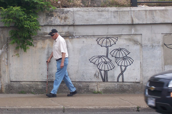
There are four visual elements at play here: three from Mongiat--grey tree trunks, white wallpaper-inspired sworls, and close-ups of spring buds--and a fourth, surprisingly active element--the worn concrete of the underpass itself. "By keeping my work muted, black, white, grey, the wall really came through," says Mongiat with pride. "Now, the weather, the rain stains become part of the design. The wall comes alive."

Ratpick on June 24, 2008 at 9:17 AM

Fabulous, fabulous. Such a welcome change from the typical cornball murals put up by BIAs. Well done!

Jerrold on June 24, 2008 at 9:19 AM

I love his t-shirt!

Gloria on June 24, 2008 at 9:24 AM

Love it.

Carlos on June 24, 2008 at 9:28 AM

this is great, i'll have to check it out this weekend!

ramanan on June 24, 2008 at 9:35 AM

I've been photographing the underpass as Richard has been working on it. I have some photos up on Flickr. (I have some detail shots online as well, which hopefully show off how cool the concrete actually is.) It's a cool mural. Nice to see something that doesn't feature rainbows and children.

Christopher King on June 24, 2008 at 11:21 AM

Very nice.
Brings a splash of class to an area that's been sorely lacking for some reason or another.

aahhrrgg on June 24, 2008 at 11:22 AM

Nice to see a mural not done collectively by the local grade seven class. Why is no talent 'cute' when you're a kid?

somechick on June 24, 2008 at 11:55 AM

YESS!!! Let's have More grey in an already grey area. This will look absolutely amazing come mid februrary and cheer up the bleak landscape even more. I actually like it when kids paint underpasses or walls in the city. It brings a better sense of community and inspires the kids to be productive citizens. Oh yeah....and kids like COLOUR!!!!!!!!

somechick on June 24, 2008 at 11:56 AM

YESS!!! Let's have More grey in an already grey area. This will look absolutely amazing come mid februrary and cheer up the bleak landscape even more. I actually like it when kids paint underpasses or walls in the city. It brings a better sense of community and inspires the kids to be productive citizens. Oh yeah....and kids like COLOUR!!!!!!!!

kathleen on June 24, 2008 at 12:09 PM

Love it! Can't wait to take photographs of it! I wish they had done this to some of the back alleys off Queen St. or that wall the Bloor subway passes near the Keele station INSTEAD of those brightly colored murals. I weep/cringe when I think of the art that was once there! (No disrespect to the little people!)

trajik on June 24, 2008 at 12:54 PM

great way to add some life to the area..live right next door at the BE BLOOR condo and hope more things like that make there way to the 'hood

guy lafleur on June 24, 2008 at 2:01 PM

agree with somechick...nice art but the area suffers from an abundance of drab already, it's all gray and run down... sunshine and rainbows would be a nice touch

somedumbguy on June 24, 2008 at 2:24 PM

He's using the concrete as the background of his designs which is why he chose grey, white, and black. It's quite clever. Instead of masking the concrete with bright garish colours and designs (sunshine and rainbows) he's incorporating it and making us think about it in a different way. The concrete is his inspiration.

Sum Guy on June 24, 2008 at 2:26 PM

Unfortunately because it's not bright there will be grafitti all over it. It's gray and washes in with the background. Good job otherwise

Gloria on June 24, 2008 at 2:46 PM

@Sum Guy, you overestimate the honour of some vandals in this city. There's an awesome, beautifully coloured mural in my neighbourhood of space robots (complete with binary dialogue!) that's been severely defaced.

Anyway, like I said, I love it. It incorporates the material of the pass, for once, rather than trying to hide it. It's subtle and doesn't need to shout -- maybe a metaphor for this city and the neighbourhood: pay attention and you'll find something pleasing to the eye.

guy lafleur on June 24, 2008 at 7:52 PM

hey, guess what, the neighbourhood is ugly, no need to accent it.

davin on June 25, 2008 at 12:59 AM

I live next to it and everyday I think of going out with some leave stencils and green spray paint and finishing some trees off. Dont get me wrong, I really like it! But I would love some colour as well.

leanne on June 27, 2008 at 12:38 AM

I have been watching the mural go up and I had no idea it was done.

karyn on July 15, 2008 at 2:59 PM

the mural is amazing and inspiring. there's no need to create something garishly colourful to liven up an area. the subtle colour of the murals works with the urban landscape rather than covers it up.

Add a Comment

Name: Email: URL:
Comment: