Someone just redesigned the TTC logo and people have thoughts
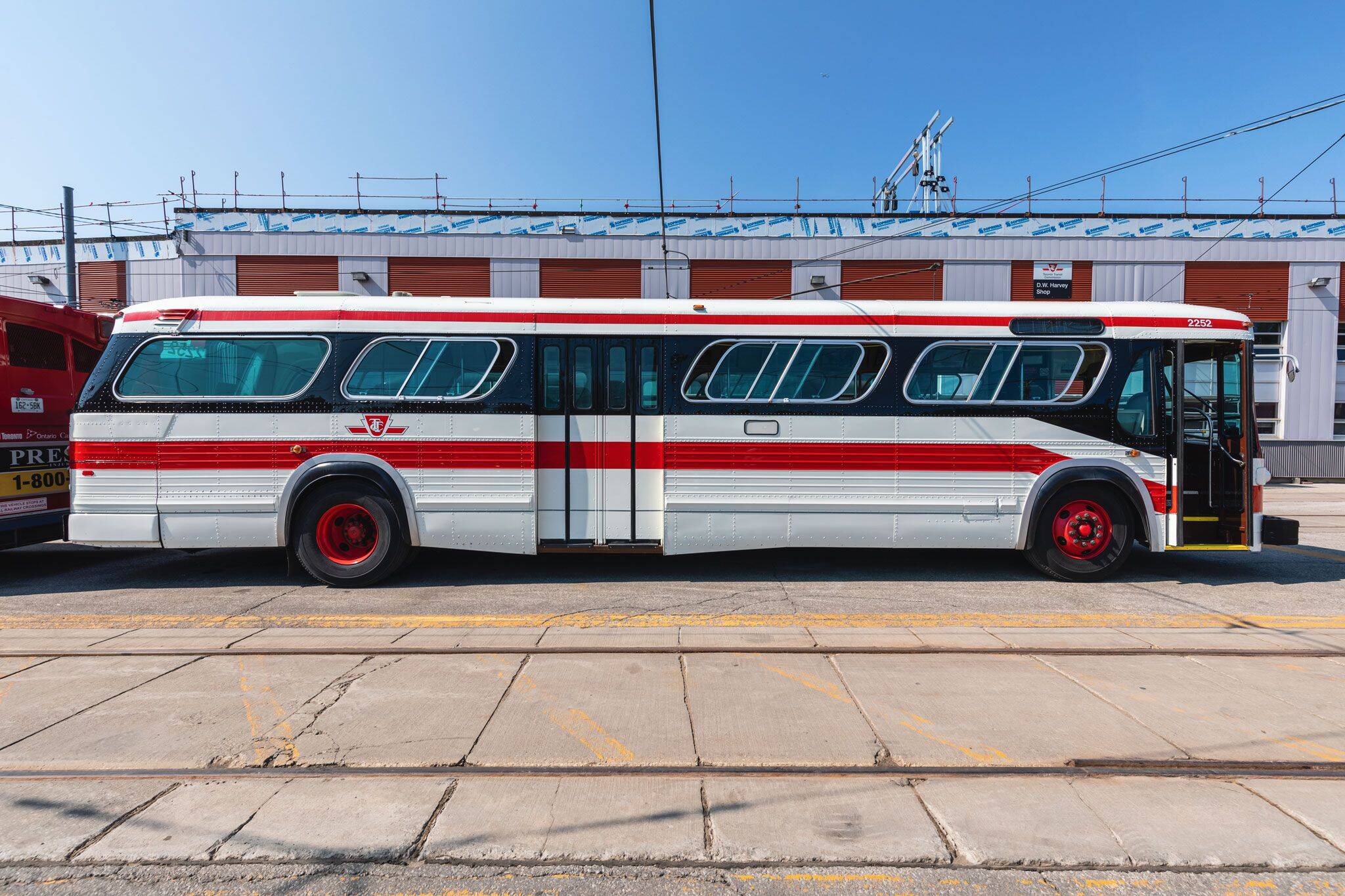
The TTC's iconic logo and typeface have remained unchanged since the 1940s, the current look developed during the planning of the Yonge subway.
But in the decades since that instantly-recognizable look was introduced to Toronto commuters, the city's rapid transit network has grown by leaps and bounds, leading one design firm to take it upon itself to reimagine a symbol that has come to be the city’s most beloved logo.
Simon Archibald, Creative Director at ANTI CREATIVE HOUSE*, tells blogTO that his firm designed a third-party, unsolicited TTC rebrand, saying that "just because it's iconic, doesn't mean it's the right choice for the modern era."
What the firm came up with is a departure from the current look, doing away with the old shield-style logo and replacing it with a simplified graphic that uses two bullet points and a lower-case "ttc."
Archibald says that "the goal with our rebrand was to simplify; allowing space for the elements to breathe while maintaining a distinctive, bold design."
"Using a modern typeface (TT Norms) and preserving the classic "TTC" red, our team has created a mark to bring the Toronto Transit Commission into the modern age and beyond."
Archibald says that he hopes his team's design "has the potential to reach the decision-makers at the commission and hopefully get adopted."
The firm shared its creation on social media, though the reception appears mixed, with many commenters comparing the logo to the Toronto Public Library's branding.
"I don't understand why you would do this," reads one comment, joining the chorus of people suggesting "that this looks like following in the footsteps of the TPL rebrand."
Others seem on board (sorry) with the new transit logo design, with comments like "cool rebranding."
It's worth noting that the existing TTC logo also faced controversy during its design phase.
Another short-lived logo was briefly used during the construction of the current Line 1 subway, though chief TTC engineer Walter Paterson rejected the design, passing over it in favour of one that more closely resembled a design previously used on TTC vehicles.
Jack Landau
Latest Videos
Latest Videos
Join the conversation Load comments


