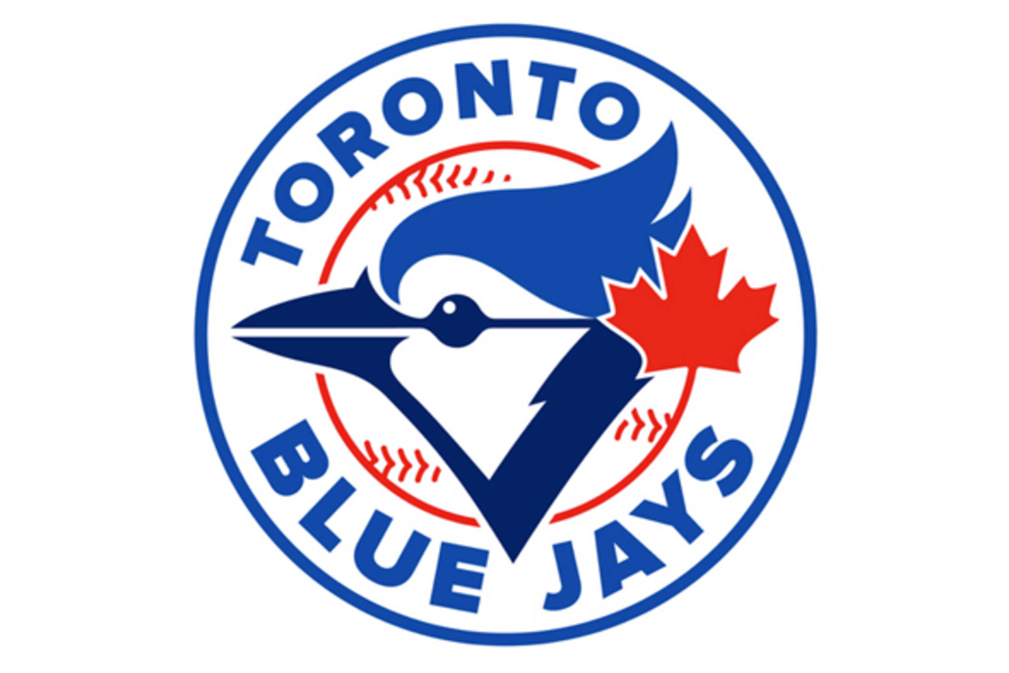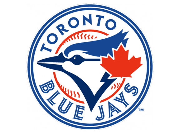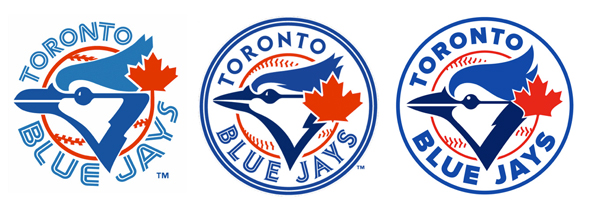
Is this an even better Toronto Blue Jays logo?
When the new Toronto Blue Jays logo and uniforms were released yesterday, there was quite the discussion in our comment thread about a critique we shared from a local designer who pointed out what in his estimation were some pretty glaring errors. Naturally someone finally suggested that Rob, the designer in question, put together a design that addressed the faults that had been identified â and wouldn't you know it, he did.

I like that. Although his own criticism became the subject of much criticism, here's someone who know how to put his money where his mouth is. So, now the question is which one is better? For my money, I like the revised one. Not only is it cleaner, but by not using two different fonts, the logo is more unified. Also noteworthy is how the stem of the maple leaf seamlessly turns into the outline of the ball â very slick. The entire design is also less angular (e.g. fonts, the blue jay's eye), which gives it a more contemporary look to my eyes.
What do you think?

Check out What Their Bitch Is for more.
Latest Videos
Latest Videos
Join the conversation Load comments


