What do you think of the new Toronto Blue Jays logo?
What's old is new again when it comes to the updated Toronto Blue Jays logo, which is being unveiled today (but has been leaked all over the place). I'm not much of a baseball fan, but stuff like this does interest me in terms of design. While people will inevitably say that the new logo is basically the same as the one the team originally wore in 1977 (and kept until 1996), there are a few differences worth noting.
The font is different, the colours are darker, and the blue jay itself is more angular. One might ask what's the point of crafting something so close the original â why not just revert to the vintage version altogether? â but for my money the subtle changes do help to keep it from looking too dated. That light blue sends me on a nostalgia trip to the 1980s when I was forced to go down to Exhibition Stadium with my Boy Scouts crew. Yuck.
What do you think of the update? Oh, and here's the origina logo, for the record.
Update (12:15pm):
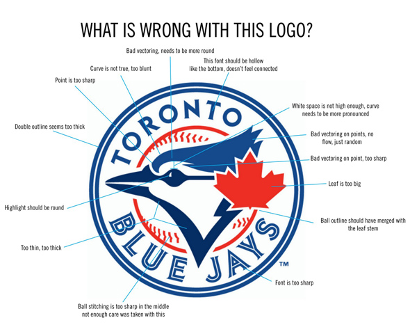
Apparently not everyone's a fan. As per the first comment below, here's a rather thoroughgoing critique of the new logo, right down to the stitching on the ball. Thoughts on this critique?
Latest Videos
Latest Videos
Join the conversation Load comments