Toronto Maple Leafs unveil first new logo in 45 years
The Toronto Maple Leafs unveiled a new logo tonight, the team's first since 1970. Yes, if there's one thing that's remained consistent in Leafland, it's the carefully managed branding of the franchise, one of the most valuable in the sporting world. Well, that and not winning Stanley Cups, I suppose.
But, hey, this freshly revealed logo is all about new directions. If ever there was a time to re-brand it's now. Even if the team is currently one of the NHL's bottom-feeders, with Brendan Shanahan, Lou Lamoriello and Mike Babcock running the ship, there's plenty of reason for optimism that the Leafs might get back to the successes of the 1960s.
And that's exactly what this new logo gestures too. Its look is thoroughly old school. The leaf itself looks like the 1960s era logo, but the font has been updated. There are other subtle differences, too. There are less points on the leaf (31 as opposed to 35), but the idea is clear: the franchise wants to look back as it looks forward.
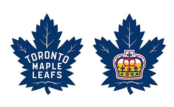
The team also revealed a new logo for the Toronto Marlies, one which uses the same shape of maple leaf, but is adorned with the crown logo associated with the team. It's actually quite nice looking, if you ask me.
What do you think of the new design? Let us know in the comments.
Latest Videos
Latest Videos
Join the conversation Load comments


