20070219_policegraphics.jpg

New Graphics for the Boys in Blue

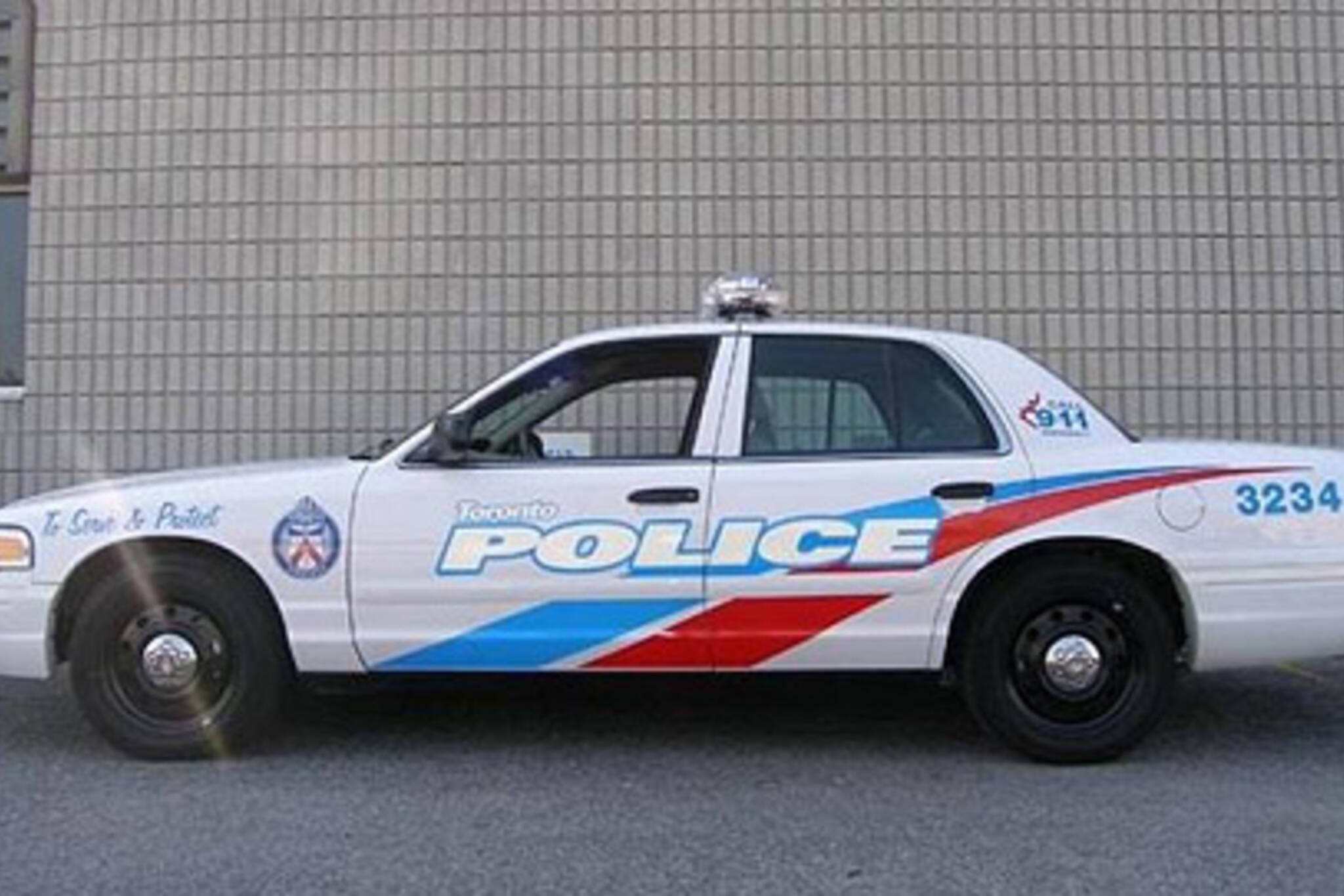
Toronto Police are phasing in new graphics for their cruiser fleet.

Opinion amongst enthusiasts about the new graphics seems to be mixed. Does the new design shout "serve and protect"? Is the font and design authoritative enough? Easily distinguished from other security company cars?

I think the new look has some nice flare, but it is a bit toyish.

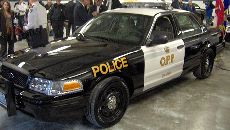
The OPP also has plans for new painting schemes. They seem to have gone for a more menacing look.
20070219_policegraphics2.jpg

Photos: policecanada.ca/

Shout out to coleridge for pointing this out!


Latest Videos


Latest Videos


Join the conversation Load comments

Latest in City

Here's a preview of what it will be like to ride on new Toronto LRT line

There's a brand-new $26M TTC subway station entrance in a popular Toronto park

Ontario's largest snake grows up to 2 metres and squeezes prey to death

Ontario is home to world's oldest pool of water at a staggering 2 billion years old

Toronto somehow isn't home to Ontario's jankiest LRT

Stunning new Toronto park set to open next year

A Toronto transit project is actually going to finish early for once

People worried about Ontario police's plan to use facial recognition software