TTC installs new signage at Bloor-Yonge Station
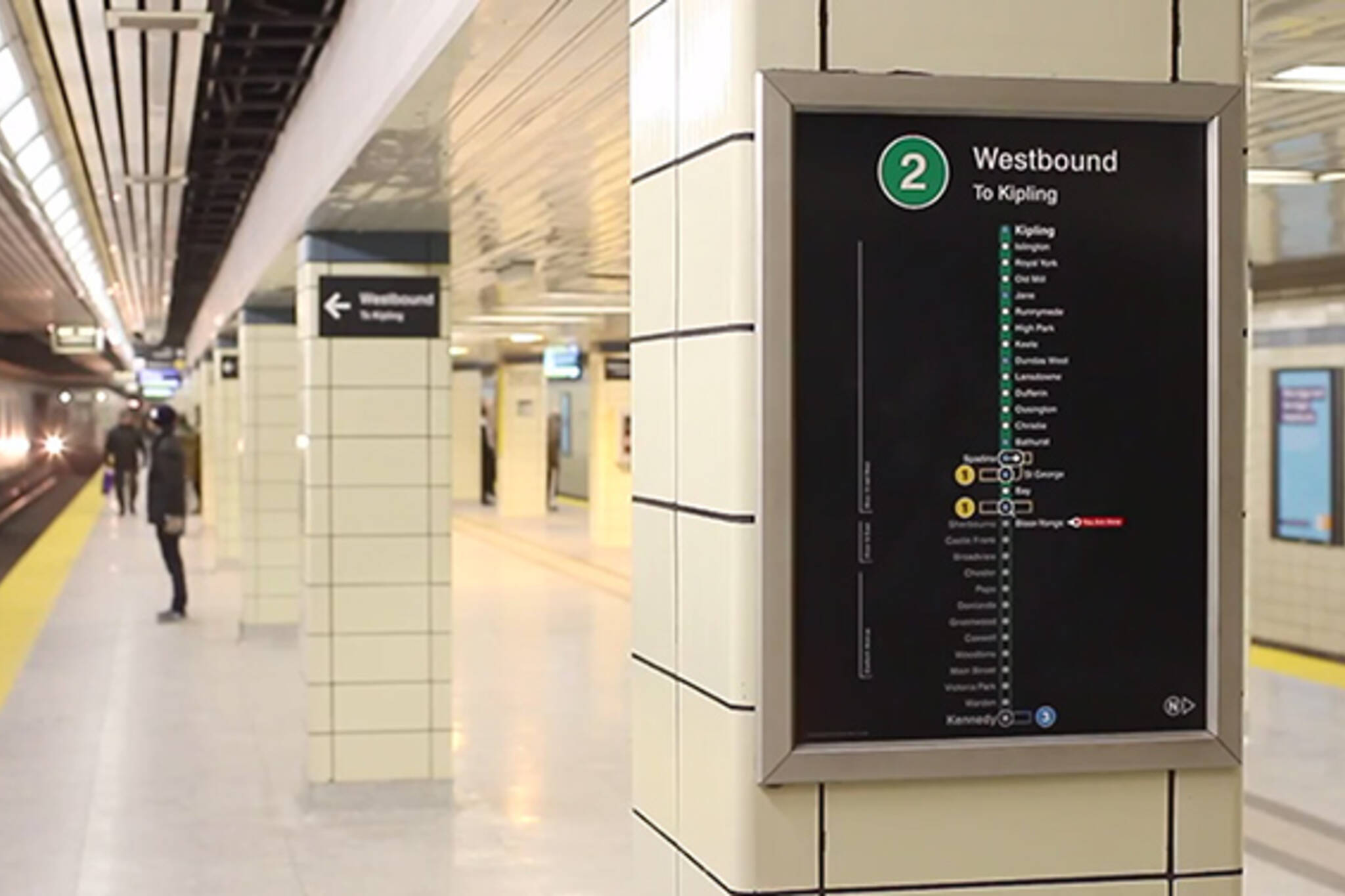
Months after unveiling the design for its new wayfinding and route signage, the TTC has taken the next step by installing it at Bloor-Yonge Station, where the Commission will try it out and gather customer feedback. St. George Station is soon to follow, which will perhaps prove even more of a litmus test of the new markers given the mess that the wayfinding is there. Aside from a cleaner design in general (and a healthy return of the original "Toronto Subway" font), the new signage ushers in a significant change as pertains to the naming of subway lines, which will now be numbered in addition to the older nomenclature (e.g. Yonge-University-Spadina).
There's a compelling argument to be made that this is the, ahem, better way, as it's not immediately clear to new users of the system when, for instance, the University portion of the line gives way to the Spadina section. By using three markers - number, name and colour - the new maps and signage should make the system easier to navigate. Perhaps even more importantly, as the TTC slowly adds additional lines like the Eglinton Crosstown, a numeric and colour-based list of routes is easier to keep track of.
What do you think of the changes? Is this a step in the right direction?
Latest Videos
Latest Videos
Join the conversation Load comments