Douglas Coupland: Polychrome
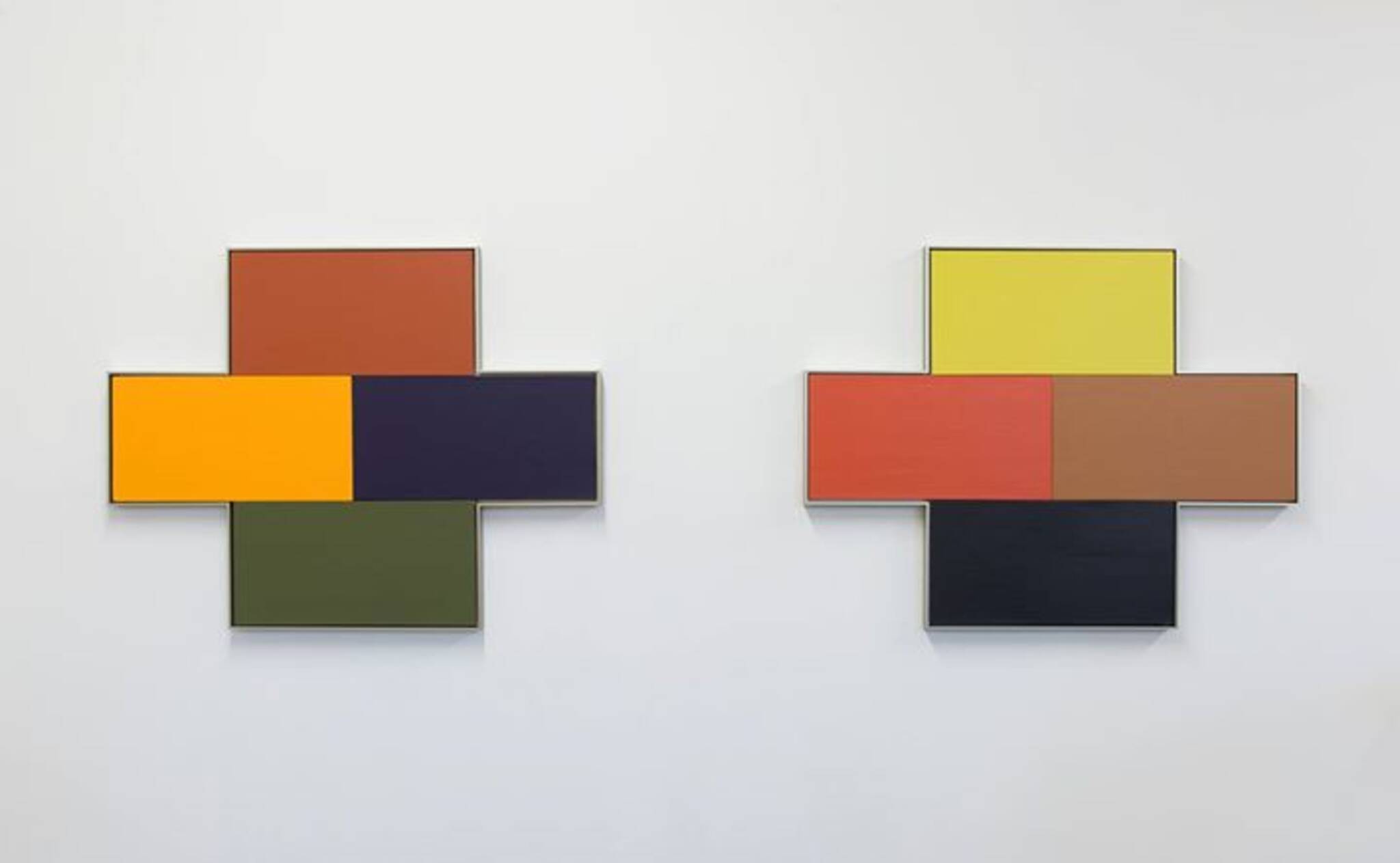
Daniel Faria Gallery is pleased to present an exhibition of new work by Douglas Coupland entitled Polychrome.
Colour is subjective and matters more to some people than others. I know a curator whos genuinely colour blind. He likes it because it means he can only look at an idea, not its colour cloak, which makes me feel sad because colour is such an important part of mammalian evolution, of our 100-million-year-old relationship with all other species and with the planet we live on. There are people out there who arent colour blind but who, based on David Batchelors Chromophobia, consider themselves chromophobes . Ive read his book, and I get what theyre doing, but I dont know why theyd want to do it. We have eyes. We were given this gift. Why would we not rejoice in it? Yes, yes objectivity but to renounce colour entirely? Its like choosing blindness.
Since I began school at the Hokkaido College of Art and Design in 1983, Japans consumer culture so heavily reliant on the pink, yellow, cornflower and pale turquoise spectrum has been an endless source of both cognitive and instinctual colourizing of my own work. Added to this are the colour studies of Senzo Wada 1883 1967, an artist and kimono designer, whose Dictionary of Color Combinations hybridized Japanese colour standards with those of the West. This was mandatory college reading. The paperback version of the book offers 348 subtle colour variations that inform much of the work in the Polychrome show. To me, these colours felt like they were imprisoned inside the book. Pieces in the Polychrome show offer these colour relationships a jailbreak, letting them enter the physical world on their own terms.
In the summer of 1991 I visited Le Corbusiers Villa La Roche in Paris, 8 square du Docteur Blanche. It was Corbusiers third commission and for its interior furnishings he collaborated closely with Charlotte Perriand. Since art school Id been a fan of Corbusiers painting and tapestries far more than his architecture, so for this visit I was more interested in seeing the works within, than the house itself. But once there, I fortunately had one of those epiphanies that are the reason we go to museums. It was simple: if a room has four walls, they dont all have to be the same colour. Thats it. Duh! What a liberating effect it had on me, with its ontological trickle-down corollary that, Forget just walls pretty much anything can be any colour. Combine this news with my essentially lifelong obsession with the candy colours of Japanese packaging, with Kinkos 8.5 x 11 standardized paper tones, and with consumer culture in general and I dont think Ive been in a monochrome room ever since.
Then, a few years back I was given a wonderful present: a multi-volume hardcover exploration of Le Corbusiers architectural colour system, which came complete with twenty tubes of latex paint that perfectly and scientifically matched the tones Corbusier chose to use in his architectural and design work. Were you to look at these colours without being told what they are, you might guess them to be, A catalog of 1940s colour, which isnt a put-down; its actually a put-up. Corbusiers structural and colourific theories were seminal to much of what modernity created from the 1930s up to the mid-1960s. His taproot was large and it went deep. Many of the pieces in the Polychrome show flow directly from this twenty-unit colour theory set, as well as from another volume on Corbusiers architectural colour theories published recently by Switzerlands KT Color that contains sixty-three sheets of paper painted with actual paint in exact tints specified by Corbusier. These pages, laser cut and bonded onto plastics, inform a large series of Polychromes one-off target-shaped prints.
To work with all of these specific colours mentioned, purely in relationship to themselves, has been a great joy to me over the past few years. By toying with scale and the dominance of one colour over another I almost had the sensation of taking a glass-bottom-boat tour through the mind of Senzo Wada and Le Corbusier and what a great ride.
-Douglas Coupland
Douglas Coupland is a graduate of the Emily Carr Institute of Art and Design in Vancouver, Canada, the Hokkaido College of Art and Design in Sapporo, Japan and the Instituto Europeo di Design in Milan, Italy. Couplands first major survey exhibition, everywhere is anywhere is anything is everything opened at the Vancouver Art Gallery in 2014 and travelled to Toronto in 2015 where it was exhibited at both the Royal Ontario Museum and the Museum of Contemporary Canadian Art. Most recently, Couplands solo exhibition Bit Rot was exhibited at Witte de With, Rotterdam 2015 and will travel to Museum Villa Stuck, Munich in the fall of 2016. Also in the fall, Coupland will have a second solo exhibition, Anticipation, at The Manege in Saint Petersburg. His work has been exhibited in numerous group shows internationally; most recently in Electronic Superhighway at Whitechapel Gallery in London 2016 and Space Between at The Flag Art Foundation in New York 2015. In 2013 Coupland was appointed to the Order of Canada. His work can be found in the collections of The Vancouver Art Gallery, Vancouver; the Albright Knox Art Gallery, Buffalo; University of British Columbia, Vancouver; Glenbow Museum, Calgary; Agnes Etherington Art Centre, Kingston and Confederation Centre, Charlottetown, PE.
This exhibition is generously sponsored by Ace Hill Beer
For more information contact Dory Smith at:
dory@danielfariagallery.com or 416 538 1880
Daniel Faria Gallery
188 St Helens Avenue
Toronto, ON M6H 4A1
416 538 1880
