A comparison of the Toronto skyline from 2000 to 2014
Not so long ago we took a comparative look at how much Toronto has changed over the last 25 years. That post relied on photos of key areas in the city that have witnessed significant change since the 1990s. It was, however, quite difficult to illustrate just how dramatic the changes to the skyline have been over that period.
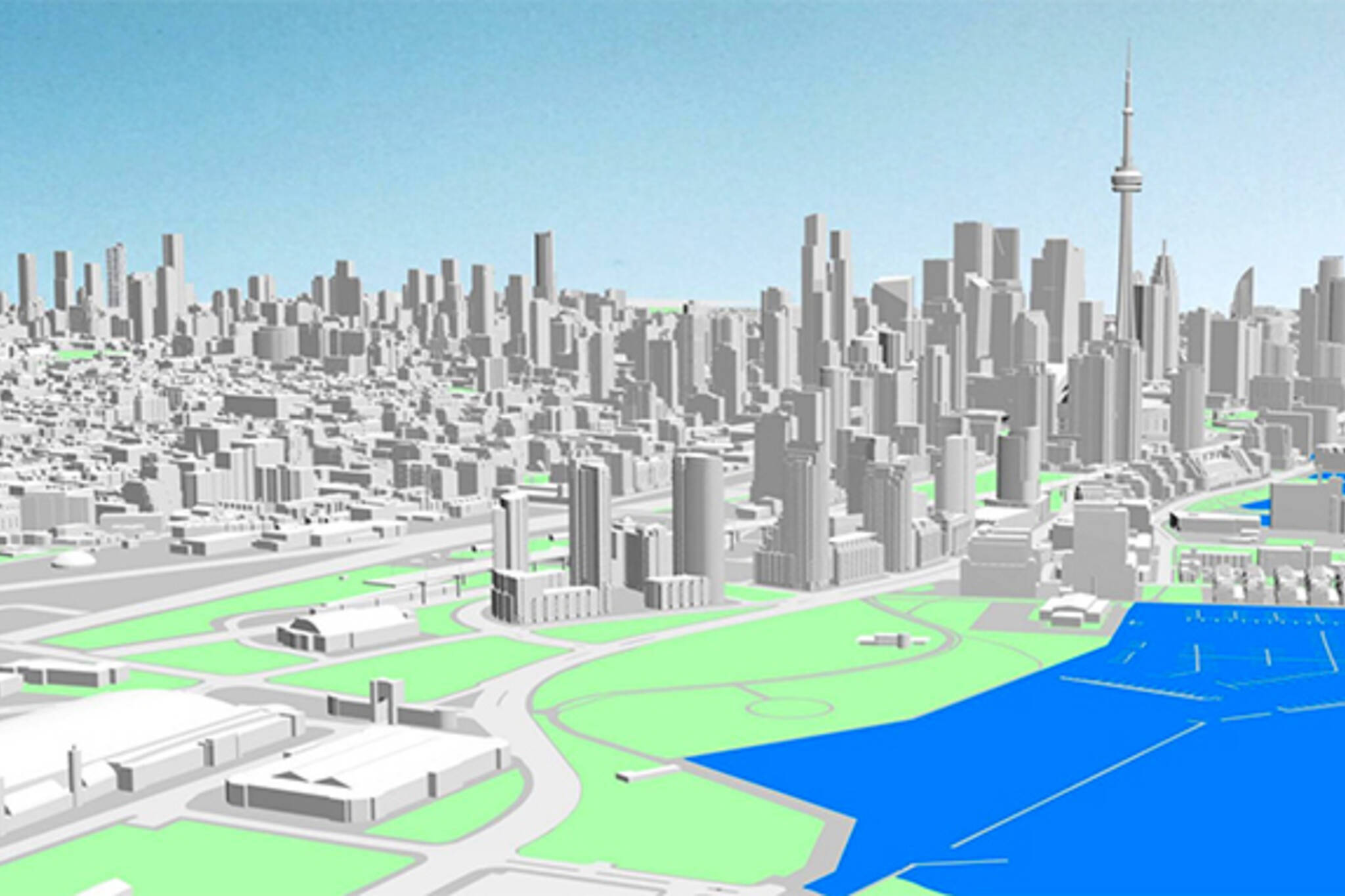
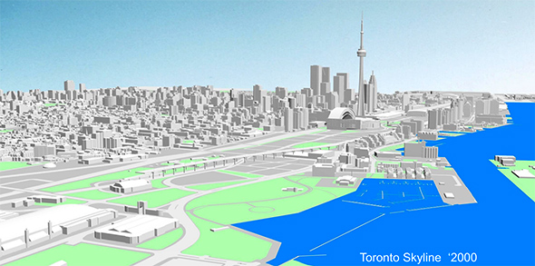
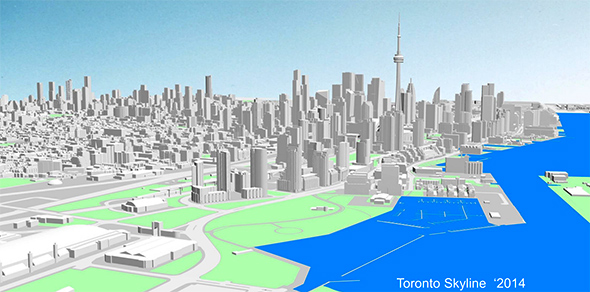
New documents released by Toronto's Planning & Growth Management Committee, on the other hand, make this very clear. Although the time period in question is narrower -- 2000 vs. 2014 -- the amount of development is staggering. Seen from an aerial perspective hovering above Ontario Place, areas like the Railway Lands, waterfront, and the corridor that follows the Yonge-University-Spadina Line are completely transformed.
The before and after images are offered below, but perhaps the best way to track the change is via this GIF that Matt Elliott tweeted last night. It shows a city in the midst of a serious growth spurt. It's riveting to think just how dense this city will become over the next decade and beyond.
Latest Videos
Latest Videos
Join the conversation Load comments