Whatever happened to the Osgoode and St. Patrick station refits?
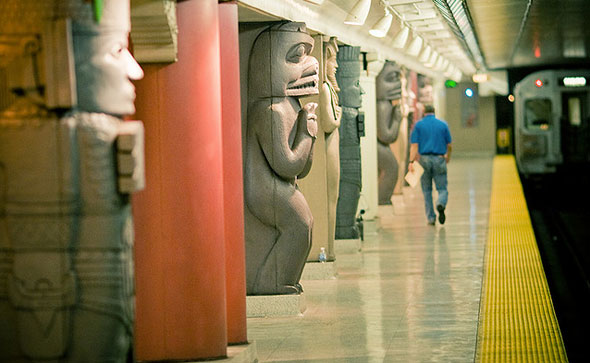
Museum station isn't like all the others. Thanks to a 2006 injection of community and donor cash, the TTC was able to give the stop beneath Queen's Park a major overhaul, replacing the original austere tile job with a series of visually-engaging Greek, Chinese, Egyptian, and First Nations columns.
The design and construction was funded in part by the Toronto Community Foundation - a charitable group with assets of more than $225 million - and was intended to be the first in a series of station revitalization projects on the University line.
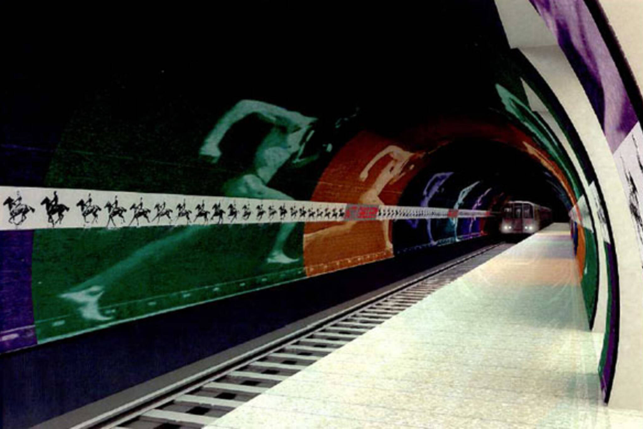
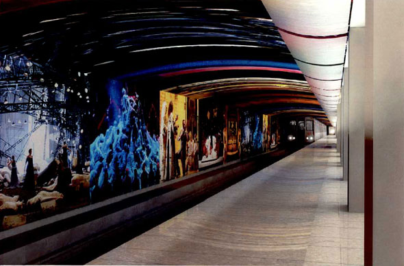
To reflect its Dundas Street location, St. Patrick was slated to receive a makeover inspired by works at the Art Gallery of Ontario. Osgoode would have been tweaked to match the Four Seasons Centre a short time later as shown in the preliminary designs above and below. So, what happened? The answer, of course, is money.
The $5 million cost of the Museum station work was split between the Toronto Community Foundation and the province, with the Toronto Transit Commission chipping in the final million. The TTC and TCF joined forces with a pool of donors, stakeholders and community leaders to create the "Arts on Track" program to oversee the initiative.
When construction wrapped up on the graffiti-proof columns and new station sign in 2008, internal TTC documents estimated work would begin on St. Patrick in 2010 and Osgoode a year later. Long-awaited improvements to Pape and Victoria Park stations on the Bloor-Danforth line would also start around the same time.
(Pape was actually supposed to be the first to get a new look but construction delays have meant the project is still incomplete. A
new exterior and set of windows for the previously bunker-like Victoria Park station finished in 2011. The TTC's plan at the time was to modernize one station a year - excluding Coxwell, Woodbine, High Park, and Keele - at $6 million each.)Not everyone was enthusiastic about the new look. Local transit advocate Steve Munro told the Toronto Star at the time that the project was "a nice show-off piece."
"The station was in good shape; the tiles were in good shape. It would have been way down the list for renovation ... This is the same system that can't find two pennies to rub together to run the buses."
Unfortunately for those supportive of the Museum refit, funding for the University line's renaissance dried up quickly in the wake of its initial success, a development that forced Arts on Track to put the St. Patrick and Osgoode projects on the back-burner, says the TTC's Brad Ross.
Simone Dalton, from the Toronto Community Foundation, says discussions are "ongoing" but confirms that there are "no specific plans at this point" to resume. It's not clear why the money vanished.
Would you like to see the project restarted? Were these preliminary designs good enough? Should the TTC use a similar model - i.e. a mix of charitable and provincial money - to fund other aesthetic improvement projects?
Chris Bateman is a staff writer at blogTO. Follow him on Twitter at @chrisbateman.
Image: TTC and "Museum Station" by tomms, "365 - 322" by yedman/blogTO Flickr pool.
Latest Videos
Latest Videos
Join the conversation Load comments