City
A typographical history of the Toronto subway system
A about a month ago I wrote a post on Jonathan Guy's TTC font posters, which I rather fortuitously discovered while searching through Flickr for something that I can no longer remember. Oddly, almost the exact same thing happened yesterday when I was trying to find historical images of the TTC on the website. Although I didn't locate the particular photo I was looking for, I did come across another poster devoted to typefaces on the TTC. What are the odds?
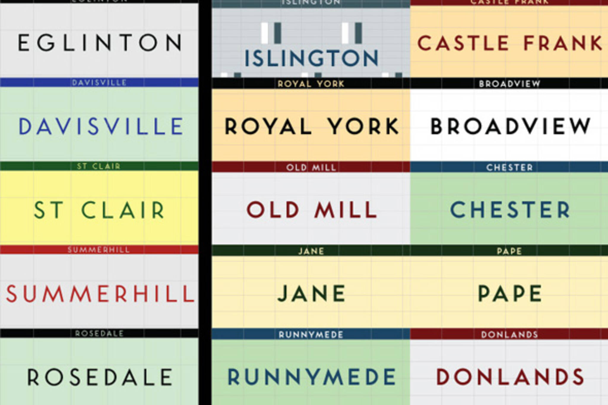
This one comes from Jose Ongpin and actually predates Guy's work. Upon finding this poster, I soon learned that it's actually a condensed version of a series of images uploaded to Flickr that represent the extensive research that Ongpin completed as part of a history of typography course at OCAD (not yet OCADU) in 2005-06. For the class, Ongpin created a timeline of the various typographical and tile styles employed in the subway system since it opened in 1954.
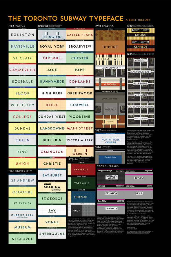
The original results of this research were reproduced in four separate pages, each of which were very popular (the first one has over 12,000 views). It appears, however, that it wasn't until about four years later that Ongpin put together the unified poster (in December 2009). This version, for whatever reason, didn't seem to attract much attention (so far as I can tell) and currently sits at 222 views.
That's a bit of a shame that I hope in some minor way to correct. Although not perhaps as aesthetically pleasing as Guy's poster of the 42 stations that still use the original subway font, there's something awfully cool about Ongpin's timeline. In fact, it wouldn't be a stretch that the two posters in question would make an ideal pair.
Take a look at the high resolution version of the poster here and for purchasing info go here.


Discussion
33 Comments
Sort By Oldest First / Newest First
Subscribe
It pis*es me off every time I see a sign in Helvetica or Arial.
IDIOTS
It pis*es me off every time I see a delay in Service or a Cancellation.
IDIOTS
Who is responsible for purchasing signage? Just make sure all new signs follow the guidelines and the incorrect ones will eventually be phased out without anyone raising a fuss about the cost of it.
I posted my opinion on that.
Notice I did not post an opinion on the price of tea in China.
Not having type consistency makes the ttc look bush league and unprofessional. I want it fixed.
It doesn't bother me at all, to be quite honest.
Yeah the 1978 - 1989 "mistakes" are quite ugly; but I like what they did for the Sheppard Line and hope they continue it into the York Region extension. But that's just my opinion, you can refute it all you want, but I'm not sure why it bothers you so much.
When I was in New York last October, I struggled to read the tiles that read the station name -- then you have that generic black and white signage that's posted on the structural steel members. IMO, looks worse than Toronto's barely visible font mistake.
He also rode the TTC for 24 hours straight for another project, hoping on various lines and buses.
TTC is a giant organization that should have its shyte together.
Count your blessings people!
However, from an art point of view, I think I like Jonathan Guy ones better.
I look forward to seeing great things from him in the future.
http://www.quadrat.com/tsr.html
Thanks for the article!
http://joeclark.org/appearances/atypi/2007/TTC/inscribed/
Using the subway font on new stations would be a great way to tie what one hopes would be new and interesting designs in to the system. Especially if the alternative is either whatever the default font is in Microsoft Outlook or a half-hearted attempt to copy another city's look.
I'd finish here by saying that the most important thing is that the signage be good, but then I'd really just be asking for a bad font choice *and* crummy signage that someone can pretend was their best effort.
BTW for those who are interested - Finalized version can be seen http://www.flickr.com/photos/neuroticjose/5370817952/
José’s poster is new. The topic isn’t.
No one said or even implied that the topic is new. So a bit of parting advice, if you're interested in us providing coverage of your work, send us an email and try to avoid comments like the one above.