City
Who's a Fan of Toronto's New Look Street Signs?
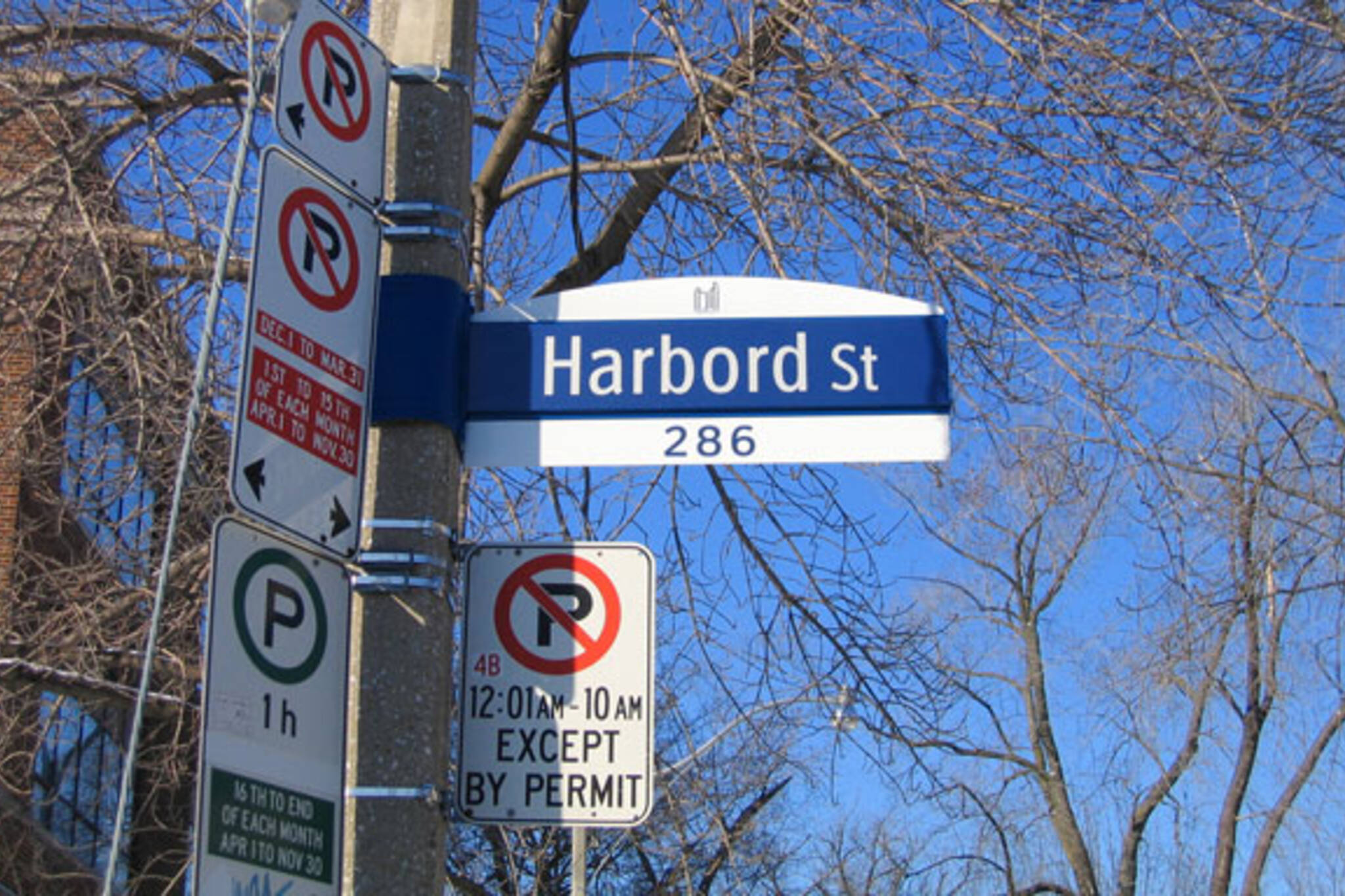
Earlier this year the City of Toronto began rolling out some new look street signs. Gone are the familiar acorn signs that we've come to know and love; and in their place are blue and white masterpieces like the Harbord one above.
The new signs were developed with some consultation but not much, or any, input from the public. The results show that clearly some working for our city government are obsessed with delivering on Toronto's international reputation as a clean and sterile place. (See Toronto a La Cart as another recent manifestation of this vision)
Thankfully the new signs have been slow to emerge. I've yet to spot any in all but a few select neighbourhoods. Of course, that hasn't stopped almost 500 non-fans on Facebook from joining the Toronto Acorn Signs Fan Page. Some of the choice comments so far....
Jamie Vernon writes
Anyone in the SIGN business can tell you that dark writing on a WHITE background is easier to read (that's why the acorn signs were designed in the first place) because light reflects back from headlights. The blue background is useless at night because it becomes invisible against the night sky. And with the lettering cast in a narrow font, it will be a blurry mess unless viewed up close.
Deid Vissi writes
This overhaul has all the trappings of some corporate zombie's decision making process. This city is not a shopping mall. It is HOME for millions of people.
John Skaife writes
When the bloodthirsty fatbrained aliens land, they will want to know where they are. They will look at these signs and say, "Toronto. We're in Toronto. The guidebook says this is the city of total wussification. Let's eat!"
Sandy Bennett-Sayer writes
Replacing the acorn signs...seriously....it may seem like an insignificant change in the scheme of things that have come and gone in this city over the years but this change is a historical mistake. Changing the appearance of the street signs to a modernized design is not improvement - it is however an unnecessary cost. Acorn signs enhance this city's distinctive character and historical value that is worth saving! Toronto is losing the quaint pieces of what makes this rapidly growing city attractive and desirable - it seems so simple but the historical value of the Acorn signs is significant and we need to realize that some things are worth keeping!
What do you think about these new signs? Take our poll below:


Discussion
99 Comments
Sort By Oldest First / Newest First
Subscribe
Everything should have been done to preserve the beautiful history Black and White Acorn signs. But no.
From the same vulgarians who brought you " Harbourfront," " Ethnic Street Meat " and " Toronto Life Square, " come these dreadful signs.
It's all fucking hopeless.
" Everything should have been done to preserve the beautiful historic Black and White Acorn signs. "
And dark and light is tough to see during the -daytime- when there are lots of visual distractions around. The white on dark blue will make the type much easier to see in a busy intersection.
Toronto continues to embarrass itself.
These signs are crap.
Okay, that's a little much. They're not that bad. But they do look cheap, and they do look clunky, and they will age terribly. They suck and I hope the city will halt the roll-out and order new acorn signs. For such a major part of the city's visual vocabulary (if I can be that pretentious) the public should've been better informed and consulted.
AND BOTSWANA
AND HONDURAS
AND FINLAND
OMG OMG OMG
Idiot.
Shalom.
Jesus, I guess we really f***ed up the STOP sign then didn't we?
(Sorry, you were probably being funny. I just feel kind of humorless and pedantic today.)
" Toronto's new street signs are U G L Y. Bring back the B+W Acorn Signs "
And join. Who knows what if any effect it may have.
Though I will miss the neighbourhood-specific designs, this new city-wide look-and-feel is going to help newcomers easily identify our streetsigns without having to decode meaningless colour schemes, colloquial neighbourhood names and varying shapes and sizes.
Bottom line, this is wayfinding people - not art. It should be clear, legible and consistent.
Bravo on the new street signs.
" Toronto's new street signs are U G L Y. Bring back the B+W Acorn Signs "
Group on Face Book
are they getting rid of all the 'neighborhood' street signs for this bland boring sign city-wide?? i think it takes away a lot of the character of toronto's neighborhoods. what a waste of time and money....
But compared to the classic old ones, they are pure garbage. I disagree with the above commenter who says this is "wayfinding, not art." First of all, wayfinding CAN be art (see London underground, for example). Second, it's streetscape -- and that means they should aim higher than signage that looks like it came from a corporate campus somewhere in exurban Jersey. Unlovable.
Opportunity missed, just like the ethnic street meat carts and the sterile, expensive farmers' markets.
These are more visible, but the visibility of the old acorn signs could be improved by making them just a little larger. (And we did manage to get to where we are today just fine with the old ones.)
Of course wayfinding can be art! Anything that graces the public realm can and should be, if not art per se, at least artful. The old ones were. These are not.
> years ago, attended in total by 48 people. I went to one of them and there
> were only about 15 people there, some of whom were city staff. I learned
> that the city never advertised the hearings on their own website, or in any
> Toronto daily, and I got the feeling that they didn't really want public
> input. Thanks for helping to generate it.
Not as good as the old Toronto city street name signs.
However, they are better than the "fake" street name signs put up just before the new ones started showing up.
I have noticed that the city park signs have a similar shape to the new street name signs.
What is this city to become? Is this a 'sign'? (Oh, that was a sour pun!)
To reiterate above comments, the lack of communication between the City and its residents results in soulless works such as these. I really can't fathom how so many on the committee thought the new design is so much better than our original and charming acorn signs. I'm just thankful I had the wherewithall to take a snapshot of my beloved corner signage last year.
Once I first saw my beloved Crawford street sign had been replaced with this blue monstrosity [seems Crawford was one of the first], I swore quite a bit, then got on the web to do some research. If you'd like to purchase your original sign, they are being saved for collection, awaiting approval by the City to be sold. Send your request here:
signsandmarkings@toronto.ca
Simply wasteful.
I ask the same question about Vancouver. They say, "I did shopping on Robson, walked along on west 4th, checked out Commercial Drive..." They remember their experiences by the street names, and they say it was very easy to get around, because you would always find nice big green street signs hanging above streets.
Toronto is larger than Vancouver, so rather than streets, neighbourhoods seem to have more significance here. But still, if you would want to locate themselves in a city, you would need to know which street they are on.
As a newcomer, I find new street signs much more practical, recognizable, and consistent in its size, colour and proportions. Old acourn signs may be pretty, but you really have to look for one when you need it. Maybe we can keep some feature acorn signs for sentimental reasons, but Toronto can do better directional signs for sure.
http://vancouver.ca/engsvcs/transport/streets/signs.htm
This may not be exactly what's been talked about here, but it's an idea.
I tell my friends back home "I live in Toronto now." And I would always find someone who would say "oh, I've been to Toronto!" Of course, Canada is one of major international tourist destinations, and if you would visit Canada, you would probably come to either Toronto or Vancouver. But I ask further, "so, what do you remember about Toronto?" They say, "uh, Niagara Falls and, some tall buildings..." They say it was difficult to tell where they were, even with tourist maps.
I ask the same question about Vancouver. They say, "I did shopping on Robson, walked along on west 4th, checked out Commercial Drive..." They remember their experiences by the street names, and they say it was very easy to get around, because you would always find nice big green street signs hanging above streets.
Toronto is larger than Vancouver, so rather than streets, neighbourhoods seem to have more significance here. But still, if you would want to locate themselves in a city, you would need to know which street they are on.
As a newcomer, I find new street signs much more practical, recognizable, and consistent in its size, colour and proportions. Old acourn signs may be pretty, but you really have to look for one when you need it. Maybe we can keep some feature acorn signs for sentimental reasons, but Toronto can do better directional signs for sure.
But the poll indicates one thing about Torontonians that continue to frustrate me -- they absolutely hate change and are stubborn to stand by the old ways.
People, some things are definitely worth keeping. But this isn't one of them.
I think I'm in the vast minority on that one though.
How silly. It's almost as though you presume the new signs (and the design thereof) are free.
But of course, the Hillbillies at City Hall refused to consult with the citizens.
bet you they end up for sale somewhere trendy.
a Public heritage, neatly sauntered away.
nah, that's what would happen in books or movies...
The old acorn signs are lovely (the original ones, of course, not the atrocious fake variety). They can be a little hard to spot, but if that gets drivers to slow down when riding through residential neighbourhoods, then hurray for that. As for major intersections, I think they definitely need much bigger signs than either the old acorns or the new bland crap pictured above.
They can't afford to replace the signs with the acorn ones people keep going on about, and people were obviously not happy with the faux acorn ones.
Again, the city finds itself in a no win situation when BlogTO is concerned. They either 1) Spend money they really shouldn't on acorn signs and have BlogTO commenters complain about how the city wastes money on non-essential things such as expensive acorn street signs. There would also likely be complaints on how the signs fail at wayfinding and how the city is discriminating against people with disabilities.
2) Save money on a durable, long lasting solution which has good legibility at the expensive of remaining traditional. This results in comments like those above.
Either way, there is sure to be
A) A comparison to some European city with a far superior system (despite the circumstances being completely different).
B) Accusations of greed and corruption at cityhall, regardless of how irrelevant that is.
C) Completely unnecessary over exaggeration. A helpful chart for those unfamiliar with the system we have here:
I'm mildly dissatisfied with the new signs = Complete garbage that has no right to exist
They're okay...I guess = Horrible in every way, what was City Hall thinking?!
I kind of like them, but I think the blue could be a tad darker = Complete fucking horseshit. My goddamn toddler could do better if I gave them a set of those shitty, no-name crayons that look bright and colourful but end up near invisible on paper.
Toronto: Black on white (green in Forest Hill); lit signs downtown
North York: White on blue, all caps
York: White on blue
Etobicoke: White on green
Scarborough: White on light blue
East York: White on blue, with EY logo
http://green.hyperdot.net/toronto-street-signs
It's the first color of a flag that came to mind. Interesting to know other flags have the same colors as well.
Calling me an idiot only shows you exist with a single digit IQ.
Also the colours of The Maple Leafs, but I doubt the colours were chosen to symbolize much of anything outside of Toronto's branding. Not sure if you were trying to come off anti-semitic, or hint at some connection between Jews and the decision to change the signs, but of all the things you could have chosen for the comparison, it's definitely sketchy.
http://www.toronto.ca/transportation/city_routes/pdf/spring2007.pdf
No doubt it was sent out for study never to be seen again?
Maybe old Toronto signs from major streets could be marketed to Canadian bars (smaller market I know) in the US and elsewhere?
The signs aren't terrible.
They're not great, they're certainly not the best choice, it would have been fantastic if the designs were opened up to the local design community and opinions were gathered from the city at large, but we can live with them.
Do we forget what happened when the city tried to re-vitalize the classic acorn signs? The giant, bland, flat, cut-outs that retained the vague shape of the old favourites. Or how about the drab TO logo that actually came out of a public vote?
The patch-work smorgasbord of halted sign revitalization attempts that litter the city is rivaled only by the failed garbage-can programs.
I would love to see a TO sign that captures the 'Torontoness' of TO. A sign that is uniform across the city, but is customized by neighbourhood with a unique piece of local flavour. We're an old city that has grown up on lofty goals and encompasses a near-global mix of cultures.
Until then, it will be interesting to see if the city follows through and actually manages to complete an initiative.
Sorry Maple Leafs fans... I'll recognize the Leafs colors when they win the Stanley Cup. Hopefully sometime soon.
This city's got more money than it knows what to do with!
They aren’t “cheap” or “flimsy.” Reach up and whack one sometime. (It’s pretty easy: A lot of the new signs are mounted on brand-new poles that hold nothing but the sign.) You want cheap and flimsy? Look at the flat signs that were temporarily used as an acorn-sign replacement.
At some point acorn-sign acolytes will have to admit that the beloved steel box signs with acorns on top were not the only sign format used in the city, possibly not even the majority case. Even in old neighbourhoods in Toronto proper they are quite rare. I’ve got photos of apparently all the other variations, and few were three-dimensional. At least the new signs kind of are.
I am from Slovakia and , too, and now am writing in English, tell me right I wrote the following sentence: "Do not use lamisil if it has ever given you an."
Waiting for a reply :p, Ulla.
I am from Japan and also now am reading in English, please tell me right I wrote the following sentence: "Three people have died and several others have had serious liver reactions after taking a popular tablet to treat related to lamisil, known generically."
Thank :o Dior.
<a href
I am from Cameroon and also now teach English, please tell me right I wrote the following sentence: "Baugur, one of the such methods of funds, not represents iceland, and baugur uk itself baked shortage in february."
With respect :), Angie.
<a href="http://zzoa.zik.dj/lexapro-toprol.php">lexapro toprol procardia</a>
If you are affectionate of pile cricket memories then what else intent be more delighting than cricket spitting image gallery.
please ignore this =)
------------
12358294867184757274
<a href="http://soxk.zik.dj/lexapro-horror.php">lexapro horror lisinopril</a>
Carefully line up the place and constantly huddle it into the slot until you get wind of it shoot into place.
<a href="http://skcopl.zik.dj/lexapro-for-menopause-symptons.php">lexapro for menopause symptons</a>
Because I grew up in the 80s and graduated from college perfectly in advance of the internet was born, like a lot of us, I was under no circumstances formally educated on the basis, so it was not marred nature.
<a href="http://si5k.venez.fr/lexapro-antidepressant.php">lexapro antidepressant</a>
So unless you need digital conviction, why not keep a handful bucks and work with an analog phone?
<a href="http://mo38.venez.fr/lexapro-discontinuation-syndrome.php">lexapro discontinuation syndrome cordarone</a>
You can go two or more shops into a reasonable laptop.
<a href="http://dim58.zzl.org/lexapro-and-dieting.php">lexapro and dieting oxytrol</a>
Understood Dedicated Server: It slices up a server into accepted servers.
<a href="http://sn42y.zzl.org/lexapro-any-drug-interactions.php">lexapro any drug interactions lincocin</a>
My affect grew as I noticed different of my neighbours chatting animatedly on the street; I began to run to agree and view what the event was.
<a href="http://sol693.zzl.org/lexapro-online-consultation.php">lexapro online consultation brahmi</a>
The power ratings of most compatible/replacement batteries are higher than the model manufacturers' batteries.
I guess I have to get used to the new Toronto Street Signs
I know the original acorn signs are multi-piece construction
and expensive to reproduce but they seemed to have a one piece
acorn that was not as nice but at least it maintained the
profile. This is a byproduct of amgamation, with all the
councillers from the boon docks, downtown will soon look
like the suburbs which is exactly what that sign looks like.
and should keep you useless comments to yourself you fool.
If you have nothing interesting to say on the subject get lost.
because you don't have a clue.
Sorrow was like the wind. It came in gusts.
My first reaction when looking at the new signs was of solemn disbelief and a tinge of sadness when comparing to our acorn signs.
The second time I looked at the new signs, I thought "yeah, of course people like this. There's nothing wrong with having something be simple and clear."
But then I started thinking about how the new signs reminded me of corporate offices and the signs in their hallways and on their desks.
That aesthetic is so clean-cut, its sterile. Generic and lifeless.
Things Toronto 'ain't one bit!
Though no doubt well-meaning, it reminds me of a kind of hapless robot designed to be boring and utilitarian. It remains static.
Which makes me think, what's wrong with having some spice to our signs?
Something beautiful and kinetic will make you intuitively want to notice it more, thus fulfilling one design mandate: make it pretty, make it useful.
Life is in the details, and the life of Toronto has within it a rich historical legacy.
Its details should reflect this heritage, bursting visibly form every corner of the city.
If its the details that add to the overall picture, affecting our visual landscape in such a way that people from other countries will consciously notice or unconsciously experience our city's unique aesthetic, why not take such small details into account with this in mind?
Is it wrong to think about even just adding to the daily pleasure in the life of a native Torontonian? Isn't it our own tax money funding this project anyway? I'm sure there are inspired jobs possible with the intelligent use of public funding.
How about starting a whole new generation of signs that comes up with something completely original and unique to the city? Something that would combine and highlight the variety of identities that each place has within its particular context and region?
This might strike some as strange at first, but we could even use the book "The Edible City" as a guideline. Food is a huge part of our city's identity. Why not?
Design is about unleashing creativity and the imagination and the new sign is utterly lacking in either of those.
Any practical propositions from Toronto's truly inspired designers?