Trending posts this week


Content from our Partners
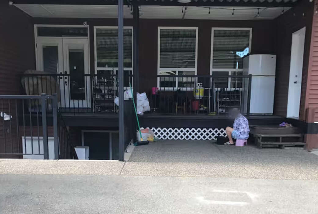
Posted 6 days ago
This content is paid for by an advertising partner.
Read more about what this means.
Read more about what this means.