The signifier plays the signified at 52 McCaul's Creative Type II
Whether it's stitched into our sneakers, bombarding us via enormous billboards, or providing the elegant medium for our favourite author's new novel, type -- and the hard work done by typographers -- can be seen just about everywhere, particularly in urban environments. Despite its ubiquity, however, typography is an art form routinely taken for granted (or simply overlooked) in our day to day hustle.
Good type ensures that form -- the particularities of how letters are shaped, placed, and juxtaposed -- conveys and reinforces the meaning of a textual message. Utilitarian, bold, and sharp typefaces obviously have profoundly different visual and emotional registers than thin, ornamented, serif-based types. It is indeed obvious, given a moment's thought, but like most people snoozing their way through the city, I rarely take a moment to reflect on the diversity, ingenuity, and sheer abundance of typefaces I might encounter in a given day.
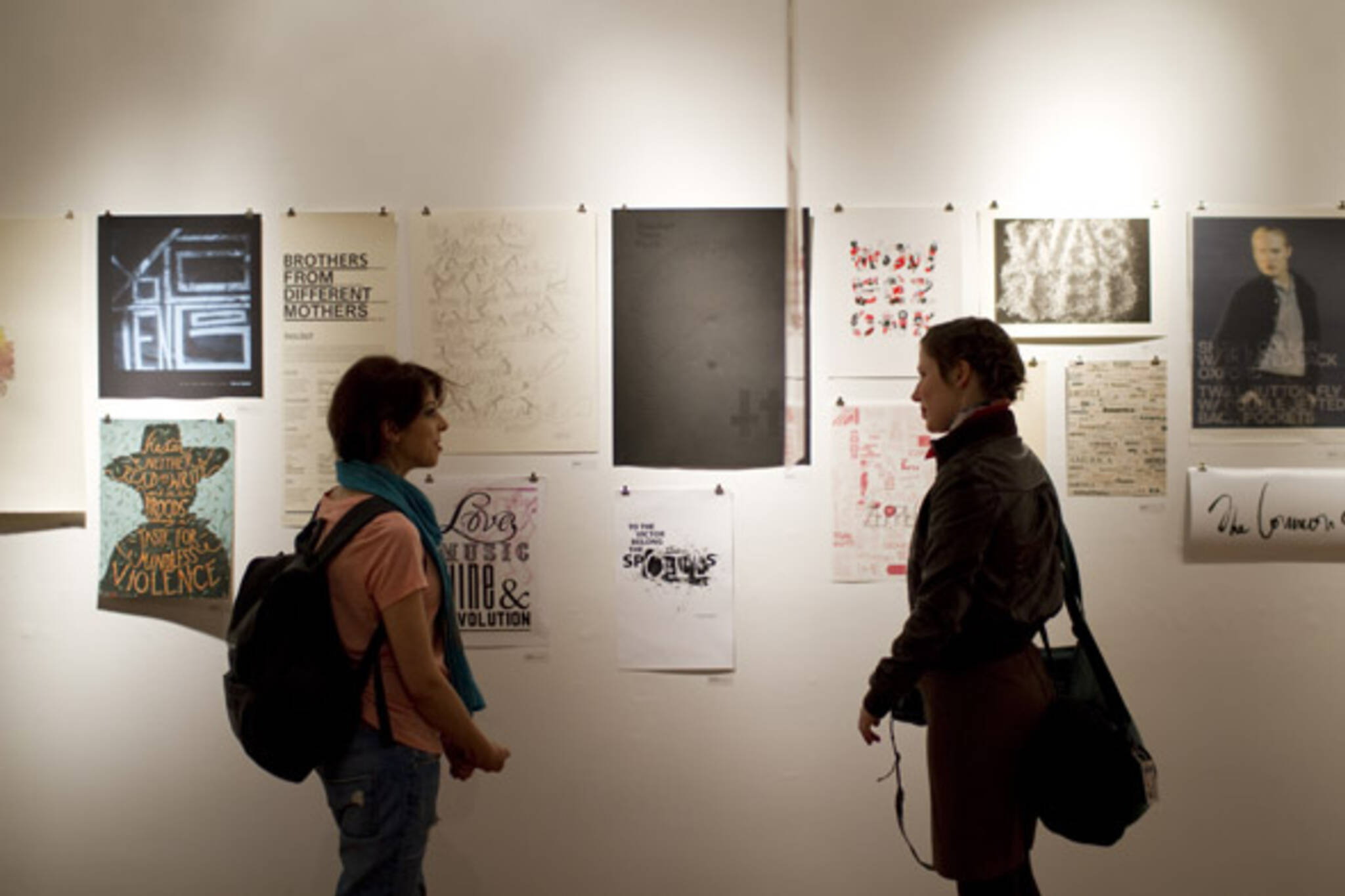
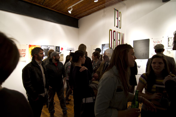
Thursday evening marked the opening reception of Creative Type II: A Typography Exhibition, held at 52 McCaul. The show (the second of its kind, following an inaugural survey in 2008) is curated by OCAD grads and designers Blair Johnsrude, Carla Poirier, and Jacqueline Lane, who've collected work from over 50 students, artists, designers, and illustrators across Toronto to "interpret and consider the complexities and intricacies of typography's importance in visual communication."
What's exciting about the showcase is the diversity of approach. Here, artists and designers aren't forced to represent a company, sell a product, or communicate a direct and unambiguous message. Freed from a purely functional approach to type, designers have embraced typography as an expressive and dynamic art form. And while complete and original typefaces are indeed on display, most of the work engages with the written word -- or our linguistic signifiers -- in a more abstract manner.
Examples of complete typefaces include Jessica Leong's "Eugene Gothic," an androgynous sans serif "inspired by American gothic typefaces" (androgynous because of its inclusion of subtle feminine design elements, such as soft edges and occasional decorative tails, in an otherwise masculine and bold sans serif) and Moshik Nadav's "Toronto Typeface," which playfully incorporates motifs (lines and spheres) reminiscent of TTC route maps.
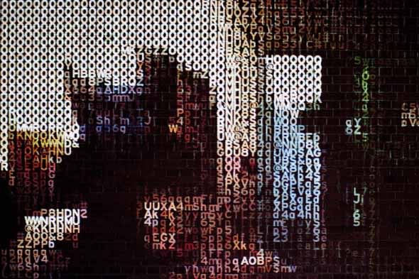
Less straightforward approaches are also in abundance. A piece by Banafsheh Pourpezeshk experiments with text emerging from binary code - white digits on a black background - where the letter I is replaced by the number 1. Adrian Farrow's "One Two Many" allows a textual message to emerge from blank space amid a dense collage of shapes, among which can be found flowers, bricks, and diamonds.
York professor Paul Sych's "So What" similarly spells out its message without using letters, but instead uses objects/glyphs (such as a scroll, a target, spheres, and so forth) that bear a resemblance to their corresponding alphabetic characters. Garry Ing's "Glitch" also plays with a type requiring a certain amount of patience to decipher. In this case, Ing's type is incomprehensible at short range; his message only becoming legible when viewed from across the room.
Many of the artists and designers drew inspiration from pop culture and other recognizable source material. Kellen Hatanaka borrows text from Led Zeppelin song titles, for example -- while Tom Briggs lists a pantheon of heavy metal bands in his piece, "Black as Fuck." Sean Lewis' "Blood Meridian" takes a line from the Cormac McCarthy novel of the same name, oddly juxtaposing lines from McCarthy's narrative of nihilism and blood with a wavy and thin lettering imposed on a light blue background.
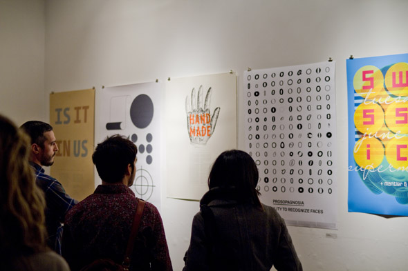
Various printing techniques -- such as the screen printed work of co-founder Jacqueline Lane, the blind embossed lettering of Kaitlin Barber's "Making Art," and even a piece by Paul Kawal ("The End") that appears to be meticulously carved into cardboard -- assist in adding distinction to the individual works (a sense that each is one of a kind or inimitable), and also reinforce just how time-consuming and labourious this kind of craft can be.
All told, it was a jam-packed, loud, and exciting environment (and also swelteringly hot ...), conducive to making new acquaintances and to a discussion of the artists' work. If you're like me, and fairly new to the complex world of typography, it's a great way to sample the art form's range of possibility, and perhaps the best way to finally figure out what 'kerning' means.
Creative Type II runs until March 28th.
Writing by Spencer Gordon. Photos by Arnaud Brassard
Latest Videos
Latest Videos
Join the conversation Load comments