Clash of the Crystals Round One: Denver vs. TO

Denver Art Musem
There's no doubt that Daniel Libeskind's architectural renovation of the ROM earlier this year drew a lot of publicity, good and bad. It was dubbed the Michael-Lee Chin Crystal in honour of generous monetary contribution of its namesake, and immediately had a polarizing reaction among those in Toronto. One Joe Clark went so far as to say the Crystal "sodomized" and "parasitized" the existing ROM architecture. So is the new ROM dramatic? Yes. Ambitious? Of course. Unique to Toronto? Well, turns out, not so much.

Apparently Mr. Libeskind has a penchant for erecting massive crystals containing priceless historical artifacts. His bio includes similar projects at the Jewish Museum in Berlin, the Imperial War Museum in England, and more close to home, the Denver Art Museum in Colorado.

So how do they stack up? In the first of a two-part series, I'll take a look at the exterior design of The Mile High City's crystal and see how our own humble children-hungry crystalline stacks up.

Denver Art Museum
The first thing to make very clear right off the bat is that Toronto and Denver are very different cities. The GTA's population just about doubles Denver's metro area, and this is made very clear in the downtown core. Businessfolk bustle around the streets during the day, but more often than not, most streets seem just about deserted when night rolls around.

Denver also has some fairly revolutionary transit ideas in motion, making use of free hybrid diesel-electric busses that run up and the 16th Street Mall, a 16-block pedestrian/transit-only mall that makes up the retail core of downtown Denver. This system is heavily used by the public, and the busses are cleverly designed to prioritize standing room.

This forward-thinking is pervasive throughout the city. Walking through various parts of it, I was left with the impression that there's a municipal government that not only cares about the city's image, but is proactive in maintaining clean, well-designed streets with a pedestrian focus.

Denver Art Museum
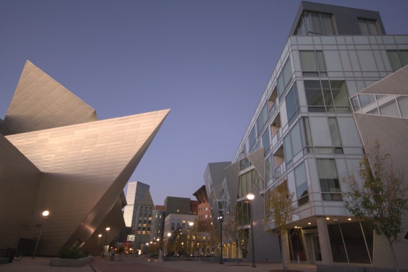
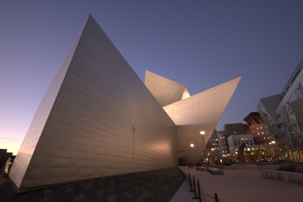
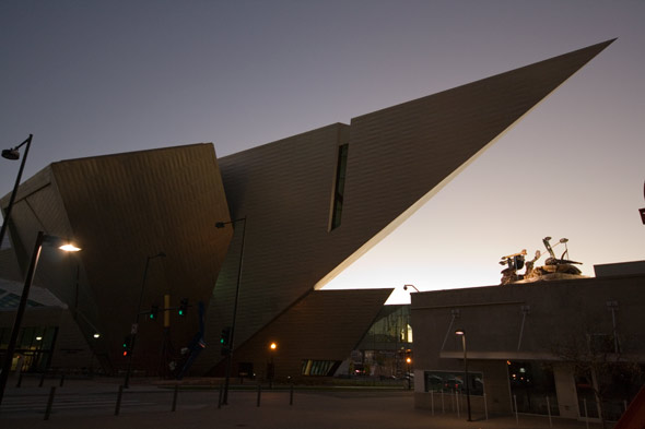
What does this mean for the Denver Art Museum? Well, approaching the structure you're immediately struck that it is all-encompassing, as if Libeskind was given near free-reign over the design and construction of the structure. The largest 'spike' on the crystal hangs well over 14th avenue, while the ROM's most prominent protrusion hangs just above the sidewalk. As many of you might also recall, Toronto city council went so far as to charge the ROM for using the public space above the sidewalk where the crystal protrudes into it.

Some would argue this measure was necessary for ensuring private-public space compliance, but to me this is an indication of artificial (and archaic) creative constraints.

Denver Art Museum
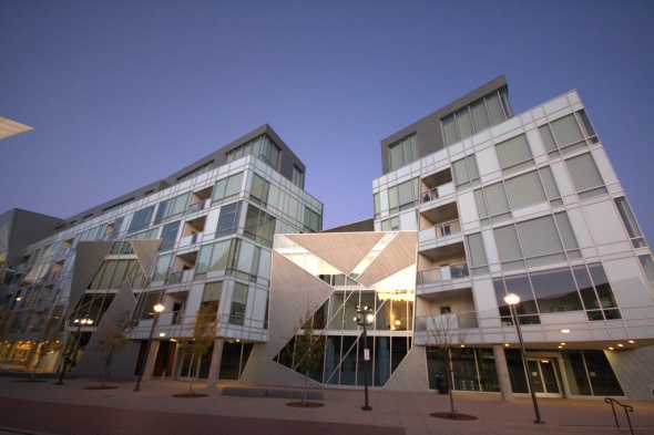
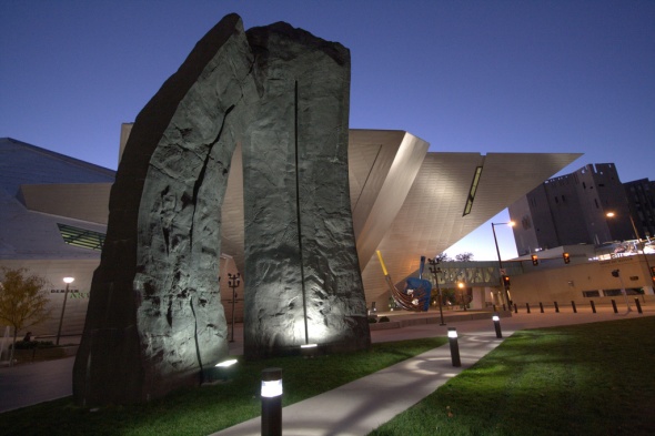
The other issue here is that the ROM feels completely out of place with its surrounding architecture. This isn't helped by the fact that much of the existing (beautiful) portion of the ROM is completely dominated by the heavily contrasting Crystal structure. At the site of the Denver Crystal, it is surrounded by architecture of equal post-modernist design, including the Denver Public Library.

Denver Art Museum
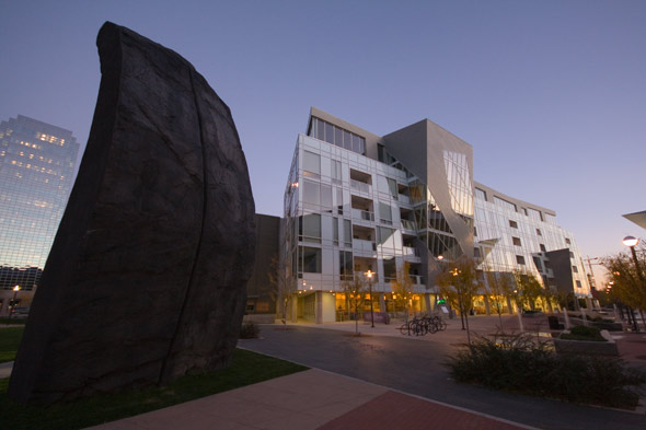
The surrounding area, stretching into nearby Civic Center Park, was given a high amount of attention to detail, and is lined with complimentary art installations, statues, all of which are illuminated by dramatic lighting at night.

While the same aluminum cladding was used in construction of the Denver museum, the distinct lack of black-outlined windows gives the structure a more consistent, and less cluttered appearance. It gives the impression that there is more confidence in the design of the Crystal itself, while not relying as heavily on heavily angular windows to give it distinction.

Denver Art Museum
Obviously, the ROM has the advantage here of providing natural light for the interior of the museum, but this may have been a logistical choice to prevent the light from damaging priceless works of art in Denver.

So on the exterior front, who comes out on top? My vote goes to Denver. As much as I appreciate Toronto's introduction of post-modern design into a rather tired-looking neighbourhood, I can't help but shake the feeling that the implementation of the Lee-Chin Crystal is "parasitized", as Mr. Clark said.

Denver Art Musem
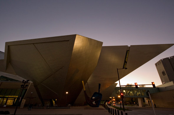
Denver's Art Museum leverages the surrounding beautiful, complimentary architecture to create a striking building, from every perspective. The level of detail given to the surrounding landscaping, illumination, and pedestrian-friendly areas in the Civic Center give it a welcoming feeling, as well as one that feels as though it conveys the original design inspiration.

In the coming weeks, I'll take a look at the interior of both of these structures in an attempt to show if Denver's good design sense translates into good use of interior space.

Denver Art Musem

All photos by me. Check out some more shots of Denver's Art Museum.

Reader Reviews and Comments

Submit a Review or Comment

You're going to be disappointed by Denver's interior - drop ceilings, acoustic tiles, terrible lighting, cases that are obviously recycled from the previous building and don't remotely fit the space. I love the cases in the ROM's crystal - lots of glass, nothing against the walls (so you can see artifacts from all sides), no cases at all where possible (artifacts on platforms). So much more visitor-friendly. And not a drop ceiling in sight! I can't imagine why the Denver folks decided to build the fancy building, and not maximize the incredibly interesting interior spaces it creates.

Posted by: Lindsay at October 26, 2007 1:25 PM

This may be the usual American disinterest in all things outside their borders, but the ROM crystal has received almost no press at all here in the US, while the DAM has received tremendous reviews and already has good public saturation in the design press. On the critics' front, ROM was crushed.

Note that the review above was much influenced by the environment outside the museum. Perhaps things would have been different if Bloor and Avenue had the kind of lush landscaping, pavers, street furniture, signage guidelines and architectural restoration that now characterizes many American cities. Toronto is extremely behind in these aspects of public space quality, and its citizens are rather ignorant of the city's relative decline. Very sad. It is perhaps best that the writer is not comparing riding a TTC streetcar to Denver RTD light rail or another depressing result would ensue, again for many of the same urban-public-space-dollars reasons.

Posted by: uSkyscraper at October 26, 2007 1:37 PM

great photo essay - i especially enjoy the way DAM interacts with the 5 storey building across the street.

Posted by: thomas at October 26, 2007 1:39 PM

Overall, what's missing from the ROM is a sense of sparkle.

Without the glass walls, there's only a series of burnished aluminum planes. If they were polished/shiny (and even illuminated at night), it would improve on the black hole that is situated there after dusk.

Posted by: Steven. at October 26, 2007 2:19 PM

uSkyscraper, I had considered going on about the Denver RTD that runs along California St and expanding on how highly successful (and well maintained!) the 16th Street busses are.

Two reasons why I didn't; I wanted to focus on the DAM, and the second is what you mentioned - it's kind of sad to see our transit and public space in the state it is compared to other cities which seem to be flourishing.

I'm no expert, but I think when looking at architecture, the surrounding environment is a really important (if not THE most important) factor in judging the design. It's not like architects plan without any knowledge of the neighbourhood, so it's so important that it's cohesive and complimentary.

Posted by: Adam at October 26, 2007 3:02 PM

I never thought I would say this, but Denver looks gorgeous. Not that Denver is any means some kind of rothole, but it never struck me as being very progressive on the architectural front. The little complex of the Lebeskind structure and the library, with the surrounding greenery, just blows anything Toronto has out of the water. As I scrolled down this entry, I had what I thought was a very Torontonian feeling: this mix of awe for another city, but also shame for our own.

Posted by: Gloria at October 26, 2007 3:25 PM

I think, yes, the Denver one is very amazing just thinking of all the engineering and years of math that it entailed. It flows well with the library which makes it look like it came from a Tim Burton film.

Architecture in the states never really has any regard for space. The bigger the better. They love to slap on sidewalks are go no where and areas that look good but are impractical. I would like to see this in real life and see just how practical and how much use is the area around it.

I am in awe of both buildings.

I love that we didn't tear down the ROM and start from scratch as many cities in the south do. The incorporation of old and new in Toronto architecture and it's livability is what makes Toronto unique.

Posted by: chris at October 26, 2007 5:26 PM

It looks blander than Toronto's Crystal with its lack of windows and uniformity. It doesn't have that impact that the Crystal does either. DAM's still outstanding in shape and execution and something that the city should enjoy.

Gloria- I'm proud of Toronto's messy aesthetic, beautifully culminated at Chinatown. And if you want trophy quality perfectionist design, look south of the Crystal. There's the U of T St. George campus where Gothic architecture meets great Brutalist buildings. Then there's the superb modernist Leslie L. Dan Pharmacy Building among some interesting additions. The terrific work done with the Distillery District, and so many other projects could be talked about elsewhere and now they're actually working on the waterfront with a great plan. Neighbourhoods previously in decay such as Queen West and the Junction are doing much better in terms of street life. There are parts of the city that do need work, but I don't need to it to look like the museum of urban design before I like it.

Posted by: A.R. at October 26, 2007 11:15 PM

The original Libeskind design for the ROM was much more effective because of its greater scale. I think this is something the final, muted version lacks. I understand when plans have to be scaled down due to financial or technological constraints. But when its done because of regressive city policies, then everybody loses.

Sent from my mobile using FeedM8

Posted by: Ivan at October 28, 2007 5:01 PM

I'm always amazed that uncritical, unthinking people fall into the trap of assuming that because something is 'different' it must be 'better' than what has gone before. There is good reason why the ROM has not been featured in the design press. The reason is that ROM is a self-serving, self-indulgent piece of pretentious nonsense that is not worthy of a serious critic's time and energy. Libeskind is not capable of serious architecture. It's as simple as that. Keep in mind that even Daniel Libeskind's own family insisted on using another architect (Alex Gorlin) to design their own home in New York City. If that doesn't tell you that the bullshit-spouting Libeskind is the joke of the century, I don't know what will. Libeskind's fan base is largely confined to juvenile students (1st and 2nd years who have not figured out that this is NOT really architecture), and middle-brow adults who like to think they are at the cutting edge of cultural commentary. Libeskind is laughing at all of them.

Posted by: Stuart Revett at December 15, 2007 8:34 AM

First, I don't understand the point of picking a winner between these two structures. They are so similar in style that there is not a clear winner. It comes down to personal preference.

Second, I don't know how anyone can say that Denver is gorgeous next to Toronto. And transit? Please. Let's no go there. I work with lots of people in the Denver area, and the are so jealous of Toronto's transit system.

Toronto is in relative decline? Maybe if sterility is your thing. It is as vibrant as ever. Could it use more love, sure. We all see that, but have a priority on the social responsibilities placed on us by the Provincial government.

Posted by: G Matt at February 1, 2008 12:27 AM

Post a comment

Remember Me?

Email This Entry

Email 'Clash of the Crystals Round One: Denver vs. TO' to: Message (optional):
Your email address:

Please type the verification code displayed in the image:

By forwarding this entry to a friend, we do not opt you or your friend into
receiving any additional mailings from blogTO. We hate spam too.
Disclaimer: Comments and blog entries represent the viewpoints of the individual and no one else.