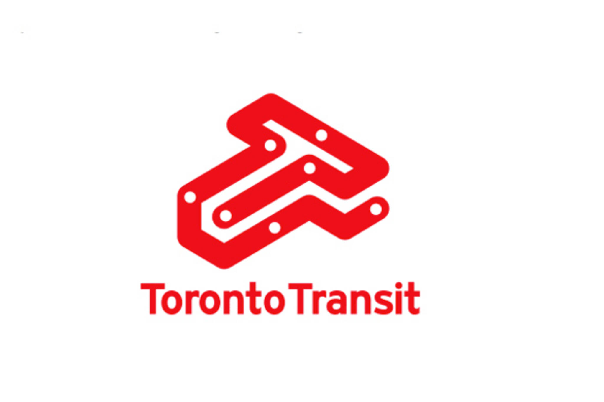
Another rebranded TTC logo
Every so often graphic designers do up mock TTC logos to strut their stuff or for class assignments, and I always love taking a look at the results -- even if I'm not a huge fan of each attempt. Whether good or bad, for some reason it's just cool to see someone take a stab at redefining a logo that's become so iconic for Torontonians.
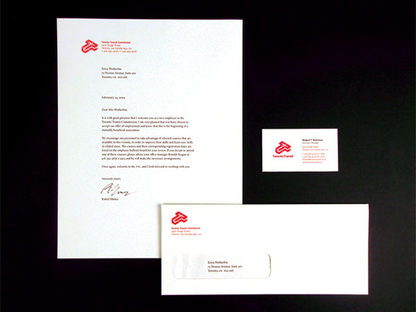
The last logo redesign we came across just didn't do it for me at all, but there's something about this one, put together by Matthew Yu, that I find compelling. A former student of Sheridan College, the now Brooklyn-based designer created it a while back, but I've yet to see much evidence of its existence floating around the web aside from a reprinted Applied Arts Magazine article (which has a small image of a black version of the logo).
What do you think?
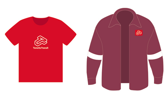
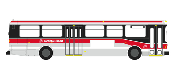
The two and three dimensional mix looks cool, but for me the best part is the way the logo is expressed as a subway line itself. And, hey, even if the TTC wouldn't go for it, it looks pretty slick on that red t-shirt. Not sure about the font, though...
Hat tip to Dylan Reid, who tweeted this earlier today.
Latest Videos
Latest Videos
Join the conversation Load comments

